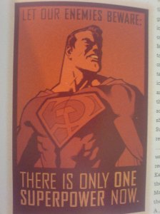
Ed Brubaker, Sean Phillips: Bad Weekend

Ed Brubaker, Sean Phillips (2021), Bad Weekend, Image
ISBN 9-781534-314405

Ed Brubaker’s niche, if you will, are comic books nibbling at the borders of masculinity. Some of my favorite works of his involve characters like Daredevil (his run with Michael Lark is probably the best – outside of some of Frank Miller’s work) and Captain America. Coming to terms with violence, balancing responsibility and the inherently transgressive work of superheroes is a constant theme. Outside of his work involving caped crusaders, Brubaker has carved himself a niche writing comic books about crime, usually with his collaborator Sean Phillips doing pencils and ink. I will admit, I am not as interested in these books, particularly those, like Criminal and Incognito, that deal with crime in a doggedly realist way. The first run of Criminal, collected in several trade paperbacks, ended a few years ago – but recently he re-launched the series, collecting the issues by storyline rather than issue by issue. Bad Weekend is, to my mind, the most interesting collection of the bunch. It is not, somehow, about crime at all.

In Bad Weekend, Brubaker and Phillips (with colors by Sean Phillips’ son, Jacob), tell the story of one comic book convention weekend, and of one legendary comic book artist’s decline, and his life of frustrations and regret. Bad Weekend is brief, but its story is told with a surprising amount of subtlety and breathing room given the brisk pace of the plot. It’s a bracing but excellent read, and if you’re interested in (yet another) tale of an old man’s decline and bitterness, then I can strongly recommend it. Both Phillips and Brubaker have been telling this kind of story for such a long time that the only surprise is the specific kind of characters and setting, but it’s enough to elevate this beyond the usual inky shadow of violence and crime to a story about the real darkness that powers the history of this colorful art form. It is by far my favorite work the Brubaker/Phillips team has produced in its long, long collaborative career.

First things first: this is not a roman à clef – Brubaker isn’t giving us a portrayal of a specific artist. Looking at his frustrations, you do immediately think of outsize artists like Jack Kirby, particularly given the fictional character’s penchant for fantastic tales over plain corporate ones. Or indeed, with Bad Weekend’s Hal’s insufficiently remunerated work on cartoons, one thinks of Alex Toth. I would, however, suggest a third artist, who, given his popularity towards the end of his life – and his seeming ubiquity in movies and on TV – wouldn’t seem to fit the bill of a frustrated, indebted, bitter comics industry veteran: Stan Lee. But crucially, the book is set in 1997, before the current boom in superhero comics on TV and the big screen. Earlier this year, Abraham Riesman wrote a magnificent biography of Stan Lee, True Believer: The Rise and Fall of Stan Lee, which offers a much more nuanced, and indeed occasionally harsh portrait of the legendary creator. Addiction, gambling, the mob – Stan Lee’s life ran the gamut. Hal, Brubaker’s protagonist insists that comics are dying – and in 1997, the comic book industry was in a real crisis. In 1996, Marvel had to file for chapter 11 bankruptcy – far from the titan it appears to be today, and other publishers were similarly struggling. Smaller companies like Defiant and Valiant went bankrupt; in a sign of the new age of comics we’re experiencing, Valiant relaunched itself in 2012, with a big slate of books and artists on board, and has since published some of comic’s most exciting titles, like Jody Houser’s Faith.

In 1997, when Bad Weekend is set, nobody expected this kind of bounce back – least of all artists like Hal, who had lost most of the rights to their titles anyway. So instead, what Brubaker gives us is a meditation on what it means to be a fading comic book artist – how you interact with archives, and participate in the creation of new archives and archival structures. Hal has sold off most prints he owns, so he signs fake animation cells to authenticate them, making very little money off them. As we meet him, he arrives at a convention where he’s about to be given an award for his life’s work – but he doesn’t care about industry awards, particularly since this industry is declining to pay him fairly for all the work and characters he has created – a familiar complaint among artists. He gets a former assistant of his to serve as his guide around the convention, and it is from that assistant’s point of view that we follow the story. Years ago, he discouraged said assistant from pursuing a career in comics, letting the then-young man get entangled in a crime-adjacent life. Now, he needs his help to recover prints that he has been trying to dig up for a while. Through break-ins and violence, we retrace some of the paths these objects sometimes take, we see fragments of Hal’s life outside of this specific “bad weekend,” as events slowly come to a head.

The final revelation, which explains the urgency at the heart of Hal’s weekend endeavor, is equal parts heart-breaking and illuminating, helping us shine light on some of the moral quandaries of a career in comics. Brubaker tells his story in small pieces of pertinent information, scattered around a fairly regular story of small time crime. The crime isn’t the point, it’s incidental, it’s the only path open to Hal at this point in his life. His memory is going – he repeats himself, forgets details, etc. – and his life is barely holding together. This connects Hal to Brubaker’s other, less artistically talented criminals. They are not supervillains, created for a life of crime, crime is incidental in their life as well, it’s a means to make lives wrecked by violence, capitalism and mental breakdowns work, a means to be able to go on among others, head held high. For all the burglary, assault and forgery committed on this “bad weekend,” Hal isn’t ashamed of any of it. In fact, he’s trying to erase something that nobody outside of the industry would consider shameful in any way – but that, more than the financial situation, is what prevents Hal from being himself, freely without bitterness and shame. In this way, Hal is just like most of Brubaker’s male characters – using the toxic fruit of masculinity to combat feelings of (imagined or real) inadequacy, themselves created by masculinity. The toxic ouroboros of masculinity and the circle of violence informs much of Brubaker’s work – and in Bad Weekend, he gives us a particularly well crafted, dense, moving version of it.

Warren Ellis/ Phil Hester: Shipwreck

Ellis, Warren; Phil Hester et al. (2018), Shipwreck, Aftershock
ISBN 9781935002802

If you read comics, you will have come across Phil Hester’s work here or there – he’s inescapable. And not like the ubiquitous mediocre artists. Hester’s work is always excellent. Shipwreck is no exception. Every panel, every page works. There’s a touch of J.H. Williams III about the panel layouts here, and a couple of younger artists have produced similar work, particularly in the way Hester relies on his inker here for depth and stature. And then there is the writing. Shipwreck is one of many projects by Warren Ellis, who has something of a renaissance these days – he has never gone away of course, but the recent creator owned comic books published by Image Comics (Injection, and, more relevant for this book, Trees), as well as his work on characters like Karnak or Moon Knight has been exemplary. Shipwreck is unusual among all these titles by being self contained. It’s a 6 issue comic, collected in one trade, published by Aftershock. The tendrils that Shipwreck extends towards other comic books are too numerous to list, but the book never feels derivative. It clearly feels like part of a longer comics conversation, yet its structure and character is quite unique, and Hester’s bold pen contributes to this certainly.

Shipwreck, like many great contemporary comic books, is high concept: a man lands on a strange world. As it turns out, he built a machine that can jump to a parallel earth, an attempt made in order to save the ballooning population of “regular” earth. This parallel earth is a strange hellscape – Ellis’s depiction draws from various ideas of postapocalyptic landscapes. The tropes are all there as expected: strange bars, unexpected encounters, no large communities – this is about isolated individuals strewn across a large vista of rocks and ruins. At the same time, we learn that somehow this world of destruction and mystery has a high level of technical expertise, plus a level of organization that allowed them to insert a spy in “regular” earth’s mission, there to sabotage it. This parallel earth is an earth of violence tropes, of fear. Towards the end of the book, a character from parallel earth says to the protagonist: “nobody understood you back there because you were afraid of everything and they weren’t. you’ve come home.” This insertion of fear here points to what Ellis is doing with the tropes and narratives here – he’s condensing them into one sharp image: the leap. It is a Kierkegaardian leap, this leap from one earth to the other, and Ellis has exposed it as such, with all the implications it has for other texts in this vein.

To my mind, the comic books that I thought most immediately about were Ivan Brandon and Nic Klein’s Drifter and Jeff Smith’s Rasl. Drifter ran through multiple trades until it ended beautifully last year. It is about a man who lands with his ship, seemingly dropped out of time – traveled through more than just space. There are contradictions and mysteries that Brandon wraps around an engaging story. While Brandon’s story, in turn, shares a lot with many other recent comic books about space-as-wild-west (Copper is one excellent example), his inversions of time and identity made his book stand out. The dominant narrative – who shoots who, who does what, all of these are diversions in the greater mystery of time and place. Drifter is full of leaps, and even engages the idea of religion, but manages to still wriggle out of it, boiling it down to a personal journey of melancholic self-discovery. This comic, towards the last trades, has some of the loneliest and emotionally gripping panels I can remember reading from a comic in this genre. Nic Klein’s art is essential to this. I’ve been meaning to do a review of Drifter for a while, but I never quite got around to it. The book’s final revelations aren’t real revelations in the sense that we are genuinely surprised – instead, we can kind of guess at everything after the first trade, but Brandon manages, with great skill, to use the majority of his run to carefully tease out all the implications and turns in his concept. The result is a wonderful comic that everybody should consider reading.

In many ways, Shipwreck uses very similar moments of revelation, the landing of the ship, the alien-but-familiar landscape, down to the way Hester renders moments of surprise, and mental strain. Another book that is similar, though in less immediately obvious ways, is Jeff Smith’s Rasl, which he published in four volumes a few years back. Smith is most well known for Bones, but I’d argue that Rasl is a greater accomplishment. RASL is a book about science, indirectly referencing various debates about the Manhattan Project and the viability and exploitability of various forms of scienti´fic progress. But more relevantly, it is about a man who straps a device to his body that allows him a form of interdimensional travel. The protagonist in Shipwreck also has a device that allows him a specialized form of travel – it allows him to jump short distances – i.e, disappear and reappear somewhere not too far away. Like RASL’s device, this one takes a toll on its user. There are a couple of scenes that read like direct references to Smith, but it’s hard to tell with such a broadly allusive book like Shipwreck. Smith does tether his story to religion, but more in the sense of a general meaty mysticism rather than something more specific. Smith’s book is effusive and inspired rather than precise and direct. Ellis’s book is the latter, more than supported by Hester’s inorganic, angular lines.

As a whole this reads like a master’s comment on a whole genre – it feels less like fiction, and more like metafiction. A comic book disquisition on craft. There is a lot of “story” in the book but at the same time, the book doesn’t appear to be interested in story. That Ellis can do story is evidenced by his own Trees. Shipwreck reads more like a proof of concept, a master showing up his disciples. Or: Masters, plural. Hester, too, has been around longer than many fêted contemporary artists, and has provided great art all this time. I first encountered Hester’s work on Kevin Smith’s iconic Green Arrow run – whatever you think of Smith’s work in comics, Quiver is a masterpiece, and Hester’s art is a big part of that. His work here is recognizable – but it, too, seems to dip into current trends, but on a much higher level. As I said – a proof of concept comic, by a legendary writer and a legendary artist.

A note towards the end: this was published by Aftershock comics. I have never heard of this publisher before – but the book is well produced, and it’s not just Ellis who writes for them these days. There’s a book by Garth Ennis, and one by the powerhouse pairing of Palmiotti/Conner, as well as a comic by Cullen Bunn, who seems to be everywhere these days.

*

As always, if you feel like supporting this blog, there is a “Donate” button on the left and this link RIGHT HERE🙂 If you liked this, tell me. If you hated it, even better. Send me comments, requests or suggestions either below or via email (cf. my About page) or to my twitter.)


Alfred: Come Prima

Alfred (2014), Come Prima, Delcourt/Mirages
ISBN 978-2-7560-3152-1

Despite the Italian title, Alfred’s award winning graphic novel is French. Alfred, whose name is Lionel Papagalli, is a 40something artist and writer from Grenoble. This book is a marvel of emotional storytelling. The basic beats of the book are well known and common enough that we all know a novel or movie or comic book about this topic. Two sons return home to their father to figure out the intergenerational sociocultural dynamics between emigré children and their parents. The what isn’t the most important part of Come Prima – it is the how. This large book is consistently spellbinding and moving. Alfred does more than just tell a story about a father and a son, he also, in various registers, tells a story about fascism, about what it means to be working class in a changing world, how we construct our futures relative to our pasts. To what extent are our identities tied up in our memories? Like all good comics, the major achievement of Come Prima is not to ask novel questions, it is to find unique artistic ways to ask and maybe answer them. As the cover suggests, the book is largely a road movie kind of story: two brothers take a decrepit little car to go to Italy, to bury the ashes of their father. On the way we discover various nooks and crannies of the family history, and both brothers gain depth as we hear more of their stories. Alfred has at his disposal an enormously malleable artistic grammar where a shift in colors and realism allows him to show shifts in emotion and tenseness. The main graphic effort in the book, however, are sections painted entirely in blue and red colors, with no black outlines, passages that indicate formative memories – both kinds of drawing, the realistic leaning main visual narrative and the memory paintings, come together in two enormously powerful panels towards the very end of the book. To be clear – Alfred doesn’t offer a particularly insightful tale here – this is all effect and emotion. But it is fantastically done, and truly compelling.

Alfred makes some interesting choices regarding his setting. The book is set in 1958, as we learn from a radio broadcast heard somewhere on the road, and while much of the beginning of the book draws on noir, we soon find that the war, which, after all, had just ended 13 years earlier, is casting a shadow on many of its characters. It is a curious achievement by Alfred to decide not to focus on that aspect specifically, despite it being a central part of why the characters are who and where they are. What this creates is a story that we can all recognize, a story that is, as I said originally, very common: the damaged older brother, the ruptured family relationships, the strange characters encountered on the road – but giving it that historical context deepens the story, and also, implicitly, interrogates those other stories for such a context. The “noir” label generally is interesting that way – the term “film noir” was invented by a French critic in 1946 – and generally, French noir is considered as having peaked in the postwar era, as contrasted with American noir, whose heyday was in the 1940s. It’s true – there’s a whole batch of French noir in the prewar era, including the enormous Le Jour se lève, which I have rewatched just last week, as well Pierre Chenal’s 1939 screen adaptation of The Postman Always Rings Twice, which was the first adaptation of that seminal noir novel (the first American adaptation followed much later in 1946); there’s no denying the importance and centrality of post-war noir as a force in French and world culture, from the novels of Gallimard’s série noire, inaugurated in 1946, to the films of Jean-Pierre Melville and Jules Dassin. The war, also often implicit in these movies, is also a force in all of them, even clearer, in some ways, in the extremely political Italian noir of the 60s and 70s. Contrary to the usual noir lighting and cinematography, Alfred shifts the genre into the light – Come Prima is positively flooded with sunlight. Outside of that, I think the comic is engaged in a dialogue with the genre of film noir and its validity for our narratives of today. I went on and on about film noir because it’s not necessarily explicit in the comic – apart from the very noir beginning of the book.

But leaning heavily on the tradition of film noir allows Alfred to lightly touch on complex questions of masculinity in some vignettes here and there without having to play the scenes out to the end. The book begins by introducing the older brother, Fabio, a failed and failing boxer, who shies away from a steady job. The implications of boxing for discourses of masculinity are clear (Mailer, Oates), but most of the other scenes in the book deal with the issue as well. Fabio is visited by his younger brother Giovanni, who is asking him to come home to bury his father’s ashes, which Giovanni brought with him. We never meet the father in the book, but the whole tale is about dealing with father figures and one’s own relationship to maleness and fathers. Giovanni, as it turns out, is a father, as well, one who has abandoned his child. Fabio fights on the streets and in the ring to deal with insecurities and vulnerabilities. Even the few female characters are tied to fatherhood and masculinity, from Fabio’s girlfriend in the present, who tries to convince him to take a job with her father’s company, to Fabio and Giovanni’s adopted younger sister whom Fabio has never met. We are rushed through scenes and characters, with Alfred spending languid moments looking at landscapes or focusing on small moments rather than elaborately written scenes – but his reliance on genre means that he can do that without the whole thing feeling rushed. He plays with genre in other ways too – the memory passages are presented to us with increasing narrative detail – every time they return we come closer to some revelation – but when we finally know everything, the “revelation” is a minor detail, and instead of rushing towards some dark family secret, the passage of memory panels turns out to be a quest for a fullness of memory. There’s no secret at the end of this tunnel – at the end, this story is about being honest to yourself about why you have led the life you have, what your various failures mean within the context of your own life and that of your kin. And that, I think, also leads back to the forgetfulness of masculinity, and the erasure of history by the victorious and the virile.

This is particularly salient here because the period of rupture is the advent of fascism. What Alfred here does is extremely clever: he does not use fascism’s destruction of families as the point where this family breaks apart. That’s such a common narrative, but his point of departure is just before everything crashes down. Fabio and Giovanni’s father was a left wing unionist during fascism. He was beaten, broken, he saw friends being killed. In fact, adopting that girl is a direct result of these devastations. And yes, his son was on “the other side” – but not when these things happened. Fabio joined the black shirts as a young man in order to hurt his father and in order to belong to something different, something bigger. By making this narrative part of the novel’s general discussion of masculinity, he implicates the latter in the former – general narratives of masculinity in fascism. In the end, Fabio leaves for Africa and later France before fascism completely takes over, allowing Alfred to include this dark chapter of history but having his story be about more than that. The absent father and his values of cooperation, kindness, solidarity provide the moral background in a story that implicitly interrogates the value of Grand Personal Narratives that always focus on violence, women and alcohol. In the end, the past and the present fuse beautifully into a contemplation of life by Fabio who has always been on the run. “Come Prima” means “as before” – and while we know from Heraclit that we cannot live exactly as before, sometimes we need to return to our origins before we can begin again.

*

As always, if you feel like supporting this blog, there is a “Donate” button on the left and this link RIGHT HERE. 🙂 If you liked this, tell me. If you hated it, even better. Send me comments, requests or suggestions either below or via email (cf. my About page) or to my twitter.)

Marjorie Liu et al.: Monstress

Liu, Marjorie and Sana Takeda (2016), Monstress, Vol. 1, Image Comics
ISBN 978-1632157096

Gibson, Claire, Sloane Leong and Marian Churchland (2016), From Under Mountains, Vol. 1, Image Comics
ISBN 978-1632159441

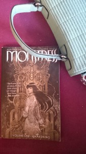
_20161215_142408Marjorie Liu is slowly but surely growing into one of the mainstream comic industry’s most interesting figures, at least for me. She is not one of the steady writers, who write creator owned or licensed titles every year, but she’s also not one of those novelists who dip a toe into comic books here and there like Brad Meltzer or China Mieville. Liu has only a few titles to her name, but they are all important and worth reading, working with Marvel characters like X-23 (who is the new Wolverine in the current line of Marvel comics) and the X-Men (where she engineered the first gay wedding). This year, she wrote Monstress, a creator owned comic full of gorgeousness and brutality for Image comics that I would consider one of the four most beautiful and original comics to come out of mainstream comics this year, two of which I will review here. The second one under review is From Under Mountains, co-written by Claire Gibson and Marian Churchland. From Under Mountains is a comic by a writer and artist who I never heard of and I don’t remember what made me preorder the trade, but I am very glad I did, because its story of war and peace, of spirits and men, is worth reading and rereading. Both it and Monstress have created their own mythology, both of them based in fantasy worlds other than the typical European medieval environments we usually find. And both comics are true collaborations between writers and artists that found a unique visual language for a story that is complex but also as simple as any myth is. Sana Takeda’s sumptuous, rich art, which barely requires Liu’s dialog, is just as essential for Monstress as Sloane Leong’s angular lines and flat colors are for From Under Mountains. Neither comic is without flaws, but I recommend both very strongly.

dsc_3156

The first page from “Monstress.” Protagonist gets sold off in a slave auction, naked and without an arm.

Monstress, despite the adorable young girl on the cover, is brutal. Its story is a rough retelling of the aftermath of colonialism, as it happens in our world, but heightened with myth and metaphor. Liu’s story is set at the frontline of an uneasy truce between humans and a world of magical beings, the Arcanic. The book’s events are informed by the brutal war that preceded the truce, with a horrifying calamity forcing humans to accept a temporary peace. Humans are superior in every way to the retreating world of magical beings, but the unspecified calamity has convinced humans that the magical army possesses a terrible weapon that they will deploy with unspeakable ruthlessness. The basic opposition of modernity and myth has played out in many stories and movies, but I’ve never seen it expressed in such a physical, grounded way. Liu’s characters are former or current soldiers. They bear the scars, inside and out, of war, and the traumas thereof. The politics of the world Liu portrays are full of shifting loyalties and betrayals – the horrors of war makes people change sides, hide secrets and offer cruel compromises. The most convincing element, however, is the physicality of it all. Like a handful of good writers, Liu’s concept of magic involves the bodies of its practitioners. Magic is an ability that is bred into people, it is in their blood, and using it is a physical skill. So far, so common. Yet Liu, writing a world of realpolitik and brutal war, follows through with her ideas, and invents a specialized cadre among humans, the Cumaea, the so-called nun-witches, who extract material from the magical beings through various methods, none of them pleasant. People lose limbs, by and by, to satisfy the appetite of the voracious human military apparatus, which is increasingly dependent on its magical cadre.

dsc_3153

A temple of the Ancients from “Monstress”

It’s easy to see these elements, as I said, as metaphors for acts undertaken by colonial powers in our world. The greed for knowledge and the piecemeal devouring of the native people are framed in ways that make them enormously fitting, and makes much of the book’s story ride piggyback on our cultural memories of war and colonialism. There is an emotional narrative, but the book only occasionally touches on it, with the biggest revelation coming as a cliffhanger at the book’s end. The main impact is, so to say, political. It makes us feel the cruelty and brutality of slavery, genocide and colonialism. Yet Liu interestingly balances these metaphorical effects, where she blends a thing in our world with a similar (but different) thing in the world of the book, with clashing effects, such as her interrogation of the role of women in our histories. Liu’s book is centered completely on its female characters, which has interesting implications, as has her use of the trope of the witch. Sana Takeda’s art is more than just helpful in all of this. She creates an overwhelmingly decadent visual language for the book, replete in browns and blues and gold. The décor seems sometimes Asian, I think, without really using orientalist stereotypes. It draws from multiple sources including fin de siècle decadence. It is impossible to express the enormity of Takeda’s achievement, who creates full landscapes and buildings, deep in color and rich in detail. Nothing is neglected, everything has the patina of history. Going through the book’s amazing art, you get the feeling that Liu had to write a story as harsh and impactful as she did, just to keep up with the extraordinary power of Takeda’s art nouveau panels. Takeda’s art mirrors the complicated strategies of metaphoricity that Liu pursues in her writing by offering art that is both recognizable and alien, giving us details that remind us of things we know, and elements seemingly plucked straight from a drawing room in 1900 in Paris or Shanghai.

dsc_3157Monstress is, thus, both beautifully disorienting and gloriously immersive. Just so we’re clear: it’s not a perfect book. Liu’s dialog is nowhere near as good as Takeda’s art and the contrast is sometimes not entirely pleasant, and Takeda’s art forces the book into a very slow pace, with its preference for big, immersive panels rather than quick story-oriented smaller sequences. Liu’s decision to drop us into medias res without long expositions adds to the book’s atmosphere, but also gives the reader an impression of having to catch up sometimes. But these are small quibbles in an overall greatly entertaining book. Small quibbles are also the only things I can mention on the negative side when it comes to From Under Mountains. I have not heard of any of its creators up until I read the comic, so the book’s quality took me by surprise. Much as Monstress, it does not offer any slow world building at the start, throwing us right in the middle of a court intrigue, a wizard’s scheme and the aftermath of a war, expecting us to catch up and add up all the elements to a coherent background. The writing is much sharper than Liu’s, but the story, despite its intrigues and complications, is simpler and not as complex as Liu’s, because Claire Gibson and Marian Churchland are not as interested in creating a similarly complex web of myth and reality, history and fantasy as Liu did. This may be due to the fact that From Under Mountains is a spin-off of sorts from a creative project masterminded by Brandon Graham, one of comic’s most original writers, whose run on Prophet is a breathtakingly brilliant science fiction comic. I have not read any comics from that project called 8House, since none have been collected into trades yet, but if Graham’s past work is any indication, they won’t be simple. Thus, it stands to reason From Under Mountains was conceived as a simpler tale told in a more turbulent universe. I don’t know. In any case, the simpler structure of the book is not a bad thing. And it just means less complicated than the byzantine world of Monstress. Gibson and Churchland have written a world that is not without its own complications and difficulties.

dsc_3158

full page from “From Under Mountains”

At its center are three characters, whose stories intersect: Lady Elena, daughter of the Lord of Karsgate, Tomas Fisher, a war hero with a dark secret past and a present full of debauchery and shame. The final protagonist, bleeding through the stories, connecting them, is a young thief who one night witnesses Lady Elena’s brother, the heir to Karsgate, get murdered by a spirit. From this murder, the three stories fan out. An impending war has to be prevented, the murderous spirit needs to be caught and personal demons need to be encountered and dealt with. Like Monstress, Gibson, Leong and Churchwell work with a large backdrop of history and intrigue and have no exposition to deal with any of it. In fact, the broader politics of the realm, with its apparently incapacitated king, its marriage policies and its way of dealing with supernatural threats, is barely touched upon in the pages of the first volume, simplifying much. Indeed, the clarity of the art and the less overwhelming politics of the book may give From Under Mountains an appearance of simplicity, but Gibson and Churchland approach narrative almost associatively. The three protagonists and some side characters slip in and out of their story so that when one of these stories, the arc of the Lord of Karsgate, is somewhat resolved, there’s a great feeling of narrative tension being released, with a myriad of other threads still in the air. The complicated arrangement of the protagonists’s stories makes for compelling reading in a trade but I cannot honestly imagine how this worked for readers of individual issues. The series appears to be on a hiatus for now, and if that had anything to do with sales, I can guess why. Much as with Monstress (and Prophet), this book appears to reap the benefits of a less tight editorial reign. From Under Mountains reads and looks like a completely realized artistic vision. The story is excellently orchestrated, and the dialog is much better – moreover, the book frequently contains silent panels, sometimes for several pages at a time, never losing narrative tension.

dsc_3160

Silent full page vision from “From Under Mountains”

Much as with Monstress‘s Sana Takeda, this book is unthinkable without Sloane Leong’s art. It mirrors the flow of the narrative, it sometimes provides the book’s only language and overall dominates the whole book. Leong uses panels very freely, using the whole page for her effects. All pages are set in specific pastel hues, and the space between panels, when there’s such space, is colored in that hue so as to increase the immersive effect. Leong’s control of pace is masterful. Her broad, flat art is very static, but she uses panels within panels and blending with other panels to create time and focuses on attention as needed. Whereas Takeda in Monstress prefers big splashy pages deep and rich in detail, Leong’s backgrounds are sparse, but the artist constantly zooms in on small details, giving panels to hand gestures, flowers, flying insects, creating a story that draws you in without overwhelming you. As you can tell, I clearly lack the vocabulary or training for these descriptions, but suffice to say that visually, From Under Mountains is at least as virtuoso a performance as Monstress. And this doesn’t even include the attention lavished on dresses (there is a primer in the back about the different dresses for the different classes of people in the book, from peasants to nobles) and presentation. The way the book presents gender and race, visually, is intriguing, and the creative team appears to have decided to move some of its ideas in that department onto the visual level rather than have a disquisition on those ideas in the story which is exciting but conventional. If you’ve read mainstream fantasy comics these days, the story may have reminded you, for example, of Anthony Johnston’s very good Umbral, but whereas Johnston’s collaborator Christopher Mitten is fairly conventional (if very good), the end result of From Under Mountains is much more unique. This makes it so puzzling (and intriguing to see, on the comic’s final page, that the next trade/issues with end Leong’s run on the book and Gibson will continue with a new artist.

Anyway. If you trust me, you should go read these two books. You’re almost certainly not going to regret it.

*

As always, if you feel like supporting this blog, there is a “Donate” button on the left and this link RIGHT HERE. 🙂 If you liked this, tell me. If you hated it, even better. Send me comments, requests or suggestions either below or via email (cf. my About page) or to mytwitter.)

Ellen Forney: Marbles – Mania, Depression, Michelangelo + Me

Forney, Ellen (2012), Marbles: Mania, Depression, Michelangelo + Me, Robinson
ISBN 978-1-4721-0689-6

marbels coverYou know how when you feel a bit unwell and you go on WebMD and suddenly, you feel as though you were dying of a terminal illness because ALL THE SYMPTOMS FIT. Now imagine if you were given the DSM manual and asked to self evaluate your mental state and were given a list of symptoms – what are the chances you’d behave exactly as you’d do when exposed to the unfiltered WebMD? I have always considered these self-diagnoses a form of psycho-astrology. I have seen people rationalize the vagueness of horoscope prose as fitting for their lives. “Yes, yes, that applies to me! I am SUCH a taurus!” These self diagnoses of mental illness work, in my opinion, very much like that. Ellen Forney’s graphic memoir of bipolar illness, Marbles, is predicated on all these intuitions being perfectly valid and accurate – and applicable to people (like Michelangelo, Van Gogh or Randall Jarrell) who have been dead for decades or even centuries, because this flim-flam system of symptoms is impervious to questions of reasonable and evidence-based inquiry, of course. In American politics, there’s the Goldwater Rule, instituted by the American Psychiatric Association. It is well summarized by a professor emeritus of psychiatry at Yale and a member of the APA’s Ethics Committee who said: “If you’re going to talk to the press and spread stuff on your opinions, it’s important to at least say very clearly, ‘I have not examined this individual and therefore much of what I’m saying is sort of mystical black magic.” Or, as I like to say, psycho-astrology.

marbles 4

A page from “Marbles,” depicting mania and the patient/therapist situation

Ellen Forney is a fantastic artist, and the book itself is extraordinarily well made. It combines a variety of styles and forms to tell the story of how Forney discovered and came to terms with her mental illness. There is so much that’s amazing and admirable and extraordinary about this book that it is quite regrettable that it is so thoroughly dedicated to the arguments put forward by Kay Redfield Jamison and some others. Jamison’s Touched by Fire is something like the spiritus rector of this book, and if you have done or read some literary criticism on writers who have admitted to or been accused of having a mental illness, you have probably crossed paths with Jamison or one of the other like minded writers. In Lowell scholarship, there’s Jeffrey Meyers, for example, who has just put out a new book that I don’t have to (but regrettably will) read to know what it is saying. This “mystical black magic,” rejected by the APA, but embraced by people writing on arts and literature, is not just invariably badly argued and based on flimsy evidence, but it is also, overwhelmingly so, dull and boring. In all of these cases, we find a complex work reduced to the (mis)firings of a few synapses. As a (good) philosopher would say: it is a category error. The weakness of these arguments does not, of course, reduce the seductiveness of their academic or popular application. An army of frequently contradictory studies have been marshaled to prove one point or another about this, with small sample sizes and dubious methodologies. Recently, a cultural movement to embolden (no pun intended) sufferers of mental illnesses has been instrumental in enshrining many of these ideas as not just profoundly true but fundamentally emancipatory.

hyperbole1What’s most remarkable (and regrettable) about Marbles is how single-mindedly it pursues its ideological thesis about mental illness instead of delving more deeply into the actual experience of mental illness. The book is always strongest when it finds images, scenes and examples for the way the suffering person’s mind, Forney’s graphic representation, deals with depression, mania or the liminal states in-between. There is a series of panels showing Forney in the shower as the fog of depression lifts that are extremely well paced, well drawn and true to at least my experience. Forney’s skill in this area is immense. She manages to do two different things, equally well. One is finding the right kind of scene or situation to encapsulate the manic or depressive state of mind her memoir-self is in, the other is finding the right art to go with it. The visual grammar she employs for mania is vastly different from the one she uses for depression and this goes beyond what she draws. The crushing emptiness and devastation wrought by the depressive state is rendered in sometimes sequential art of solitude, sometimes in stark, powerful images drawn on a single notebook page. We get a page of the notebook itself, binding and all, to represent the way these states of mind are resistant to the usual flow of narrative. Many who write about the experience of particularly heavy depressive episodes will repeat this indescribable aspect of it. And this isn’t just true for memoirs. The Hypo, Noah van Sciver’s graphic biography of young Abraham Lincoln uses a breakdown of routine pencilwork to represent the heavy melancholy that sometimes took hold of Lincoln in his formative years before his engagement to Mary Todd.

marbles 5

A page from “Marbles”

I do not, however, think, I have ever seen an artist achieve this level of reflection and complexity while still remaining completely in control of a coherent narrative, although some have come close. Just looking at depression (in this review I discuss comics dealing with OCD and schizophrenia), there are two texts in particular that are extremely well made, and approach the topic from two different angles. The fundamental problem is, for these books as well as for Marbles, that some aspects of autobiography are more problematic in graphic form, I think. And critics much smarter and way more accomplished than me have tackled this. I recommend, for example Mihaela Precup’s The American Graphic Memoir: An Introduction as an excellent primer on the subject. I am here however particularly interest in a remark by  Georges Gusdorf who once wrote about autobiographies which he called “scriptures of the self” that in them the “subject remains an I, who refuses to transfer his problematic to the level of we.” There is no direct access to meaning, no community. There is only the gnarled core of “revelation” – and for Gusdorf, autobiography is a way of negotiating, revealing this revelation. Autobiography, according to Linda Peterson, is inherently a genre of self-interpretation, and much has been made of how, with enlightenment, it has become this very linear story of self examination and masculine self-projection. That is not, however, how graphic autobiography, especially of depression and other hard to reveal subjects works. A key to understanding how these work is, I think, in Hsiao-Hung Lee’s study of Victorian autobiographies, which frequently have ghosts, fairy tales, doppelgangers and other elements that undermine the structure of normal autobiographies, presenting instead “a submerged counter narrative.” This tradition is the one we find in these texts here, and for two reasons, I think. One is textual in the sense that the tradition of autobiographical comic books is one that comes into the genre sideways, through odd texts like Binky Brown, and is often tied to all these genres that came out of the mid to late 19th century, from Dickens to ETA Hoffmann and others. Fantasy, science fiction, horror.

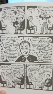
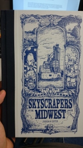
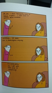
cotter 4The other reason is personal, in the sense that one frequent topic of writing about your own depression means acknowledging that there are fissures in your self, that there is a profound, fundamental discontinuity between various impressions of what one’s self is. That’s why a book like The Nao of Brown, written by a person not afflicted by the mental illness he describes, feels so exploitative, because Dillon has not gone the extra mile of research to make his book work. Dillon finds one visual language that speaks for all states of his afflicted character. By contrast, Marbles frequently comes up against the impossibility of doing both: depicting a certain mental state and keeping to a fixed visual grammar. There’s a curious phrase in an essay by Shari Benstock who insists that for Woolf, the past doesn’t exist as subject matter, but “rather as a method.” A method? Aside from all the implications this has for modernist fiction (and I am sure there’s a study to be done that applies Woolf’s thoughts on fiction and method to the perennially undervalued work of Jean Rhys, by the way), it’s very interesting to look at this as a very fitting way to describe graphic memoirs, particularly memoirs of mental illness. If the past of people with mental illness is discontinuous, if it feels partly not within the subject’s control, then this informs the methods writers and artists use to cope with telling stories of a self and that past. The two books I want to mention here as providing different angles on the idea of writing graphic memoirs of depression are Allie Brosh’s Hyperbole and a Half, a collection of pieces from the webcomic of the same name, and Joshua Cotter’s dense, but magnificently realized memories of an unhappy childhood, Skyscrapers of the Midwest.

hyperbole 2

A page from Brosh’s book

Allie Brosh’s book is the most conventional. Consisting of short stories, told in chronological order, with images roughly within the borders of realism. Brosh, to tell a story of a self, has created a visual character that is a stand-in for herself. Unlike Marbles, you couldn’t really recognize the author behind the cartoon figure. That figure, however, is the central visual element of all the stories. Importantly, it doesn’t really change except in size, no matter whether the story is one of early childhood or recent adulthood. In it, I think Brosh contains an implicit theory of emotionality. By contrasting the vibrant energies of that cartoon self, displayed with a gusto that exceeds realism, with an environment that is static and does not react in a way that is commensurate to the cartoon self’s agitation, Brosh succeeds brilliantly in creating a visual representation of extreme states of emotionality that stresses both the exterior aspects of it, as it interacts with people, as well as the interiority, loneliness of it. Marbles shows images made during that time as representations of interiority. Brosh doesn’t need that. She uses images of surreal distortion of environments very sparely, and when she does it, the effect is immediate and plausible as a mental effect that we immediately comprehend. Like Marbles, it also relies heavily on text. There is some commentary, but the most effective kind of text just offers us the distorted mind of a person in a depressive episode, presented clearly and sequentially, thus increasing the effect of the fundamental strangeness of these thoughts. There is very little in Brosh’s book that corresponds to Ellen Forney’s therapy-trained commentary from the ‘healed’ outside.

cotter 1

A page from Cotter’s book

Meanwhile, Joshua Cotter has even less of that. It is less explicitly autobiographical, although various hints exist. Taking a page out of Art Spiegelman’s book (Spiegelman, Crumb and other underground artists are also clear touchstones for the book), Cotter’s book is filled with people-like cats. It is a chronological story-in-scenes of growing up in the Midwest. Frequently, Cotter interrupts the story to give us a surreal tale that sometimes – but not always – is explicitly framed as coming from the protagonist’s brain. The overwhelming feeling is an oppressive melancholy and loneliness that at times makes it hard to read. The visual language, Cotter’s art, is consistent, almost oppressively so. It’s a book dense with shadings and crosshatching. A palpable feeling of texture. In his next book, Cotter would go away from the uniformity of style that he employs in Skyscrapers of the Midwest, but that doesn’t make this one a consistent realist narrative. The truly crushing moments of emotional volatility are all told with surreal or fantastic visual elements. One of them is the fantasy of the protagonist, who was fat and unpopular in school and who imagines himself as a powerful robot. The other one is stranger, it’s of some kind of alien slug that attaches itself to people. Indebted, no doubt, to artists like Charles Burns, this device has no simple resolution. It can mean death, or just a warping of the spirit. It is, as Gusdorf said, a problematic that is inexplicable and doesn’t easily fit narratives. In fact, of the three texts, Skyscrapers of the Midwest is the most, as Gusdorf would have it, Gnostic. Brosh evades simple explanation, but she does provide commentary and some context. We get none of that with Cotter. In fact, the book ends on a scene that is both fragrant with light, and devastating. It’s a conversation between the book’s protagonist and his brother. It culminates in the protagonist’s admission – which, I think, is an admission even to himself- that he doesn’t know what’s “wrong” with him. The dark inexplicable core of depression – there’s no easy resolution. Not for Brosh, not for Cotter.

marbles 3

One of the many journal pages depicting an attempt to visually capture depression.

For Ellen Forney however, there’s a semblance of a resolution, and that’s because, despite making that impression on the surface, the memoir only appears to be about experience. In fact, it’s an intellectually structured discursive text about creativity and bipolarity. Trust meds, trust science, trust psychiatry, don’t trust yourself. This is the mantra and it’s repeated over and over and over. Forney uses the word science with an incredible frequency and insouciance. Creativity is testable! “Science has an answer for this, too!” Her model scientist for the creativity idea is J.P. Guilford, about whose model of the intellect John B. Carroll wrote “Guilford’s model must, therefore, be marked down as a somewhat eccentric aberration in the history of intelligence models; that so much attention has been paid to it is disturbing.” Similarly, Forney describes an odyssey through medication, which is so disturbing and disheartening that it is ultimately puzzling that she arrives at an affirmation of medication and isn’t instead questioning the placebo effect. For every page of visually powerful, arresting or simply awe inducing art, Forney offers an artless page containing thought bubbles, square boxes summarizing dubious science or koans to her well being. The discursive nature of the book is borne out by the two last chapters. The penultimate chapter is a full adaption of the incurious nonsense about creativity and mental illness, with Kay Jamison’s god-awful book and Guilford’s “eccentric aberration” as guardian angels. I have not really gone into detail about the nonsensical idea of mining the lives of people long since dead for evidence of mental illness. It relies too much on the accuracy of testimony and what the American Psychiatric Association calls “mystical black magic” – I have no patience to dismember that theory, but I do want to recommend Janet Malcolm’s book on Sylvia Plath, the writer who is most frequently posthumously psychoanalyzed (incidentally, in Marbles, Forney meets someone who did their PhD on Plath who says “you need to know her biography to really understand her work,” if you can believe it, I mean JESUS fucking Christ), which is a good antidote to all that.

marbles 2

Yeah…

The final chapter, then, offers adherence to the medical science of psychiatry almost like an article of faith, telling her younger self to trust the psychiatrist. In the middle of this review there is a lot of talk about autobiography and the indescribable and unsayable and how visual art tries to get around it etc. I then offered Allie Brosh and Joshua Cotter as two incredible artists who dealt with the issue in two different ways. But ultimately, it is Ellen Forney who had the strangest resolution to this. Her frequently silent descriptions of experience and her discursive portions are at odds with each other. Just one example among many: the experience based portions say that mania has only become such an immense problem now that Forney is watching herself, is constantly self medicating with 5 different kinds of meds, keeping journals, basically creating her own doppelganger, her own postmodern detective that watches her suspiciously: is this a sign? Are you up? Are you down? The art “balanced” Forney produces now and the art she documents at having earlier produced provide an interesting contrast as well. I admit: I am biased as someone who has been diagnosed with depression and suicidal ideation and has never been on medication for any serious length of time. Ultimately, more than anything, this feels, despite the discoursive nature, like an enormously private event: this is Ellen Forney telling herself that all will be well. I’ve heard that one before. At least the art is sometimes extremely good. Read it for the art, and skip the last two chapters. Please.

*

As always, if you feel like supporting this blog, there is a “Donate” button on the right. 🙂 If you liked this, tell me. If you hated it, even better. Send me comments, requests or suggestions either below or via email (cf. my About page) or to my twitter.)

Line Hoven: Love Looks Away

Hoven, Line (2008), Liebe schaut weg, Reprodukt
ISBN 978-3-938511-66-4

[Translated into English as Love Looks Away (2014)
Blank Slate Books
ISBN: 978-1-906653-18-7]

Hoven1The great medievalist Jacques Le Goff, in discussing memory, posits that what we call memory is really an “intersection” of various practices and discourses. Orality, testimony, historiography, and the symbolic structures of what Pierre Nora called “lieux de mémoire” are all part of the process that Le Goff envisioned as being constitutive of ‘memory.’ Photographies have, from the beginning, been part of that process. In a Baudelaire poem, the act of photography is connected to more ancient liminal moments, particularly rites of death, and photos have been part of examinations of witnesses and testimonies throughout the next century, from American agrarian classics of photography to the complex way text and photography interact in WG Sebald’s novels. In the debut graphic novel Love Looks Away by the young artist Line Hoven, there is a complicated representation of truth, personal memory and, to the extent that any public examination of history contributes, of cultural memory, or rather, following Marianne Hirsch, “postmemory”.

_20160827_010057Line Hoven’s art, consisting of stark black-and-white scratchboard or scraperboard art, exquisitely blurs the lines between representations of narrative memory, and between ‘found objects’ like photographs and ticket stubs and other things. The drawing of photographs, thus introducing them into the visual grammar of the artist’s vision, is not part of a Gerhard Richter-like interrogation of representation. On the contrary. I think the book is incredibly disinterested in questions of representation qua representation. Line Hoven’s focus is, almost obsessively, on memory and how getting a family memory ‘right’ can have an impact both on personal as well as collective identities. Hayden White has drawn attention to the way “imagistic” historical representations are “a discourse in its own right” which tells us things “that can only be told by means of visual images.” Love Looks Away is, I think, attempting to do just that, provide a doubly refracted “historiophoty” and the result may be a short book, but reading and rereading it can take a while. It’s been translated into English, but I cannot ascertain the translator’s name. I strongly recommend you acquire and read this book. It is very good. I am personally greatly looking forward to whatever Hoven produces next, given how patient and mature and intelligent -not to mention gorgeous- this first offering is. This artist is going to high places. Get in on the ground floor. Read this book.

The English cover features different script from the German one; the result is so much more anodyne. An inexplicable decision. It makes me worry about the way the book's been translated.

The English cover features different script from the German one; the result is so much more anodyne. An inexplicable decision. It makes me worry about the way the book’s been translated.

So over the past years I’ve consistently reviewed comic books of all stripes. None of those books, however, were German even though Germany has a fairly vibrant comic scene, plus I’m German, so it would stand to reason they would turn up on my shelves at some point or another. The reason for this absence is that until this year I’ve just never read any. A big loss, as it turns out. Love Looks Away is, as you can probably tell from my very laudatory first paragraph, one of my favorite German comic books, a small, but carefully crafted, powerful graphic memoir. It’s been translated into English in 2014 and published by Blank Slate Books, a publisher who also translated other major German comic book creators like Uli Oesterle or Mawil. Love Looks Away is a book about Line Hoven’s family history, and unfolds, in spare imagery and well spaced episodes, a story that’s more than just one family’s tribulations during and after WWII. It actually ends up providing a convincing picture of a whole generation, despite the unique family circumstances. The story is rooted in Hoven’s grandparents who came of age during the 1940s, and I think this connection allows us to see in the work a kind of exploration of what Marianne Hirsch famously (and importantly) called “postmemory” – a memory of a generation that did not experience historical traumata, but creatively and imaginatively invests in a kind of cultural landscape, a memory created from testimony, but more importantly from objects like photographs, documents and the like. Hirsch’s theory, like many in the area of memory studies, was written to deal with the aftermath of the Shoah specifically, but “postmemory” can really apply to any retroactively created memory of events that are hard to explain or comprehend, usually traumatic. There are things that defy easy channels of recollection, and the process of “postmemory” is one that deals with that, I think, fairly well. I think Derrida referred to the material objects that precede us as the “déja là” – the already here. Hoven’s book starts with what’s already there and her art fills the gaps with a subtle, prodding imagination that stops short of filling in all the psychological questions. This is why I said that her book is primarily about memory: it is not about the “why” of history, personal or political. What it attempts to do is give an artfully heightened account of the things that happened, creating a memory in art.

_20160827_010112The gaps are nowhere as obvious as in one of the first sets of family pictures. Throughout the book, the painted copies of photographs are arranged on pages that look like photo albums, with hand written labels, and more. In one of the early “family album” pages, the amorous history of Hoven’s paternal grandparents is represented in four labeled and dated photographs. They met in a Hitler Youth summer camp. That specific photo however is missing, and whether the real photo is genuinely missing, the marked and labeled absence of that photo, shown as a blank space in a photo album, is symbolic of the difficulties of German cultural memory dealing with the more thorny aspects of the nation’s past. Even today, so many year’s later, the events of the time are papered over, guilt is deferred or projected elsewhere. Hoven does not condemn her grandfather, yet neither does she wash him clean of his past. Drawing a blank half page is an indictment of the shame in a suppressed memory. We owe to Martha Langford’s excellentr studies our understanding of how family albums work – as an ersatz oral tradition. Moreover, Hoven’s art in the narrative sections dealing with the past are careful, but sharp. In them, we see a dreaming boy walk proudly and smilingly in his Hitler Youth uniform, and we see a wedding picture where the now young man smiles in a uniform that should not give him reason to be joyful. In a later scene we see that uniformed portrait hanging in a family living room. Hoven’s work consists of scenes with little connecting tissue except for the drawn pages from a family album. It depends on her reader’s sense of history, on our sense of contexts and motivations. According to Martha Langford, reading family albums is an interpretative performance. We all, strangers or actual family, create narratives around the arranged photographs, as Langford found. If we understand this to be part of the underlying oral structure of photographs, then Hoven’s sparse illustrations, low as they are on explanation, have a very similar effect. We get more story than we would from photos, but the isolated effect is very similar.

DSC_2504This style of memory and writing is further emphasized by the book’s use of language. Hoven’s father, Reinhard is German, but her mother Charlotte is American, and the family history offers us both sets of grandparents – who do not, obviously speak German (in fact, Charlotte’s father has an almost pathological hatred of Germans, which is partly rooted in his inability to enlist in WWII due to health issues). Charlotte herself frequently speaks English in the book. Hoven does not translate or annotate any of the English dialog. The book is, in this sense, completely bilingual. Anything that was German when it happened, is rendered in German by Hoven, and everything that was English is rendered as English. This only further emphasizes the near-documentary narrative ethos of Hoven’s work of “postmemory.” The documentary effect does not, however, really extend to backgrounds. I mentioned Nora at the outset, but the book isn’t incredibly concerned with places of memory. I am not entirely sure how strong even the sense of place is? Much of the book is set in Bonn, the former capital of (West) Germany, and since I also live in Bonn, I recognize the vast majority of facades and buildings we see, but I am not sure that for someone who does not intimately know this cooky little West German city, the sense of place is particularly strong here. Hoven does not connect her visualization of memory, or postmemory, to commonly shared buildings. Evading obvious landmarks that are understood across a shared culture is done so thoroughly that it seems almost intentional. One of the “family album” pages shows a foto of family members standing in front of the Cologne Cathedral, which is one of Germany’s most famous buildings, yet the angle only includes part of the front door, as you would in a family picture. There is no wide pan to include the whole building and unless you have been there a few times and will recognize it even from this small snippet, the building will, at best, say “some big cathedral.” The exteriors of Bonn, similarly, are obvious to me (and extremely carefully and precisely rendered), but evade some of the most obvious landmarks.

_20160827_010125I mean, all of this seems hyperfocused. I have not really discussed the smaller stories here because there is so little narrative that I think you should let yourself be surprised by it. I assure you, you’ll like this book, if you like this kind of stuff at all. And I haven’t even mentioned the art at all. Like all the content aspects, the art also contributes to the book’s theme. The art consists of black and white scraperboard etchings (see wiki for details). The effect is really interesting. It creates an interesting dynamic that strongly interacts with the static structure of the book, the photographs and all that, and it also allows us to read the book in a certain German artistic continuum. There is a lot of historically and politically heightened art with similar effects – I mean, it strongly echoes some stark 20th century woodcuts, and in many pictures here I think has a conversation with German expressionist woodcuts (think Ernst Barlach). Another well known/excellent contemporary German cartoonist who employs this scratchboard technique (and hews closer to the German expressionist tradition) is Thomas Ott. Look, I know this review discusses memory studies a lot, and it seems as if I am less interested in the art, but everything I described hinges on Hoven’s art. Fundamentally, the biggest and most entrancing aspect of the book IS the art. Hoven has been working on that art in the years since the publication too, picking up awards, exhibitions and I will read whatever book comes next. It is also the art that sets her apart from many of her German peers. Much of German art is influenced by American underground comix, with some extremely notable and excellent exceptions (the unbelievable Peer Meter comes to mind, who also, incidentally, works on memory and history). Line Hoven is in the process of carving out a space of her own.

*

As always, if you feel like supporting this blog, there is a “Donate” button on the left and this link RIGHT HERE. :) If you liked this, tell me. If you hated it, even better. Send me comments, requests or suggestions either below or via email (cf. my About page) or to my twitter.)

Kolbeinn Karlsson: The Troll King

Karlsson, Kolbeinn (2010), The Troll King, Top Shelf
ISBN 978-1-60309-061-2

troll king coverI have never read a graphic novel by a Swedish creator before, but if The Troll King is any indication, Swedes like their comic books like they like their rock music: weird and intense. I think the only book I read recently that approaches Karlsson’s interests and the direction of his work is Jeff Vandermeer’s recent Southern Reach trilogy of novels. The Troll King is a novel-in-stories, I guess, but given how coherent the whole narrative turns out to be when we read the last story, it may just be a novel, full stop. The book starts off strange and then just keeps getting stranger until a surprisingly emotionally resonant ending. Reading the book I was so overwhelmed by its themes, its art, its contradictions and its metatextual elements that I didn’t even consider the direction the narrative was taking until the final of the book’s stories just took me by the hand and led me down a narrative path that proved to be as poignant, as it was strangely common, almost formulaic. Karlsson draws on a broad range of influences, from Nordic myths to anime/manga, he writes a story that is both tender and emotional as it is filled with a strange physicality. If you feel weird about two large bearded men/monsters having a loving and sexual relationship, depicted fairly directly, you won’t even make it past the first section, and you’ll miss fever dreams, the murder of birds, a lot of other (small) male genitalia, death, birth and rebirth and other topics. All of it realized in an art style that somehow straddles the divide between crude and precise drawings, colored with inspired abandon. It is a dark tale with a sweet ending, a violent story with quite a few funny visual jokes. If we look for the way the book relates to its audience, how it employs perspectives and speakers and voice, we (or rather: I) get the feeling that Karlsson is sometimes seduced by his own powerful artistic vision to the detriment of really mapping out all the book’s details. Would I recommend it? The blurb on the back of the book suggests that Karlsson and Miyazaki are kindred spirits and that’s not far off the mark. If you feel like reading a version of Miyazaki that is darker, more physical, more violent, more racist/reactionary, more explicit, but similarly inspired of and reverential towards nature, dreams and folklore, then read this book. I personally greatly enjoyed reading it, and I can assure you that the book only becomes better upon rereading. This is quite something.

troll king insideFor all its skill with visual elements, for the ingenious way the author uses color both in backgrounds as well as in lines, the most impressive part of the book is its narrative discipline. For much of the book I thought I was reading a couple of stories set in the same part of the world, united by the trippy visual imagination of the author and nothing else. The final section or story however ends up tying up all the book’s strands, even though it doesn’t do so neatly. Some asides, like an odd, seemingly LSD-fueled vision of the Wild West, don’t really find a place in the book’s final narrative concerns, but most do. It is, as we find out at the end, a story about family, humanity, about modernity and modern man’s resistance to it. For all the book’s violence, the underlying emotion is a gentle sadness, a longing for a more natural time. The two odd characters on the covers are not trolls or beasts, they are “mountain men,” as the back of the book proclaims. Their beards and body hair are just drawn with such attention to detail that it flips over into mild surrealism. Hence the hair helmets. The artistic goal is one where the way the mountain men are drawn and the way trees, grass and bushes are drawn resemble each other. The men are truly becoming part of nature, and in the process they lose some part of their humanity. This is where Miyazaki is likely most relevant, with his stories of nature resisting man-made modernity, of some pockets of humanity allying themselves with nature and with the magic that is fundamentally linked to that nature, magic that has its roots in the connection of people with the soil and animals. There is a reactionary element to that kind of story, which has been discussed a few times in scholarship, but Miyazaki leverages that reactionary element with his intelligent manipulation of gender and class discussions. Karlsson…doesn’t, but I’ll get to that in a moment. At this point I’d just like to stress the way Karlsson’s book, despite looking like a surreal tale of madness, really does fit many of the ecological tales. In her influential 1962 study of pesticides, Silent Spring, Rachel Carson writes that, “[g]iven time […] life adjusts, and a balance has been reached. For time is the essential ingredient; but in the modern world, there is no time.” In some ways, The Troll King is a resistance to the loss of time in the modern world. Events in it happen in some kind of dream time. While there is a clear chronology that connects many parts of the book, others appear to speed up or slow down time to allow for things (skulls, mushrooms, trees and dead cowboys) to grow and die. Human agency doesn’t shape time, the processes of nature do.

Uh. Can you say Dragonball?

Uh. Can you say Dragonball?

This attitude towards human agency also feeds into the book’s relationship towards language and myth. The longer the book continues the fewer lettering we get. The story starts relying on expressive images rather than on explanatory captions. Yet even before that, what few words we are given are rarely explanations and more emotional commentary by one or more of the people depicted in the panel in question. Karlsson’s lettering looks like very personal handwriting, so when he switches to a different character’s voice, I was at first taken aback (this, I suspect, speaks to the density of the book which made me assume that all details were calibrated exactly). The first two chapters, consisting of the marriage of the mountain men, and of a dwarf’s fever dream, are basically the only parts of the book with consistent words and voices. In a way, these two sections ease us into the book’s themes and concerns and having words at the beginning helps us jump the hurdle of the strangeness of the rest of the book. But there is another way to see this change. As the book progresses, it dives deeper into its themes of myth and creation, culminating in the tale of two chubby hairy green men burying a skull and digging up the dead cowboy from a vision they had. In Walter Benjamin’s discussion of language and divine creation, he discusses, I think, the idea that things have, originally, no name. Their mute language is a residue of the divine word of creation. According to this reading of Benjamin, it is with the Fall that language loses this immanence, this magic quality and starts referring to abstractions, to outside sources, to broad constructs of knowledge and culture. The book, for a while, until the two last chapters, reverses this process, stripping its story of the reliance on words and constructs. The mountain men, for example, describe themselves as “Ewoks,” and their marriage dance is maybe related to pagan rites, maybe to Dragonball Z (I admit that was my gut association because I am philistine trash, but, you know, why not). This relationship to language and signification seems to be an essential part of the book, and if we assume its centrality, then we immediately connect it to the overwhelming masculinity of it all. The book abounds in small chubby penises, and all the processes of procreation are specifically framed as bypassing the female element. Despite the book’s buoyant joy in using visual references to all kinds of pagan and neopagan takes on rites and liminal spaces, it does not appear to refer at all to the bible of neo-pagan nuttery, Robert Graves’ immensely readable book of questionable scholarship, The White Goddess. Graves’ story of the maiden-mother-crone, the universal Goddess, is completely subverted by Karlsson, whose book features a brown God of the woods, who looks as if he had been created from mountain men beard hair.

troll king mushroomThis odd masculinity of myth can, I suspect, be read as a commentary on feminist theorists like the extraordinary Helene Cixous and concepts like the phallogocentrism. Given how central the binary is to Cixous, Derrida and other critics of phallogocentric thinking, it’s interesting that The Troll King has removed all womanhood from its text, in full embrace of phallocentrism, even as indeterminacy increases. Of course, the slanted take on procreation always implicitly engages discourses of feminity, and the way the book’s ending fits neatly into the canon of Western narratives also shows up the indeterminacies in the book’s middle as mere skirmishes with signification. But if we look at the way myth is masculinized here, we can ask more questions of the text. One is the connection of nations with its folklore. Surely, myth and similar narratives are among the most important stories that hold together the ‘imaginary communities’ of nations, as Benedict Anderson called them. And just last week I read a really good book on how masculinity shapes nationalist discourses and debates, Charlotte Hooper’s Manly States. The point here is that this book, which is set in a vaguely Western/Northern wood, with high rises merely shown in a few panels, should, I think, be read in the context of modern Swedish national anxieties. I cannot possibly do that, my knowledge of Swedish culture is meagre at best, but I have some pointers. One is the reflection of this topic in Hans Henny Jahnn’s immortal masterpiece Fluss Ohne Ufer, the largest portion of which is dedicated to two German men who move to the Swedish countryside to escape modernity. The other is something that turns up in two and a half panels, but is extremely specific – and both racist and possibly misogynist. These panels describe the mountain men going to town to buy groceries. In order to hide their strange exterior, they wear burkas. Black embroidered burkas. What’s more, the panels that show us the burkas are panels of their return to the wild: depicted are two humans in burkas, carrying a plethora of full plastic bags of the Swedish ICA supermarket chain. That image, of women in burkas carrying plastic bags of groceries is one that is exploited by various caricaturists. The humor here is based both on racist and misogynist assumptions.

burka

Burkas

These two panels are instantly distasteful and repugnant, particularly since they are clearly supposed to be humorous, but there is nothing else in the book that directly takes up this line of discourse – except for the book’s take on myth and masculinity as I suggested before. It is quite impressive to what extent the book ties up all its concerns like that. It makes me dislike Karlsson as a person, but the artistic power behind this book is undeniable and the focus and density of it all is exceptional.

*

As always, if you feel like supporting this blog, there is a “Donate” button on the left and this link RIGHT HERE. :) If you liked this, tell me. If you hated it, even better. Send me comments, requests or suggestions either below or via email (cf. my About page) or to my twitter.)

China Miéville: Dial H

Miéville, China; Mateus Santolouco, Riccardo Burchielli et al. (2013), Dial H: Into You, DC Comics
ISBN 9-781401-237752

Wood, Dave; Jim Mooney et al. (2010), Showcase Presents: Dial H for Hero, DC Comics
ISBN 978-1-4012-2648-0

Pfeifer, Will; Kano et al. (2003), H-E-R-O: Powers and Abilities, DC Comics
ISBN 1-4012-0168-7

DSC_0613   So, while I am a fan of comic books and do read quite a few of them, I am still frequently overwhelmed by the incredible amount of characters and complicated back stories. DC Comics is especially infamous for not just having complicated stories, but even multiple realities and universes, which they then attempted to collapse in amazingly readable and fun but convoluted “events”. Then, suddenly, DC decided to do away with all the accrued history and complications by relaunching all of its titles in 2011, calling the new set of books “the new 52”. This reset the stories on all their major titles, giving them new origin stories, and new slants. It also turned the DC universe somewhat more male, due to the fact that female creators were vastly underrepresented among the slate of amazing writers and artists, and also due to the fact that a lot of female characters either completely vanished, like fan favorite Stephanie Brown, or were declared dead, like Renée Montoya. Other female characters were revived as weaker or “sexier” versions of their old selves. And it’s not just female characters. The first waves of comics to come out seemed to have a decidedly conservative slant in how they were positioned vis-a-vis recent character history. One example is Judd Winnick’s Catwoman run, as compared to the more recent history of the character in the hands of Ed Brubaker, Darwyn Cooke and others. However, DC also did something very interesting: they decided to use the bright lights of public attention in the wake of the relaunch in order to relaunch a bunch of much less well known characters, some of whom were pulled from DC’s more alternative imprints Vertigo and Wildstorm.

DSC_0628Frankenstein, for example, last seen in Grant Morrison’s book Seven Soldiers of Victory, was given his own title (written by the great, great Jeff Lemire), as were Animal Man and Swamp Thing, both of whom had iconic runs with Vertigo. The characters thus revived are not all equally well known. While Swamp Thing is probably one of the best known ‘alternative’ properties of DC, they also offered much less well known characters and titles a spot in the limelight. One of these characters/properties is Dial H for Hero, a decidedly odd kind of title, with a very inconsistent publishing history. His revival could have gone either way. DC, however, asked China Miéville to write this title, and the result is incredibly good. I have been reading quite a few comic books during the past year, and some extremely good ones among them (I’ll probably review some of them in the near future), but Miéville’s Dial H is easily one of the best, if not the best among this crop of really excellent comics that have been coming out. If you have been following Miéville’s career (as I have), this will likely not have come as a surprise to you. Miéville has established himself as one of the leading contemporary writers of science fiction, and probably one of the better novelists in the UK regardless of genre. Even considering the regrettable duds like Kraken, his bibliography is full of inventive, smart, extraordinarily well written novels. The news that he would be turning his attention to comic books in order to write a title of his own had me giddy and excited for a year. I spent part of that year reading up on the history of the character or characters that would be featured in Miéville’s book. And as I found out, that is a peculiar history.

DSC_0606(1)Limited as I am to trade publications, I will focus on only two books centered on the “Dial H”-property. There were small instances of the title resurfacing in between, they were not, however, collected as trades. The first time comic book readers came upon the Dial H for Hero stories was in 1965, in the pages of “House of Mystery #165”. The stories featured a boy called Robby Reed who finds a strange apparatus that “looks like a dial…made of a peculiar alloy….with a strange inscription on it”. The “young genius” decipers the inscription running along the side of the apparatus and finds that it asks its user to “dial the letters h-e-r-o”. Intrepid young Robby Reed does just that and, lo and behold, he turns into a superhero. His whole physical appearance is transformed: he has become a giant, complete with a superhero uniform (that even has letters on the front) and somehow he knows that the hero he transformed into is called “Giantboy”. Using the powers of the character, he thwarts some evil villains, and returning home, dials o-r-e-h in order to transform back into his bespectacled mild mannered self. The boy turning into an adult superhero is highly reminiscent of DC’s Captain Marvel, which is a boy called Billy Bateson who turns into the superhero Captain Marvel by saying “Shazam!”. However, as far as I know, Captain Marvel (sometimes also just named “Shazam”) is always more or less the same guy. Robby Reed’s dial, however, turns him into a different superhero every time he gives his dial a spin. There is so much that is bad about this title, from the casual racism (at one point he turns into “an Indian super-hero – Chief Mighty Arrow” and is even issued a companion, “a winged injun pony”. When he is upset, he shouts “Holy Massacre” and wishes he could “scalp” a monster) to sexism (Robby’s love interest find the dial, dials “h-e-r-o-i-n-e” and turns into “Gem Girl” despite Robby’s warnings that the dial is not a toy, and he ends up forcing her to dial herself back into a girl “before she gets any more ideas”), and overall ridiculous writing. However, it’s some of the most incredibly inventive work I have ever seen.

DSC_0607Robby transforms into heroes that make sense, like Giantboy or The Human Bullet etc., but in one issue he transforms into geometric shapes with arms and legs, for example. Coming up with new heroes (although you can dial up old ones too, it’s basically a randomized selection out of a finite, but large pool) forced the writer of the books, Dave Wood, to dig deep. And Jim Mooney’s art perfectly realizes Wood’s wacky vision. It’s just so much ridiculous fun, and the Showcase volume is well worth your while. If you want an idea of the silly fun on offer, click here to see a selection of covers. After a while the Dial H for Hero stories petered out. There were various small scale revivals, including one in the 1980s by the great Marv Wolfman, also called Dial H for Hero, but since none of them have been published as trades, I can’t really comment on them. They introduced more characters spinning the dial and further enlarged the pool of super-heroes. I’ve had a look at the Wiki summary of Wolfman’s run and it seems delightfully insane, and it seems to have more of a coherent plot than the Wood/Mooney version, which is basically a gonzo one-off kind of thing in each issue.

DSC_0611Even more coherent (and initially at least considerably more down to earth) is the 2003 incarnation called H-E-R-O, written by Will Pfeifer and beautifully illustrated by Kano. That run went on for 22 issues, but for some reason, only issues 1-6 have been collected as a trade (called H-E-R-O: Powers and Abilities). Pfeifer’s run features different people finding the dial and examines what happens to their lives when you add the opportunity to transform into a superhero. There is a young adult mired in a mediocre life, “making sundaes at minimum wage”. In order to impress a girl, and more generally as an attempt to “be someone”, he uses the Dial to unimpressive and even disastrous effect. A business man finding the dial becomes obsessed with it. A girl uses it to become popular at her new school, etc. The book was a bit of a letdown, even though the writing and art was just so much better than the Wood/Mooney version. But Pfeifer got rid of the ridiculous fun and inventiveness and infused the whole book with a dour morality, mostly lectures about being content with who you are and knowing your limits and being nice and industrious within those limits. Much more than the original book, the dialing device becomes a metaphor for situations that we all face in our lives etc. etc. I’m boring myself just describing it. For all the good writing and wonderful art that went into this book, it’s hard to recommend, because Pfeifer so consistently underwhelms. The idea of the dial is one of the most liberating literary devices I have ever seen, and to see it used in this pedestrian, moral, middle-class way was disheartening. If that was the direction that the Dial H for Hero story was going, I was worried about Miéville’s run presenting more of the same. Silly me. China Miéville blows Pfeifer’s run clean out of the water.

DSC_0626Miéville renames the series Dial H, and provides a spin on it that is equal parts original and respectful to the Silver Age original. The protagonist of the first trade is called Nelson Jent, and he’s an obese unemployed middle aged man, who, one night, is almost beat up by a group of lowlifes and, attempting to call the police from a phone booth, transforms into Boy Chimney. From that moment the reader knows that this is something else than the other titles in the Dial H for Hero series. And it starts with small details: Mieville, like many writers, offers us the thoughts of the characters that he focuses on. And as Jent transforms into Boy Chimney, his thoughts seem to transform, as well. Strange fragments enter them, and as Boy Chimney proceeds to beat up that gang, he appears to have a dialog with the consciousness of Nelson Jent. Additionally, Boy Chimney is very clearly not a super hero, as all the previous titles imagined them. He is a strange creature that has uncommon strength and unusual powers and abilities, among them the ability to use and command smoke. But it’s only Jent’s consciousness that keeps Boy Chimney from outright killing the brutal assailants in the alley. It feels less like Jent is genuinely transforming into a super hero, and more like a kind of symbiosis. And there is another basic difference: Jent doesn’t have to transform back by dialing the letters in reverse. He automatically returns to his normal self, “into the worst identity of all”, after a certain, variable amount of time has passed. Apart from this, the book’s early parts seem to be fairly straightforward. There’s a villain with a secret plan and he and Jent’s super heroes keep meeting and fighting. And then, the book quickly goes off the rails into the most incredible insanity. The villain, it turns out, is a “nullomancer”, a kind of wizard of nothingness, able to conjure and control nothingness, and her plan involves channeling an ancient beast called the Abyss, a strange thing composed of nothingness, but at the same time, containing universes.

DSC_0625(1)If this sounds absurd, I can assure you that Miéville makes it work on the page, and in his origin story, which closes out the trade, he offers a brilliant explanation for what the dial basically does. It’s hard to give you more details without spoiling the book, so I won’t, but the upshot of it all is that Miéville managed to tell a story that makes use of the incredible artistic liberties that the material has to offer, and yet it’s a book very determined to make sense, in multiple ways. What’s more, the art is not a let down. Would it have been a better book with JH Williams III at the helm? Possibly. But Mateus Santolouco, of whom I have never heard, does an excellent job. I was especially impressed by his work on the super-hero identities invoked by the dial. They are the most crucial visual element of the book, as they have to appear both plausible and iconical – and absurdly odd at the same time. As Boy Chimney leaps from the phone booth he is instantly alive on the page, as a scary, off the wall character. Almost as important are the colors, and Tanya and Richard Horie have done a simply magnificent job throughout the book. In my review of Brian Wood’s DMZ I have lamented the fact that the art seemed but a servant to Wood’s writing in the book, making for a less than great reading experience. That is not the case with Dial H. Even though Miéville is a famous award winning novelist, Santolouco brings a very distinct artistic vision to bear. The sketches in the back show how he worked on and tweaked the look of various superhero identities. Santolouco’s achievement is thrown into even starker relief by issue #0, which presents a kind of origin story, and is included at the back of the trade. Riccardo Burchielli valiantly tries to do justice to Miéville’s amazing script, but it’s an overall disappointing effort, compared to Santolouco’s work that came before.

DSC_0631The book has so many ideas, and one of them is an obsession with identity. With superheroes, we talk a lot about identities, secret and public ones, but that is usually a naming issue: what name do I use? What mask do I wear. Alternative takes on superhero narratives (cf. Millar’s Kick-Ass) suggest that wearing masks is liberating, but they don’t really discuss or problematize the core issue of identity. Miéville, as all his work so far has also shown, is very aware of how identity is tied up in physical forms and in cultural and social ties. The characters that Jent turns into appear to have their own memories, and while it turns out to be an issue more of colonialism and appropriation than of sociology and psychology, Miéville opens wide the doors for these discussions. In doing so, I think, he goes beyond even writers like Morrison, as he uses the iconicity and language of big publisher super-hero comics and examines it carefully. This is not another one of those books critical of ‘superhero myths’, and it doesn’t offer a grimy reality based taken on super heroes. There are enough of those around. No, Miéville embraces a lot of the central qualities of the genre and uses its language in order to interrogate it and tell an absorbing story at the same time. The best news? There is much more to come. For all the density of this book, it merely collects the first issues in an ongoing run. The next trade is due in January 2014. You should be reading this book.

*

As always, if you feel like supporting this blog, there is a “Donate” button on the right. I really need it 🙂 If you liked this, tell me. If you hated it, even better. Send me comments, requests or suggestions either below or via email (cf. my About page) or to my twitter.)

Jeff Smith: RASL: Romance at the Speed of Light

Smith, Jeff (2011). Rasl: Romance at the Speed of Light. Cartoon Books.
ISBN 978-1-888963-33-5

This is going to be a short review, because it’s a review of the third volume of a series that you shouldn’t start in the middle. You should start at the beginning. If you click here you can find my review of the first volume, as well as general comments on Jeff Smith’s remarkable work, and if you click here, you can find a review of the second volume. If you need a summary of all my reviews, here it is: RASL is one of the best creator-owned comics we currently have, and if you haven’t yet, you should start reading it as soon as possible. Jeff Smith is one of the best graphic novelists of our time. Read him now. The whole RASL project has been, from the start, a fascinating undertaking. In its mixture of myth and science fiction, it resembled Terry Moore’s extraordinary (recently finished) Echo (see here my review of the first Echo trade), but with a much darker and twisted core. Readers coming to find a second Bone will be disappointed. This is no warm, full, engaging fantastical tale. The richness of Bone’s woods, mountains and ravines is in stark contrast with the desolate stretches of desert we’re offered in the RASL books. It’s really hard to believe that the same writer who gave us the gorgeously detailed rat monsters and fantasy foliage in Bone is the same that creates vast expanses of white emptiness in RASL. While I’m obviously commenting on a work in progress, it seems clear that there is less consolation in Smith’s most recent work than in his most famous books. The warm heart of Bone was palpable in its protagonists, the cartoonish Bones, and the lovably odd villagers. Even the monsters threatening to destroy the idyllic life are drawn with a playful love for furs and twinkles and the humorous moments of epic adventuring. True, there was much drama as the story of Bone unfolded, and a serious tragedy at the center of it, but it was all part of a much brighter, more colorful whole. RASL, on the other hand, starts off on a bleak note in volume one and maintains that mood throughout the second and this one, the third volume. Even the glimpses of love and sexual relations are shrouded in the anticipation and memory of loss and impending doom. By the third volume, sex is presented less like a loving act, and more like a desperate way to be less broken, less alone, less adrift in a multitude of worlds.

RASL: Romance at the Speed of Light is the best installment so far, as expected. It is the first time the plot and its characters really come together. I admired the way Smith took his time with the plot, without offering his readers easy satisfaction. The first volume, RASL: The Drift, is full of mysteries, full of beginnings and ideas, and it’s not an easy book to figure out. There was never any doubt that the end result would be magnificent, but the exact direction was unclear, as we readers were left impatient asking for more. And just as the first volume was full of beginnings, so the second volume, RASL: The Fire of St. George, was clearly transitory. Instead of whispered hints and intriguing settings, we were offered more muscular developments and a great deal of information was injected into the book. It seemed as if Smith tried to make up for the vagueness of the first by being extremely specific in the second volume. As a read it was much different, but every bit as brilliant. In it, Smith treats us to the (by now well known) story of Nicola Tesla and fleshes out most of the principal characters and their relationships with one another. Additionally, we are offered more background on the protagonist, and how he came to be this disturbed traveler between worlds, haunted by guilt, and driven by something dark lodged deep inside. Finally, we are introduced to the book’s MacGuffin, Tesla’s journals, which contain some powerful, brilliant secret that Rasl, as the books’ protagonist is called, endeavors to hide from his friends and the government. Tesla’s brilliant ideas have often served as pivotal elements in science fiction or steam punk culture. One of the most recent examples is Christopher Nolan’s movie The Prestige, where Tesla’s near-magical science provides the mechanics of one magician’s attempt to reproduce another magician’s magic trick (which, as it turns out, was achieved in a much more profane and simple (though not easy) way).

Indeed, The Prestige is a fitting reference because of how the RASL books are perched at the divide between magic and science. In fact, we might be reminded of Arthur C. Clarke’s famous third law, stating that “any sufficiently advanced technology is indistinguishable from magic”. In Smith’s work, magic is replaced by religion and myth, but the basic question remains: if something extraordinary happens, is it a scientific success or a miracle in a religious sense? The third volume puts considerable emphasis on this part of the book. As our memories of Tesla’s historical experiments slowly recede, we fall back into the protagonist’s attempts to fully make sense of what’s happening in his rapidly expanding world. Government agents are added, and questions of self and reality are invoked again, but most importantly. Smith evaded providing a faux-scientific explanation for the dimension-jumping. Instead, he confronts his readers with the bleakness of a man lost between multiple copies of the woman he loves and the multiple worlds that woman lives on. Rasl has no great plans: when he jumped into another dimension, he did so impulsively, and ever since, his actions have been less driven by careful deliberation than by impulsive acts. The first of the (so far) three books gave off a strong noir vibe, which is more expounded upon in this volume that affords more space to Smith’s protagonist. Like a character straight from Hammett’s pages, Rasl drinks in order to deal with the labyrinthine world around him (although in Smith’s work, the effect the world has on Rasl is a palpable, violent one as dimension-hopping exerts a heavy price on the person doing the hopping), he is quick to threaten and execute violence on other men, and his sexuality doesn’t lead to happiness or peace, au contraire, it’s as desperate and violent as everything else in his new life.

Like all extraordinary works of science fiction, Jeff Smith’s RASL books use the freedom afforded by the added and changed vocabulary in order to tell a story about the world that discusses issues on the fringe of knowable and expressible facts. Tesla’s scientific work proves to be a red herring, as it is his journals, which contain a secret discovery that makes sense of the scientific and metaphysical puzzles of the books, journals which are treated just like sacred texts. In Smith’s art, we are also presented with technically advanced objects that look like mythical or ritual artifacts. With every new issue, Smith continues to put the screws on what we feel can be easily said. He works within the languages of masculinity and violence, but at his hands, they blossom into possibility. Jeff Smith is a very good writer who, so far, had written two vastly different masterpieces, Bone and Shazam! The Monster Society of Evil. RASL, still a work in progress, is ready to join their ranks. When it’s finished it might well be his finest achievement yet.

A short personal note (January 2013). As I am trying to finish two manuscripts and getting back into reviewing books, I have a hospital bill to pay off, which means all kinds of issues for me. If you have a buck or two to spare, I would be more than thankful. There is a paypal button on the right hand side of this page. That’s just in case you feel charitable. As it is, I am happy enough about every single one of my readers. There are more of you than I ever expected, even through the dry months in the past year, and I am thoroughly humbled. Thank you all.

Gene Luen Yang: American Born Chinese

Yang, Gene Luen (2006), American Born Chinese, Square Fish
ISBN 978-0-312-38448-7

American Born Chinese, Gene Luen Yang’s graphic novel, created only five years into his career in comics, won several prizes and deservedly so. Among several honors it was the first graphic novel ever to be nominated for a National Book Award; additionally, it won the coveted Eisner award, the Reuben award, and the Michael L. Printz award. However, being a NBA finalist (in the YA fiction category) is especially interesting and significant: Gene Luen Yang, who is both writer and artist, didn’t just produce a superior graphic novel, one of the best books of the non-superhero comic genre I’ve recently read, but a surprisingly complex young adult novel, within whatever convention. At 233 generously-margined pages, it’s not a big book, yet the story it tells, of Asian-American identity in a predominantly white(seeming) culture, is told with the scope of a larger, more epic book. Told not just through the writing: Yang’s art work (and Lark Pien’s colors) is simple, cartoonish, yet it delivers its points with aplomb; American Born Chinese is a serious book, one that makes concise and important points about second generation immigrant experience; but Yang’s art, as well as the light, humorous but never farcical dialogue, make this an entertaining, an amusing read. Yang creates indelible characters, although he doesn’t need all of them to be realistic, three-dimensional representations of reality. Instead, he weaves together myth, stark media criticism and a emotionally moving story of an ‘American Born Chinese’ boy growing up, and not just with what seems like effortlessness. As we read through the last pages of the book we can’t help but realize that Yang has managed to tie off the various strands of his story with a sophisticated flourish that is (to be honest) quite unexpected from comic books written for children.

These strands mainly consist of three stories told separately, in alternating chapters. All three are drawn in the exact same style, differing only in small respects, if at all, which helps bring home the idea that all three stories are really only about different aspects of the same story, i.e. what it’s like to be an ‘American Born Chinese’ boy. These three stories, similar though they look, draw on different traditions, and reference different media, different ways of telling a tale. This absolves Yang from having to be openly preachy or lecturing in the most ‘realistic’ strand of the book, because he can rely on our knowledge of these modes of writing and storytelling. He knows that in our heads, all this comes together and makes sense in an obvious yet not obtrusive way. The conventions and lines of thought and plot are so clear and move the book along so quickly, that, at the end, as all three stories finally collapse into a single one, we are even slightly taken aback. This moment of explicit synthesis at the end poses more of a challenge than the separated strands did in the bulk of the book. All these aspects show that Yang is an artist both with a profound knowledge both of the extent of our knowledge of cultural termini, tropes and markers, and with the ability to use this knowledge in a way that is accessible and rewarding. American Born Chinese is a book for young adults, and it continues a trend in recent YA fiction of creating art that does not talk down to its pimpled audience, but involves them both emotionally as well as intellectually in surprising ways. The most surprising way of them all is Yang’s decision to make the final tweak, the last part, less about shock, less about hammering a moral stance into its readers. No, the final section is about art, it asks its readers to really think about the function of each of the three story lines. This is easily the most elegant, smart, self-reflexive ending I’ve read in a book targeted at young adults in a long, long time.

Much of the complexity of this derives from the first of these story strands, a re-telling of the story of the Monkey King from the Chinese classic Journey To The West. This is a novel about a monk’s pilgrimage through China to India, accompanied by his three protectors, three mythical helpers. Among them: Sun Wukong, the Monkey King. The monk barely makes an appearance in the book, which rather looks at Sun Wukong’s life before he became the monk’s protector. It tells us about how Wukong became one of the most powerful demons of his time. We see how he learns the “Arts of Kung Fu”, including the “Four Major Heavenly Disciplines”, yet when he tries to enter a dinner party for demons, spirits and gods, he is thrown out by the scruff of his neck on account of his merely being a monkey. Sun Wukong then proceeds to throw the heavens into Chaos, defeating heavenly armies, beating up Gods and so on. The diminutive monkey seethes with anger, trying to force the Gods, spirits and demons of the heavens to acknowledge him as an equal. Eventually, he uses his skills to change his shape, making himself taller and stronger of body; this change marks a difference even to his fellow monkeys, and places him, as a queer mixture of monkey and humanoid demon, between two worlds without being able to belong to either. It takes the Buddha himself to take him down a notch: after losing a challenge posed to him by the chubby deity, the Monkey King finds himself trapped for several hundred years under a mountain, until the monk comes and frees him. The story, as sketched out here, is canonical. There is little that Yang actually changed about it, it is straight myth, though told with a lightness of tone befitting the book’s audience. What is interesting is the visual aspect of it all: on the one hand, Yang’s panels crawl with a slapstick-like humor, on the other hand, his representations of demons and Gods are clearly rooted in traditional imagery, containing echoes of traditional Chinese theater masks.

In as smart a book as this, depictions of traditional masks and looks are not merely there to display ethnic roots or connections. Yang also uses them because they conform to Western readers’ expectations of how Asian cultures look, and of how traditional Asian stories would have to be told visually. The implicit light satirical criticism is enhanced by the other non-realistic story, which is introduced to us with a TV title card saying “Everyone Ruvs Chin-Kee”, accompanied by a stereotypical/racist picture of a Chinese person with buck teeth, a long black braid, a cap, sallow skin and slanted eyes. On the bottom line of the frame the word “clap” is printed several times, suggesting a clapping audience. As this first panel makes abundantly clear, we’ve entered the territory of contemporary myth here, so to say. This story is told in the form of a sitcom, with the prerequisite laughs (“ha ha” printed several times on the bottom of the ostensibly humorous frame in question), and the typical looks, postures and narrative build-ups of the genre. While Wukong’s tale was genuinely funny, this one isn’t, at all; it is a rather intense (yet not preachy) criticism of the way we represent immigrants in the media, our easy way with racial and cukltural stereotypes. While the example of “Everyone Ruvs Chin-Kee” may seem exaggerated, characters like Dr. Rajesh Koothrappali from the hit TV show Big Bang Theory (or indeed the brand new sitcom Outsourced) show that Yang is not far off his mark with this satire. More importantly, however, it sets the ‘traditionally Chinese’ masks and pictures from the Monkey King story in a context of how Asian narratives are told and framed in general. Also, the themes of belonging (or not) to groups that discriminate based on looks, of the imperfection of not being quite Godly enough in one case, or not being All-American enough in the other, these themes are raised and presented in two related, but very different ways.

All of this sets the stage for the main story, the story of Jin Wang, whose parents immigrated to the US from China. Jin Wang grew up in San Francisco first but his parents soon move to an unnamed different city, where Jin has to attend an elementary school with just one other Asian-American student. As a scrawny, differently-looking kid, he is picked on by many of the other students but seems to find a place for himself within the complicated hierarchy of school life, an achievement that is threatened when one day a first-generation immigrant boy (whom Jin calls an “F.O.B.” as in “Fresh Off the Boat”) enters the school. To survive in that school (sarkastically named “Mayflower Elementary”) means for Jin to be -or at least seem- less different than the majority around him. The new student, who speaks Chinese, and looks and acts much less like a regular American boy, is in danger of reminding the others of just how Asian (as opposed to Asian-American) Jin actually looks. But, his initial hostility eventually wanes, and he strikes up a friendship with the new boy that will even carry over into his high school years. All this is just preamble, told in a quick, almost matter of fact way. What follows is much more typical of the ordinary teenage experience and yet contrasts starkly with how the ordinary American teenager might have experienced it. Jin falls in love and, shamed by his different looks, tries to change himself into a more regular kind of teenager. This story is warm and readers of the same age group can easily relate to the woes and worries of Jin, yet unlike most of the readers, Jin runs into a wall of racism and prejudice now and then in a way that white Americans won’t. There are no easy answers for his problems and questions, and to his credit, Gene Luen Yang doesn’t try to provide them.

Instead, he uses the “Everyone Ruvs Chin-Kee” show and the Monkey King narrative as parameters of what complicates the usual American romantic high school experience (falling in love, courting, being shy and euphoric etc.) for Asian-Americans like Jin. There is tradition, in the form of tales told by grandparents, and in texts and movies one is expected to read or watch, and there is the racist incomprehension of the vagaries of ethnic (or religious) difference. Make no mistake: Yang doesn’t throw his hands up in the face of it all. The complexity of the problem is his point, and the potential that is hidden in this chaos. American Born Chinese is everything at once. An entertaining read, an insightful deliberation on immigrant experience in the US, and a seductively crafted comic. The simplicity of the forms Yang uses turn out to fit each story as if they were created especially for them. And in a way, they were. The two contextualizing stories of American Born Chinese are, at basically allegorical, and not retellings of old stories qua old stories, but modern re-creations that just contain old proper names. In this, Yang follows the tradition of books like Journey To The West, which is itself a complicated set of allegories, pretending to retell the monk’s story but really providing an intellectual and spiritual mirror for its own time. What Yang offers us are three stories of being challenged by difference, wrapped in a book that might, read by avid children all over the country, just make a difference. Read the book, buy it for others, and follow Gene Luen Yang’s career. I expect great things from him.

*

As always, if you feel like supporting this blog, there is a “Donate” button on the right. 🙂 If you liked this, tell me. If you hated it, even better. Send me comments, requests or suggestions either below or via email (cf. my About page) or to my twitter.)

Alan Moore and Oscar Zarate: A Small Killing

Moore, Alan; Oscar Zarate (2003), A Small Killing, Avatar Press
ISBN 1-59291-009-2

Alan Moore is one of the titans of the comic book industry and probably the best living writer in the business, especially after Frank Miller went off the rails. Unlike a few of the leading writers/artists of alternative comics (if you read this blog regularly, you’ll know I am a raving fan of Charles Burns’ and Jeff Smith’s work), Moore managed, throughout his career, to touch on a truly vast array of notes and genres, and rare is the unsuccessful book penned by Moore. With whatever artist he collaborated, whether he worked on a creator-owned book or for DC Comics, whether he wrote an elegiac Superman story or the pornographic narratives of Lost Girls, Moore always came through and produced a standout work, one that was both recognizably his, and that gave the artists he worked with the space and freedom to shine, as well. A Small Killing is no exception to this rule. Originally published in 1991, it is a fascinating work of art, both a compelling story, as well as a intriguing, seductive, colorful maelstrom of a comic. Both the writing and the art are exceptional, and the overall product, short as it is, is a tremendously powerful, awfully dense political and creative statement, which is both completely original, and full of echoes to contemporary and more classical art and literature. Although its content seems mired in the 1980s, since it tells a story about a yuppie’s nervous breakdown, replete with cultural and political criticism of 80s politics, it actually exchanges the narrow scope of contemporary reference for history and psychology. It is not surprising that this book has been repeatedly picked up by various publishers and been reprinted several times since the 1991 edition, then published by Victor Gollancz, dropped out of circulation. This book is both terrific and terrifying, and it’s an understatement to say I recommend it to everyone.

In the coming weeks, I will also review Alan Moore’s run on Swamp Thing enthusiastically, but one of the most interesting things about A Small Killing is the fact that, unlike, say, Swamp Thing or Supreme, it’s really not a graphic novel tailored to and of primary interest for readers of the genre. The reason for this is mostly Oscar Zarate’s stunning art. Zarate’s pages, if one associates them with other artists in the industry at all, reminded me most of José Munoz’ (who is probably the main influence on Zarate) or Bill Sienkiewicz’ work (say, Electra: Assassin or Stray Toasters). But while the latter is a well-known artist with a thick portfolio of excellent and popular work, many, like me, will draw a blank where the name of Oscar Zarate is concerned. Even searches in online venues come up almost empty. Reading them we learn he has illustrated a handful of books, penciled a few short stories and co-created A Small Killing. While it’s hardly surprising that a masterpiece like this would overshadow the rest of an artist’s work, it is indeed odd that there doesn’t appear to be much of a ‘rest’ if one’s resumé includes work as singular and powerful as this. To return to the book at hand, the first thing you notice is that Zarate did not, as is usual in the genre, pencil, ink and color the panels, Instead, he appears to have painted it. Indeed, the contours and depth that an inker works with, the use a good inker makes of different degrees of clarity and visibility, of shadows, of light- and of darkness, Zarate hands over to colors. The strongest contours in A Small Killing are those of Zarate’s intrepid pencil and what appears to be a very fine ink brush. Some panels are almost exclusively penciled, with few colors entering the hailstorm of leaden lines, some seem to be completely in color, with contrast between different fields of color as the only kind of contour and boundary. From panels I found elsewhere on the web, I gather that this is, indeed, Zarate’s style, and that other writers have had comics created for them that looked similar.

However, the combination of a lack of a large back catalog of work, and the singular nature of this book right here made me feel this this style was created just for this story, these characters. The small fact that it wasn’t isn’t really important. Fact is, Moore wrote a story that Zarate’s art fit like a glove, and vice versa. It is not often that calling an artist a co-creator makes as much sense as it does here. It is almost impossible to say whose contribution is more important for the overall effect of the book, but Zarate’s style seems most specific to the kind of writing and thinking that A Small Killing represents, especially the way that Zarate’s swirling, disturbingly slanted art recalls early 20th century artists like Otto Dix but especially Max Beckmann (pre-1930s). Of course, Zarate’s work is very comic-like in the simple garishness of some of his colors and the lack of figural complexities, but the basic structure of the colors and the way he treats characters and actions in individual panels are highly reminiscent of Beckmann’s work especially where Beckmann depicts groups of people in bars. I found it impossible to read this book quickly, I think it needs to be savored page by page, and not only those pages that include a crowd tableau. Zarate slips his protagonist in and out of the artwork, sometimes as a blueish character in front of a screechingly orange mob, sometimes merging with crowds or background, sometimes threatened by erasure. Faceless sketches of people are inserted and glorious full-page visions. There’s really everything here, but the strongest part, and arguably the most important part for how the story is perceived and read, is the way Zarate treats crowds: a nameless mass of grotesque gluttony and vapid sensationalism. The slants and lights in many of those images make it impossible not to think of Dix or Beckmann.

Here the undecidability concerning Moore’s and Zarate’s contributions kicks in again, because part of that association may also be due to Moore’s story. Moore wrote, as many writers in the late 1980s and earlyy1990s, a harsh indictment of the shallow and chintzy 1980s culture. Of these writers, the most successful was probably Martin Amis, who rose to fame on the strength of his 1980s satires. But Amis’ brand of topical writing doesn’t always suit Moore very well. He doesn’t have Amis’ narrow obsession with the smallness of minds, or Amis’ bitterly biting pen. It’s not that Moore doesn’t try to be topical now and then, but he’s always best when the topical bleeds over into the allegorical, mystical, strange or the plain personal. Lucky for us as readers, and for A Small Killing, this is exactly what he does here, and it’s one of the main reasons why the book is still so readable today. Unlike Amis, Moore is a generous, easily puzzled writer, and this insecurity and openness enables him to write tales about the abyss in us and our culture without damning it all to hell. The story is simple enough, but engineered in a complex manner. It involves Timothy Hole (which is “pronounced ‘Holly’, actually”, “it’s a sort of English thing”), a middle-aged yuppie who works in advertising, and is quite talented at it. As Hole lands a new job and a great contract, marketing a fictional soda (a stand-in, quite explicitly, for Coca Cola or Pepsi) to Glasnost-era Russia. This set-up, and a few stray lines here and there may make the reader think of Billy Wilder’s One, Two, Three (1961) but laughs are scarcer in Moore’s and Zarate’s book. Bewildered by the difficulties this job entails, Hole suffers a nervous breakdown and encounters a small boy, apparently bent on killing him. After appearing in the middle of the road one dark evening, causing Hole to swerve and crash, he appears to follow him, menacingly, for the rest of the book. Hole develops a paranoia, screaming whenever he’s sure to have caught a glimpse of the unknown dark-haired child, sweating with fear whenever he doesn’t see him.

There would be a Twilight Zone-style cheesiness to this mysterious boy, if Moore hadn’t made sure that we all knew pretty soon who that boy was. So instead of hurrying through the book to find out what would happen to the book’s protagonist, we watch as the environment changes around Hole’s increasingly frantic mind, and we follow the flashbacks down their path to Hole’s past. Hole, who is from Sheffield, which is a British industrial town that aw its industry fail in the 1980s, moved first to London and then to New York. Mad with terror, Hole retraces his steps in the present to the places of his past, flying first to London, then taking the train to a more affluent part of Sheffield and finally walking to the poor quarters where he grew up as a child. There is no real explanation for him taking this trip, but as his memory travels back in time, so does he, in a way. Moore takes the metaphor of space and travel that discussions of flashbacks and memory entail, and mirrors it in literal travel. At the end of the book, in a revelation that is devastating for Hole, both levels come together in an epiphany of sorts. The colors of Zarate’s mad tableaux of crowds and landscapes reflect Hole’s own disturbed mind, and his alienation not only from others but from himself, from his own ideas. Hole is really unpleasant protagonist, we don’t much care for him, he betrays people, cheats them and cheats on them, a truly shallow individual who apparently found his niche in advertising. There is the palpable (and explicit) influence of existentialism on the book, but despite a few similarities, Timothy Hole is no Antoine Roquentin, and the book ends on a different note. A Small Killing is about self-discovery, about how people can change as they age and the lies they tell themselves about their own past. As the world is subsumed by Hole’s feverish brain, and past relationships with women, his parents or mentors are seen to have failed due to his increasingly uncaring and empty emotional state, we as readers are drawn into Zarate’s terrifying whirlwind of colors and lines.

But, really, it’s more than just personal. Two aspects in particular are worth mentioning. One is Moore’s mastery of various registers of speech: this skill shines most in the large, full-page crowd panels, which are flooded by small pieces of dialogue, ad culture nitwittery, empty 1980s hipsterism and other bits. The way Moore zeroes in on those moments, and the way he makes a highly economic use of them within the larger structure of A Small Killing is so well realized that it reminded me personally of William Gaddis’ use of salon banter in The Recognitions. The other aspect is political. With a handful of deft allusions and hints, Moore and Zarate settle the book firmly within a fixed historical and political context, as the book was written and published at a time when the United States were governed by George Bush père and the United Kingdom by Margaret Thatcher (and Thatcherite PM John Major). Thatcher is especially significant as Moore connects modern apolitical culture with the demise of a traditionally left-wing worker town, and Hole’s betrayal of himself with that same change. This sounds topical, but I don’t have a personal context for Thatcherism, and yet it still works. Hole can be made to stand for any political peregrine who endorsed ideals as a young person yet swore off them as he grew older and more successful. The central focus of A Small Killing is on the was our core beliefs about society are linked to core beliefs of ourselves. In a book of dichotomies, of overlapping levels, this is one of the most important. I’m not sure this book has been very influential or important for the genre or literature in general, but as a work of art, it is amazing, and very powerful. Alan Moore’s enormous body of work casts a large shadow, but that should not be an excuse for readers to ignore or shun a small, less widely publicized masterpiece such as A Small Killing.

A short personal note. As I am trying to finish two manuscripts and getting back into reviewing books, I have a hospital bill to pay off, which means all kinds of issues for me. If you have a buck or two to spare, I would be more than thankful. There is a paypal button on the right hand side of this page. That’s just in case you feel charitable. As it is, I am happy enough about every single one of my readers. There are more of you than I ever expected, even through the dry months in the past year, and I am thoroughly humbled. Thank you all.

Jeff Smith: Rasl: The Fire of St. George

Smith, Jeff (2010), Rasl: The Fire of St. George, Cartoon Books
ISBN 978-188896322-9

Jeff Smith is an extraordinary writer and artist. Ever since he started publishing the Bone comics on his own imprint Cartoon Books, he has been consistently brilliant and fun. The whole of Bone, now available in one indispensable, addictively readable volume is one of the best graphic novels of the past decade. Since the completion of that series, he has undertaken a few smaller projects, all of which are highly recommendable, but many readers have been waiting for another epic work to approach the narrative scope and power of Bone. Two years ago, Smith did just that when he published the first volume of his new project, Rasl (pronounced like dazzle). I reviewed that first volume, which collected Rasl issues #1-3, on this blog (click here), and recommended it unreservedly. Rasl: The Drift is a fascinating work, a take on an ensemble of topics and literary traditions, from the noir to time travel books; it showed us a rough, unshaven young man, the eponymous Rasl, who travels through different dimensions, to find out he’s being hunted by a lizard-faced villain in a trench-coat who can travel the dimensions with as much ease as Rasl himself, and threatens his girlfriends in several dimensions. Does this recap confuse you? Well, it is confusing, as is the book. Rasl: The Drift is a dense introduction to what promises to be one of the best contained graphic novel series of our time. Jeff Smith introduces us to a plethora of plot strands, ideas, and lots of other suggestions. The Drift is a dazzling display of the range of Jeff Smith’s mind, and at the same time, it raises very high expectations for the rest of the series. When I picked up the followup volume, Rasl: The Fire of St. George, which collects Rasl issues #4-7, it wasn’t without hesitations. The expectations that The Drift raises are almost impossible to fulfill. And yet, The Fire of St. George is a deeply satisfying read, both following up on ideas and suggestions of the first volume, as well as further raising expectations for the next volumes.

Rasl: The Drift told us little about the protagonist. We learned that Rasl has a lover, and that there’s a version of her in every dimension he travels to, which is true for other people, as well. We find out that Rasl is a nickname of sorts or a pseudonym. His real name is Dr. Robert Johnson and he used to be a physicist, working with a friend, Dr. Miles, and a female co-worker (who eventually became a lover) on an exiting but obscurely dangerous new project. We infer that their professional relationship has gone sour and that this demise is connected to his current existence as a dimension-hopping art thief. This aspect comes somewhat late in the book and the overall topic of (serious) science was but one of a multitude of tangents that The Drift proposed to us readers. Instead, while we were busy trying to make sense of all this, Smith offered us several other kinds of explanations. Masks and symbols suggested myth and religion to us, while the lizard-faced man, the variations between the different worlds and the rough-and-tumble manner of traveling between dimensions had a strong whiff of the paranormal, with its implications of X-Files-like intrigue. All this appeared to be part of the tangle of Rasl. I say ‘tangle’ because The Drift makes no serious attempt to explain anything, it just piles reference on reference and plot on plot and character on character, stringing its readers along, offering but small clues here and there. This is is stark contrast to the new volume, which at times almost seems earnest, as it slowly, carefully and patiently explains a few of the allusions and suggestions of The Drift. The aspect Smith decided to shed light on first is the science bit, but he doesn’t explain what exactly is happening, scientifically speaking. Instead he has Rasl tell us the story of how he and his friend came to make a momentous discovery; at the same time, he tells us about Nicola Tesla’s life and his discoveries, his scientific genius and his eventual downfall.

Tesla has become a touchstone of geek-culture these past years, especially since the advent of steampunk fiction. On TV, Tesla has featured prominently in shows like Sanctuary, and the steampunk-fest Warehouse 13. In literature, apart from the use Alan Moore makes of him in The League of Extraordinary Gentlemen, the perhaps most prominent appearance of Tesla is in Thomas Pynchon’s masterful Against The Day. Tesla appeals to a certain demographic because he’s just the right amount of anti-establishment, mixed with a dash of unorthodox genius. His attraction for writers is also due to the fact that for every invention that was eventually realized and used, there is an obscure, unfinished, rumored invention. And because we don’t really know, writers are free to imagine anything, and so Nicola Tesla, whatever the facts about the historical Tesla, has become some kind of real-life Jules Verne character, just as outrageous and mysterious as Captain Nemo. In The Fire of St. George, Smith even proposes that Tesla was the inspiration behind the Frankenstein in James Whale’s 1931 Frankenstein movie that deviated quite strongly from Mary Shelley’s novel. This idea is then followed up by a short re-telling of Tesla’s life as a scientist. For anyone even remotely familiar with the man, these sections of the book will seem a bit tedious, a reiteration of what seems to be common knowledge. Telling one’s readers about some relatively well know historical fact is something that many lesser writers do in order to manufacture some fact-related credibility for their far-fetched plots. The most annoying example of this is probably Dan Brown, but these days, that’s all the rage, from Kostova’s Historian to Mosse’s Labyrinth and the books by Preston/Child, bookshelves groan under the weight of annoying, simplified knowledge. Smith, however, isn’t a lesser writer, and his use of these historical sections may seem similar, but they are in fact far more complex and intriguing than that, but they don’t wear this difficulty on their sleeve.

In The Drift, readers knew they needed to look for clues to find their way around the bewildering events of the book, and so most will have read the book with care, parsing the panels for hints and subtleties. The tone in The Fire of St. George appears to be very different, the narrative far more clear and conventional. The X-Files reference has become stronger, with a mixture of unexplained phenomena (in the 1940s, a ship vanishes in the middle of the ocean), sober scientific explanations and the beginnings of a governmental conspiracy or cover-up operation. Jeff Smith, however, is a talented and insightful writer, and so even simple-seeming stories have unexpected depths. There is, for example, the absence of mysticism or religion from this volume (with a few eerie exceptions) although the first volume strongly hinted at these issues. But in the retelling and the images thereof, there are ellipses, and smaller nudges that one could almost have overlooked, from the fact that Rasl tells us about the creation scene of the Frankenstein movie, but omits the line “In the name of God! Now I know what it’s like to be God” that is one of the central lines of the movie and is, I think, one of the underlying themes of the whole Rasl story, that will be talking about issues like the creation of dimensions and the question of the humanity of people in other dimensions. Smith’s art contributes to this, by abandoning what feels like a dark, hollow black-and-white style for an almost flat iconicity in his biography of Tesla (except for a few panels where the Tesla bio bleeds into Rasl’s disturbed own life. This is but one example of countless others. Smith has abandoned the nested detail of Bone for a style, both in the writing and in the art, that seems more simple, dominated by large swathes of black and white, with sweaty, scared, hunted Rasl aka Dr. Johnson trying to make sense of the trench-coated man who follows him everywhere, making ominous threats. For all the explanations, we are doing the same, because every answered question opens up another pack of questions.

To the mysterious symbols introduced in the first volume, a mysterious silent child is added. The symbol tied into a whole discussion about native American myths, and its speculative connections to mysticism and extraterrestrial life. Since the symbols only appear in the ‘new’ dimensions, i.e. dimensions different from Rasl’s original one, questions about the nature of chronology and the laws of cause and effect are raised. Also, skeptic doubts about the validity of referring to any world as the ‘original’ one. The child, as well as Rasl’s multiple lovers add to this questions of the body, and of its connection to intra-dimensional energies. If this makes it sound as if Smith were engaging in weird esoteric speculation, he isn’t. Instead he is using common scientific knowledge (there’s a very short bibliography appended if you happen to not know some popular books on the subject (I’m betting all of you know at least 80% of them, so common is this knowledge)) and his own inspiration as writer and artist to launch questions and suggestions at his readers, nudging them, egging them on, raising expectations again and again. To be honest, there’s so much build-up even in this second volume, that it’s hard to see how on earth Jeff Smith’s going to make good on his promises, but experience tells us that he might manage. After all, if we remember all the things that happened between the first Bone volume and the last, we might almost be confident that it works out to the best. If it does, the Rasl narrative might turn out to be one of the best graphic novels of our time, similar to writers like Grant Morrison or Thomas Pynchon, but more grounded than the former and just plain different than the latter. Already, an announcement of a new Rasl volume is a great bit of news, but so far, all we have are teasers. If Smith follows up on them, we are bearing witness to a great work in progress. Already, Rasl: The Drift and Rasl: The Fire of St. George are excellent reads, intriguing, well written, fantastically penciled and inked. I recommended the first volume in my review of it, and I do so again. Read Jeff Smith, and read Rasl. The next volume will be called Romance at the Speed of Light.

Mark Millar: Kick-Ass / Wanted

Millar, Mark; JG Jones, Paul Mounts (2008), Wanted, Top Cow
ISBN 9781582404974

Millar, Mark; John Romita Jr. et al. (2010), Kick-Ass, Titan Books
ISBN 9781848565357

This isn’t the first time, nor will it be the last, that I confess my admiration for Mark Millar’s work. I consider Millar’s books to be among the best published in comics these days, although at least half that admiration is owed to his artists. His comics have pencils by major artists as J.G. Jones (Wanted), Brian Hitch (The Ultimates) and John Romita Jr. (Kick-Ass). I try to read as much of his work as possible, even when, as in Ultimate X-Men, it appears to be slightly sub-par. In books like Kick-Ass or Wanted, it isn’t. Mark Millar is known to publicly overemphasize his importance and brilliance, but sometimes, his material just works perfectly. On the other hand, Millar keeps bothering me in different ways. In comics, the fact that every character and action comes with its visual representation, the fact, too, that you can’t bury essentials in pages of text, can create problematic depictions of various issues. Many comics touch upon some of these issues,, and Millar is no exception. However, while a lightweight series like Y: The Last Man provides a quietly reactionary soap opera, Mark Millar, clearly enjoying his role as provocative writer, dishes up a densely narrated drama in his books, where all the elements are so well posited and constructed that they heighten the importance of each individual element, including the troubling ones. The Ultimates, for example, is a clever and sparsely told disquisition about military power and its relationship to basic elements of culture, from the treatment of women, to chauvinism, racism and much more. Every character, every line, every panel in the comic seems to be designed to work that angle. The Ultimates is almost flawlessly executed.

Both great writers like Grant Morrison and bad ones like Jeph Loeb tend to use the serial nature of mainstream comics to write expansive, associative work. There’s a line threaded through a series of books like Morrison’s fantastic run on the New X-Men, but images and characters tend to touch on many issues and moods. In comparison, Millar is uncommonly obsessed with the same topics and ideas within one book or one run. Although Millar’s run on the Ultimate X-Men pales beside Morrison’s work with more or less the same characters (more in a few weeks on this blog), it’s still strong, and most of all: it’s a taut, concentrated genre exercise. Millar reconstructs the X-Men from the bottom up, he re-introduces them and their themes for a new audience; in their case it makes for a certain dullness, because we know the X-Men by now, we’re familiar with their themes. Additionally, his X-Men work was largely penciled by Adam Kubert, who, despite his fame, is clearly not a very good fit. Millar, as the X-Men stories, or, to an extent, his work with the Fantastic Four has shown, is a writer with a limited palette. He’s excellent in what he does best, but remove a few of the variables, or change them, and his work can quickly seem dull and uninteresting. But if the artist, the material and the setting is right, as in the aforementioned Ultimates, his writing is incredible: it’s hard to deny the perfection of The Ultimates. On the other hand, two of his more original graphic novels, Wanted and Kick-Ass, seem very divisive. In my opinion, both of these books compare well to the best ‘regular’ literature I’ve read this year, but their highly violent content has not gone over very well with all their readers.

Kick-Ass is especially violent, both in terms of actual, depicted violence, and in terms of emotional violence. It’s a borderline-surreal tale that seems to be premised on the idea of what super heroes would look like ‘in the real world’, but, as any closer look will immediately reveal, is anything but that kind of book. Kick-Ass and Wanted are books soaked with decades of superhero (or supervillain) history. Not just the history that surfaces in explicit and implicit references to canonical works, but the whole idea of superhero comics, their iconic and intellectual function in our cultures. Not even Morrison is so obsessed with the minutiae of comics and comics references alone. Millar’s books seem to have soaked up heaps and heaps of comics and internalized them, and seem to develop their ideas further and further. Millar’s work on The Authority is similar to The Ultimates, grappling with similar themes, but it lacks the incredible polish and concentration of the later work. Plot-lines and concepts seem to complete or prolong questions raised in the earlier work. In the same way, Kick-Ass, while not a regular superhero comic, is a continuation of an earlier Millar book, and is best read in that context, I think. That earlier book is Wanted, published in 6 issues between 2003 and 2004. Wanted is the story of Wesley Gibson, a frustrated young white man, who finds out his father was an extremely talented killer and takes up with a gang of super-villains. Given that the main character is a super-villain-in-waiting, its not surprising that the comic deals with hate a lot. The narrator is the protagonist, who, in the fourth panel, complains that he’s “taking shit from my African American boss”.

The word “boss” is helpfully printed in bold to point out Wesley’s incredulity at having to take flak from someone who is not as nicely white as he is. This line of thinking continues throughout the comic, which glories in mass shootings, rape and other distasteful actions. Apart from calling him a villain, the book never once breaks through that mood, effectively providing an appraising account of one of the least likable characters in fiction. At the end of the book, Wesley turns even on the readers of the comic, accusing them of weakness. The penultimate panel has, however, a striking image. While telling us that we’re “going to close this book and buy something else to fill that big, empty hole [they]’ve created in [our] life”, we see the hand of a customer buying a couple of comics. One of them is an issue of Wanted. I’d argue that that image short-circuits the book, inviting us to read it in terms of comics and iconicity. J.G. Jones’ clear and highly detailed art creates an extremely realistic world that houses an fantastical story. The contrast between the narrative, characters, the voices, and the visual representation of them turns a ratio upside down that tends to dominate graphic novels. If we take, for instance, Vaughan and Guerra’s Y: The Last Man, we find a regular Science Fiction story, clearly intent upon finding out “what would really happen” if all men died, and “what really could have caused it”. Vaughan, as in much else of his work, strains to find a believable voice, and dialogue that sounds “real”.

Pia Guerra’s pencils, in contrast, while depicting a realistic setting, indulge in iconicity. Every depiction of humans is extremely idealized and refers not to a sketch of an actual person (however they were actually created) but to a culturally developed idea of a shape. The female form, the depiction of pregnant women, of militant women, of black women, all the details of the eponymous man: this is superhero comics material, just without the spandex. JG Jones’ far more sophisticated work aims for more realism while reflecting a discussion of issues of iconicity in countless details of the depiction of the characters. Jones’ art is so detailed it slows the story down, scattering it into a series of tableaux. There is a tension between the superhero aspects, like the glossy poses that many of the uber-cool villains assume, or the odd, surreal accessoires they wear, and the wrinkly realism of the artwork itself. The results are intriguing, and absolutely stunning. While none of this is Millar’s art, he did write the content for Jones to fill in, and the very choice of Jones (who is, after all, famous for his style, cf. Greg Rucka’s Wonder Woman run) as artist was inspired. In a book like Wanted, which, as I pointed out, thrives off the kind of tensions that mark J.G. Jones work, nothing seems off. Everything here fits like a glove. The problem with this is, from a reader’s perspective, that it naturally reinforces any troubling issues raised in Millar’s script. However, Wesley is such an exuberantly bigoted character that the book makes more sense in a reading that assumes it to be a satire, than a reading that takes the opinions and ideology of its characters at face values. It’s a satire, and a sharp-tongued one at that, drawing on more than just media criticism. In a time-honored comics tradition, from the Skrulls to Morrison’s and Moore’s masterpieces, it questions conventional narratives and perceptions.
There is still more to it, though. The criticism it contains isn’t really new or spectacular, following lines established by the comics I mentioned and movies such as Natural Born Killers. Millar’s dense and focused way of telling and constructing his story is fairly rare, however. Additionally, at least for me, it’s hard now to disregard Kick-Ass when reading and commenting upon Wanted, which is much enhanced when assuming that it is part of a narrative or intellectual trajectory that includes Kick-Ass. On a surface level, the two books couldn’t be more different. Kick-Ass‘ art is almost the exact opposite of Jones’. While Jones did both pencils and inks in Wanted, John Romita Jr. only did the pencils in Kick-Ass. Its inks are handled by Tom Palmer, and one feels an odd disconnect here. This is worth noting, since Palmer is one of the most legendary inkers in the business today. His inks in Byrne’s X-Men run (although I’m not partial to Byrne’s pencils) are nothing short of stunning, for example, and his influence in the industry is hard to overestimate. But in Kick-Ass, his work and Romita Jr.’s are a bad fit. The point is that J.G .Jones’ art is of a piece and hits you straight in the face. It overwhelms you, lets you examine the world of Wanted in full dark detail. None of that here. It’s not just the inks, however. Romita Jr.’s art is low on details, and the few panels that contain many can seem almost sloppily done. In Romita Jr.’s art, objects and people merge, and objects in different states of matter (liquids, gases, solids) start to resemble one another. The effect is both disconcerting and cartoonish. So, on the level of the art, you have a focused, detailed, fully coherent book, and a book where the different elements don’t quite fit, where the art in general is always slightly out of focus. But the connection is, of course Millar. The two novels’ art is similar in the sense of perfectly fitting the writing. The changes in the art correspond directly to the changes in the narrative.

Instead of reveling in super-villains, Kick-Ass looks at super-heroes. Wanted‘s super-villains were created as amalgams of more traditional villains, with references hidden in slogans, details in costume or bearing. The villainy was established by creating a vile protagonist, and making his fellow super-villains even worse. The writing told us what to look for, and the art scattered hints and clues all over the gorgeous pages. Kick-Ass is different. It’s reference to comic antecedents is far more specific and less playful. It doesn’t allow us to distance ourselves from the writing and its implications. A few lines earlier, I called some of Wanted‘s panels “tableaux” – the implied act of leaning back and contemplating a panel or a whole page, this doesn’t quite work for Kick-Ass. The art doesn’t ask you to stop and look, instead its completely immersive, attracts you into its haze of idealism, fear, anxiety and hate. Hate is one of the things that you’ll notice very early on. The narrator doesn’t vocalise his prejudice quite like Wesley, but the art draws your attention to a similar mind-set. In Wanted, the narration needed to be fueled by hate, because the art, due to its detailed realism, suggested impartiality, showing things as they were. Romita Jr.’s art doesn’t even pretend to be impartial. Instead you get sucked into the maelstrom of the protagonist’s teenage mind from the very first panel. Like Wesley, the eponymous Kick-Ass (his mild-mannered name is Dave) moderates the first few panels, telling us what we’re seeing. Unlike Wesley, he abandons narration rather quickly. He doesn’t need to keep it up, however, because the art is clearly doing it for him now. Hate is less expressed and more implied. For instance by the fact that all the villains of the book, and I do mean one hundred percent, are non-white. Latinos, African-Americans, Italian-Americans (for the whiteness of Italian- and Irish-Americans I recommend reading select works of Whiteness Studies (Roediger and others)). The protagonist, on the other hand, is blond. What’s more, he’s ethnically unmarked. As in his best work, Millar uses everything to full effect. We’re never in doubt about the ethnicity of people in the book. Language, color, clothes, all adds to the basic impression: a white blond boy, constantly victimized at school, and, by extension, in his world as well, has enough and fights crime.

Fighting crime in Kick-Ass means fighting all the ethnically marked rabble. There is a plethora of critical writing on superhero comics that addresses this question of marked and unmarked actors, and the use and import of wearing a costume, as well as the racial and sexual fault-lines in a tradition that focused on and even expanded notions of masculinity and manliness. Dave is a perfect representation of the fear and anxiety of white males in this new century, afraid to lose privileges and calling frequently for an emancipation for men and accusing people of being racist towards white people. Phenomena like the American Tea Party movement are symptoms of that growing feeling of being threatened by a wave of otherness. And Dave is fighting back. Brilliantly, Millar creates an ambiguous motivation for his protagonist. Dave is beset both by local and global fears, and the local fears are mostly connected to his being a teenager and grappling with the process of growing up. There isn’t enough bile or strength in him to call the adults out, calling them ‘phoneys’. Instead he retreats first into his imagination, and then into violence. In his imagination, as a scrawny comic geek, he learns the symbolic language of comic which works largely through displacement and metaphorical representation. The rhetorical flourishes of right wing attacks, constructing scapegoats, using ideas of purity and evil, Dave has learned all this from comics, in short: he’s perfectly equipped to be a small hateful thug with ideals. There isn’t a patchwork of allusions and references here. There is just one big paradigm in Kick-Ass: it’s Batman. Mostly Frank Miller’s Batman, but Millar uses small details that suggest other Batman-related characters, too. Dave corresponds in many details to the Batman in Frank Miller’s Batman: Year One. The trajectory, from the unsuccessful first bout with criminals which ends with the superheroes-in-waiting bleeding profusely, to the successful second fight and the subsequent establishment, is similar, but what’s more important is that the criminals and the heroes conform to a normal/other dichotomy.

The other canonical Miller text on Batman relevant here is his masterful The Dark Knight Returns. In this book, Batman has turned into a hateful muscled old man, disdainful of political correctness and leniency towards criminals, and largely dismissive of democracy. In Kick-Ass, Millar creates the characters of Hit Girl and Big Daddy to reflect that side of being Batman. Like the Cassandra Cain-incarnation of Batgirl, Hit Girl was trained by her father (as Cassandra was trained by hers) to become an excellent killer at a very young age. The rigorous and excessive training has produced a killing machine without many social skills. Without even blinking, Hit Girl slices through hordes of criminals. Neither she nor her father care whether someone is actually guilty of a crime. Being a criminal means being guilty by association. So they kill not just a drug dealer, but also his mistress and all his friends. The utter disdain for human lives and the violent, bracing righteousness connect these two to Miller’s old Batman. Between David, Hit Girl and Big Daddy, Millar has gathered many of the facets of Gotham’s crime-fighter. He has picked up on Miller’s reading of the character as a reactionary, fascist madman, and made a book that reflects that attitude. There is no lee-way in Kick-Ass that would allow for a critical or satiric reading. On the contrary: Mark Millar has, as he does in the best of his books, created an incredibly focused book where every detail is put in the service of one idea. Here it’s right wing hatred. Not criticism of it, but depiction of it, with a clarity and assiduity that makes it almost an anatomy of that attitude. Nothing here is extraneous, everything, the art, dialogue, and the story is extremely focused on one thing and one thing only. In fact, I think that Kick-Ass might well be his best book, because despite the strengths of his other work, this one might just be the most focused and densely told of all his tales.

This is not to deny that his method has its problems. Depicting hate and violence, without even attempting to contain or criticize it, is a risky business and just as The Dark Knight Returns affirms its protagonist’s reactionary values, so does Kick-Ass provide an apology for the dark dreams of Dave. In his review of Haneke’s US remake of Haneke’s own Funny Games, New York Times critic A.O. Scott writes: “voyeuristic masses are implicated in the gruesome spectacle of senseless cruelty. Are we, though? What if the guilt trip never takes off? Or, even worse, what if the American audience, cretins that we are, were to embrace Mr. Haneke’s vision not for its moral stringency but for the thrill of, say, watching Ms. Watts, bound at the ankles and wrists, hop around in her underwear? Who will be implicated then?” This moral ambiguity is characteristic for much of Millar’s work, and while reading him is always an awesome experience, his readers may feel increasingly uneasy. The divide between being a moral writer and an excellent craftsman is not often as wide as it is in Millar’s case. Millar’s work is often problematic and often difficult to stomach, and if we look at the way his oeuvre develops, it seems that there is much more to come. His clean work with the Ultimate X-Men eventually lead to the fascist ambiguities of Civil War, his playful game with hate and villainy in Wanted turned into unfettered racism and violence in Kick-Ass. I am both excited and afraid of what’s to come next from Mark Millar’s busy pen.

*

As always, if you feel like supporting this blog, there is a “Donate” button on the right. 🙂 If you liked this, tell me. If you hated it, even better. Send me comments, requests or suggestions either below or via email (cf. my About page) or to my twitter.)

Grant Morrison & Comic Continuity

Grant Morrison on continuity in comics

In terms of endless continuity, there’s always something new coming up. Obviously I want to tell my definitive Batman or X-Men story – which has a beginning, middle, and end – but comics will run for hundreds of years with hundreds of characters. My stories are in a long chain of other writers’ definitive stories. So when it’s time I leave, I’ll try to leave the toys exactly as I found them. So I like to put the characters through changes, but I try to leave a blank slate for the next writer. It’s the nature of the beast. With the big franchises like Batman, Batman always must be Bruce Wayne, in his mid-30s or late 30s, and he always must have a Batmobile and a butler. I can take them to the edge, but it always will come back to the basics. Unlike novel characters, comic book characters last an eternity.

Grant Morrison: Batman: The Black Glove

Morrison, Grant; J.H. Williams III, Tony S. Daniel (2008), Batman: The Black Glove, DC Comics
ISBN 978-1-4012-1945-1

Batman: The Black Glove is another installment in Grant Morrison’s work with DC Comics characters like Batman and Superman, and while it’s another strong showing, it’s also suffering from being one volume in a larger build-up to last year’s major crossover events. Sometimes it seems to me as if superhero comics are a bit like Pro Wrestling. Hundreds of story-lines, different organizations and titles, with crossovers between the different kinds of titles and wrestling events happening now and then. It’s all very odd and confusing, and so are superhero comics. If you try to follow superhero comics without really buying every issue of the dozens of smaller magazines where they are published, you are bound to get kind of confused. Now and then there’s a huge crossover event that tries to clean up a bundle of story-lines in one fell swoop, but the result are books like Batman: The Black Glove, which overwhelm some of their readers with the richness of references and events that they are embedded in. This particular book is part of an enormous undertaking. It is part of the Batman R.I.P. Story (as was The Resurrection of Ra’s Al Ghul which I’ve reviewed here), which in turn leads into the larger project of Final Crisis. But, first things first.


Grant Morrison, superhero writer extraordinaire, writes on many stories at the same time, and unlike the major other writer who works on many canonical characters and story-lines at the same time, Mark Millar, he doesn’t get to invent a parallel canon where he can change and adapt and do as he pleases without catching flak for it. Millar inaugurated the Ultimate series, with his Ultimate X-Men books, which spawned a whole Ultimate Marvel universe that is similar but different from the Marvel canon. This re-invention culminated in the bafflingly great The Ultimates, a re-vamping of the Avengers in the Ultimate Marvel vein, and in Civil War, both of which I’m still pondering and will review later this month. Part of the ease with which Millar’s stunning work for Marvel reads is due to the fact that his re-invention of the characters allows him to let go of the past, and work with a clean slate. This leads to an incredible energy and freshness in his books, and to a renewed understanding of how, in cultural terms, these characters work. Millar’s work for Marvel continues to explore new alleys, with nods and references to canon, but being really independent of its exigencies and baggage. His most recent publication, Old Man Logan, is a case in point.

Millar’s approach couldn’t be more different from Grant Morrison’s, who, before signing an exclusivity contract for DC Comics, dabbled a bit everywhere (he had a part, for example, in the conception of The Ultimate Fantastic Four). In temperament he’s much closer to the prolific Brian Michael Bendis, who thrives on canon and continuity, and is the main reason why recent Ultimate Marvel publications are almost as confusing as all the recent DC Comics events. Grant Morrison’s Batman issues especially are not so much new and interesting story- lines but riffs on old ones, which is both a boon and a problem for these books. Naturally, the better you know the older stories and the more of the recent (sometimes parallel, sometimes intersecting) stories you have read, the richer your reading experience may be. However, I’m herewith issuing a full recommendation to read Batman: The Black Glove. Compared with the flaccid affair that The Resurrection of Ra’s Al Ghul was, this is a dense and interesting piece of storytelling which may seem obscure and bewildering at times, but that does not necessarily make for bad reading.

On the contrary. I greatly enjoyed this book and so will you, unless you have an inexplicable aversion to men in tights. Part of this enjoyment is due to Morrison’s impeccable writing, yet another, arguably greater, part is due to the choice of artists. While Tony S. Daniel, who penciled one of three sections of the book, isn’t great, his pencils are confident and clear enough (especially when inked by Jonathan Glapion) to steer the reader through what, at times, seems like a maze of smaller and larger stories. The highlights are the first and the short last section of Batman: The Black Glove. The first seems to comprise a self-contained story, which draws on Gothic elements and classic DC characters and story-lines, as well as thriller and mystery tropes from various literary and cinematic sources. The art, by J.H. Williams III, who appears to have penciled and inked the whole section himself, is extraordinarily evocative and energetic. There are many moments in Morrison’s recent output when you have the impression that his work is a chore and that he’s content with producing solid stories that make enough sense to continue in later volumes. Maybe it took an artist like Jim Williams III to reintroduce this kind of enthusiasm for the genre to Morrison’s efficient “event” writing.

This first section, “The Island of Mr. Mayhew” is about a meeting of Silver Age ersatz-Batmen, with different looks and strengths. There is a Native American with a cliché feather headdress, an Englishman who uses a knight’s armor. There is an American crime fighter who dresses up like a Roman soldier, and many more. All of them refer back to equivalents in the canon, but their grievances, and the back stories that are introduced here and alluded to are clearly influenced by the work of Neil Gaiman in some of his Sandman volumes, and by Alan Moore’s writing in The Watchmen. These characters meet regularly, and Batman is also regularly invited yet he never shows up. There is a bitterness in these would-be superheroes. They are not ridiculous, in fact, they have fought crime, each of them, with varying degrees of success. They are old now, grown fat, lazy and despondent, and blame others for their demise. Since the whole Batman R.I.P./Final Crisis event involves the demise of Batman, who vanishes at the end of these story-lines, dead, mad or lost, the coven of old superheroes is a clever mirroring of the actual Batman, it also prefigures the appearance of multiple Batmen later in the story. Most importantly, however, it uses its connections to Moore’s and Gaiman’s work to smuggle a critique of superhero-dom and its Manichean thinking into what appears to be a regular kind of story (unlike books like Miller’s The Dark Knight Returns).

Grant Morrison is adept at this: writing a great story which, however, has implications that transcend the usual goals and meanings of the genre. Don’t get me wrong, I don’t want to belittle superhero comics, on the contrary. I think that the things that can be said with the tools and tropes of the genre are fascinating, interesting and challenging intellectually, but there is, as with all other genres, a limited palette, all colors of which tend to point inward, into the dark caverns of genre and writing. This is true of many of the best works of the genre: the aforementioned book by Miller, or Frank Miller’s great Electra run (with art by the amazing Bill Sienkiewicz), Greg Rucka’s writing, or indeed much of Mark Millar’s work, for example. Morrison, even in his weaker stories, is different. He never seems to have abandoned the thinking and powerful artistic vision that we see in his The Invisibles comic book series (continued in the madness of The Filth), but he’s no longer flaunting it. Instead his work quietly, through juxtapositions and odd disruptions, destabilizes assumptions in normative narratives. Sometimes, as in “The Island of Mr. Mayhew”, it’s just a few references and peculiar settings.

The chapter develops into a regular murder mystery, as one by one the aging superheroes are murdered by what we soon assume to be Mr. Mayhew, the man who called the meeting. It’s a retread of a story that is old enough to have been consummately parodied as far back as 1978, when Neil Simon’s hilarious Murder by Death came out. In essence, “The Island of Mr. Mayhew”’s is a very similar story, with a showdown that appears to be as convoluted and overwrought as Simon’s. But it is the art that makes it stand out. Williams’ panels are often dipped in blackness, with disrupted and skewed panels, sometimes resembling the Bat sign, for example. Blood and fear seems to spill from panel to panel and page to page. It’s a highly dynamic design, although the actual drawing of the characters is much more static. As is, the reading experience is disorienting, recreating for the reader the mazes and dangers of the Mayhew’s house. In the Gothic setting, Morrison found a perfect background for his continuing interest in family and heredity.

The vision of order that follows the Batman through all his incarnations, from Bob Kane’s (or rather Bill Finger’s, as it were) colorfully campy original, to Frank Miller’s pitch-black version of it, has been transposed onto the personal level by Morrison. In this, as in previous volumes in this crossover event, from Batman & Son (pencilled by Andy Kubert) to The Resurrection of Ra’s Al Ghul, Morrison engages private order as compliment and contrast to social order, a structure that will culminate in the two parallel publications of Batman R.I.P. and Final Crisis. It’s fascinating to read the spin on this that this first section develops. As a standalone volume, this would be a short but excellent addition to the canon. It is paired, however, with two more sections. The second one, easily the longest, is called “Space Medicine” and is even more disorienting, if mostly because of what feels like dozens of stories crashing in. There are so many of them, in fact, that the main storyline gets lost and when it resurfaces at the end of the section, we don’t really care. The section continues an arc from the final chapter of Batman & Son, but you don’t need to have read it. In fact, I think that part of the fun of it is trying to make sense of the onslaught of things that happen, revelations imparted upon the reader and odd names and words.

I’m not sure that Batman: The Black Glove is supposed to be much clearer, actually, since Morrison’s sly deviations from old stories should be sufficiently confusing even to veteran readers of the books, such as his reinvention of the alien Batman Tlano from the planet Zur-En-Arrh, from a 1958 story called Batman – The Superman of Planet-X, reinvented as a psychotic personality developed by a trauma suffered by Bruce Wayne a few years ago. Again, events are turned inward, to the personal, and an interstellar crisis is converted into a personal one. It’s impossible to say more without spoiling the surprise and pleasurable bewilderment of this section, which paves the way for Batman’s last stand in Batman R.I.P.. A final mention should be accorded to Ryan Benjamin, whose art I have already praised here and who penciled the brief last section. He doesn’t get much to work with, as he’s asked to illustrate a chapter that feels rushed inasmuch as the writing is concerned. This chapter is clearly a bridge to the next volume, and that purpose is always clear to the reader. These few pages are intriguing but necessarily unsatisfying. What pleasure we derive from them is due to Benjamin’s pencils which intimate the disintegration of Batman, something that we hoped for from Daniel’s pencils in the previous chapter who wasn’t able or willing to deliver. As always, Benjamin’s work is dynamic and extremely effective, and I wish there was more of it.


That said, the book as a whole seems to be very well proportioned. Some shortcuts, some rushed scenes and story-lines, but all told, Batman: The Black Glove seems remarkably concise. It makes sense as a prequel to the cataclysmic events to come, it makes sense as a standalone book, and, most importantly, it makes sense as part of an ongoing larger project. In his most recent novel Lowboy, John Wray has one of his characters say “Your order isn’t my order”. In Wray’s excellent book, this is a statement about perception and about an examination of the conventions embedded in that which we accept as given. Grant Morrison writes about similar issues, but he doesn’t examine. He destabilizes, he suggests, intimates. As a writer he doesn’t write from an authoritative position, he doesn’t lecture. And, surprisingly, he keeps finding excellent artists to work with him. Good ones like Tony S. Daniels and extraordinary ones like Ryan Benjamin, J.G. Jones or, more recently, Frank Quitely. It’s a joy to read a new book by Morrison, and his publications are among my most highly anticipated publications each year. If you haven’t yet got on board, do so. If you’re new to this, maybe not with this exact volume, but don’t pass Morrison by. It’s more than worth it to check him out.

*

As always, if you feel like supporting this blog, there is a “Donate” button on the right. 🙂 If you liked this, tell me. If you hated it, even better. Send me comments, requests or suggestions either below or via email (cf. my About page) or to my twitter.)

Rutu Modan: Exit Wounds

Modan, Rutu (2008), Exit Wounds, Drawn and Quarterly
[Translated by Noah Stollman]
ISBN 978-1-897299-83-8

I am deeply impressed by Rutu Modan. She is a young Israeli writer and artist, whose work has been trickling slowly into our English-speaking hands. There was a wonderful column at the New York Times, called Mixed Emotions (direct link here) from May to October 2007, and then the same year, Drawn and Quarterly published her first graphic novel, Exit Wounds, in a translation by Noah Stollman and it’s one of the best graphic novels I read all year. It is marvelous. Rutu Modan has created a humane, smart, beautiful book that challenges you and charms you at the same time. It is so complete and well-structured that it’s hard to believe that this is her first solo full-length book.

Prior to this publication, Modan was mostly a creator of cartoons and short sequences, most notably as editor of the short-lived Hebrew version of MAD Magazine. She also co-wrote a graphic novel that hasn’t yet found an English publisher or translator. A few stories of hers were published by Drawn and Quarterly as Jamilty and other Stories, and we can only hope there’s more to come. Exit Wounds is a full success, revolving around some similar issues as Alison Bechdel’s “tragicomic” memoir Fun House, but without the portentous Bildungsbürger weight that Bechdel hangs on her narrative. There is a certain lightness to Modan’s book that impresses me more than many other aspects of it, what with all the bleak- and darkness that it has to contend with.

Exit Wounds is, after all, at least in part, a novel about death. It is an explosion by a suicide bomber, murdering people by a bus station cafeteria in Hadera that provides the impetus for the main plot, which is fashioned with many of the trappings of the mystery genre. Many people among the murdered have been identified, except for one. Numi, young woman, watching the news, suddenly, startled, sees a scarf on the the street, unattended, orphaned from its owner. She recognized the scarf immediately, knowing it to belong to her lover Gabriel Franco. The body, however, cannot be identified by any normal means, the only possibility left is a blood test. Gabriel is (was?) an old man, with an ex-wife and children and so Numi decides to speak to his son and convince him to take that blood test.

This is where we enter the story. We meet Koby Franco, a taxi driver in his twenties, who appears to be somewhat ill-tempered and who’s certainly not happy with the direction his life has been taking. One day, a woman steps up to him and tells him his father has been killed in an accident. When he finds out that the scarf is her sole evidence and that she has approached him to make the identification, he dismisses her hypothesis and leaves. Not until weeks later, after not having been able to contact his father, after entering his father’s apartment only to find it deserted, he decides to have a more thorough talk with Numi to ascertain whether her fearful speculations hold any water.

Together they set out on an odyssey to Hadera and other places. Hadera is a city of some 77000 inhabitants, near Haifa. In the early 2000s it has known a fair amount of murderous attacks, numbers which have only gone down after the construction of the West Bank barrier, which, in Hadera as in other Israeli cities, has increased safety noticeably and significantly. Rutu Modan’s story, however, which is inspired by David Ofek’s 2003 documentary No. 17, about someone who died in a suicide bombing in 2002 and could not be identified, takes place before this.

The Hadera we encounter is a lonely place. People are hardened, the explosion, although it has taken place in the recent past, hasn’t left the impression upon their memories that it could have. A woman in the cemetery grins as she talks about a large number of victims to be interred the day Koby and Numi visit. Another woman hasn’t mentioned her being close to the explosion to her husband so he wouldn’t find out she was cheating on him. An immigrant, traumatized, leaves the country, which one of the regular patrons of the cafeteria comments with a shrug, mentioning that “her cleaning got worse.” On Israelis, these heinous attacks seem to leave but a fleeting impression, but that’s only superficially true. In Exit Wounds, the brown, gray and ocher exteriors of cities like Hadera bespeak the loneliness, the sense of loss, of fear even, that permeates the everyday.

This experience of loss, in turn, is part of an exploration of the relationships between the survivors. All kinds of characters are in love, or in relationships. The love story at the heart of the book is especially striking in that it is initially introduced by way of another relationship, Numi and Gabriel’s. A love letter to Gabriel, penned by Numi, quoting a Cole Porter song, serves as a catalyst, as kindling for the fire of what will start out as friendship and end up in a steaming sex scene on a lawn (this scene, by the way, is one of the most perfectly realized scenes I have ever encountered in this medium, these are panels that are sensuous but also fueled by a very intimate kind of realism, slightly off, but highly believable).

The love story sneaks up on you, it hides under the mystery plot and takes up more and more space, in fact, the two stories are intertwined, and as the love theme takes up speed, the reader is more and more enchanted, but despite the magical qualities it develops, the love story always, like that scene on the lawn, stays believable. The character of Numi and her visual representation has a large role in this. Unusual for visual media, Numi, the female love interest in Exit Wounds is rather plain and Rutu Modan frequently opts to dress her in clothes that conceal rather than expose her figure. Since the basic silhouette of the female body is so well established as a signifier, Modan’s decision here is remarkable and ties into other decisions concerning sex and gender, which are also rendered visually.

The fact that so much of the book is as dependent upon the art as upon the writing is another reason why Exit Wounds is so good. I think it’s the mark of an excellent graphic novel that many significant ideas are conveyed visually rather than through the writing. The artwork isn’t a substitute for writing, or an ‘enhancement’, and writers or artists who recognize the unique powers that the art has in telling not just a story, but in exploring and interrogating ideas and concepts, frequently produce stunning works. Rutu Modan’s art, clearly indebted to the ligne claire style of francophone comics, is successful in conveying that tension between light and dark elements I mentioned before.

The precise, highly detailed background, its colors perfectly conveying shifts in light and mood, is often devastating in its depiction of landscapes empty of human beings, or fading passers-by into a brownish background. And even when Modan pits her characters against a flat, monochrome background without any details, the effect is harsh, as it draws out the loneliness in the characters acting in the foreground, their every gesture and facial expression look suddenly so much more significant.

These gestures are interesting in their own right. Modan’s cartoonish way of drawing her characters, significantly less detailed than the background, reduced to a few important, telling lines, eschews the hyperrealistic (but artificial) style that, for example, Terry Moore employs. Despite not always being anatomically correct, her characters appear all the more life-like. I find it hard to describe, but I would describe it as a kind of warm realism, capturing the sense of a gesture more than the precise angle of the limbs involved. Modan’s art brings her characters to life; unlike Terry Moore’s art, for example, which uses, or toys with, iconical imagery, Modan’s interest is less intertextual, so to say; it’s her artwork, more than the dialogue (which is sometimes rather wooden, after reading Mixed Emotions, I blame Stollman’s translation) or other aspects of her writing, which creates the sense of verisimilitude that I have kept mentioning.

This believability, in turn, makes her ideas, whether it’s about the consequences of terror in a haunted populace, as mentioned above, or about issues of gender (women with make-up, for example are drawn with wider eyes, in a more exaggerated, doll-like manner, perhaps signifying the role they assume by dressing up like that), more palatable and the whole of Exit Wounds less like a sustained discourse of ideas about all kinds of things than an affecting and effectual story about a human’s fate and two other persons’ love. That love is not an alternative to the loss that the explosion has caused in the survivors and that permeates the pages of Exit Wounds.

In fact, the central and all the smaller peripheral relationships which become the more visible the more the novel progresses, are, I would argue, structured by absences. Absences drive people into relationships or keep people in them, some, like the embittered waitress at the cafeteria, clearly keep up relationships with the deceased, the eternally absent ones. At the core of all this is Gabriel, Numi’s former lover and Koby’s father. Slowly but surely he emerges as a fascinatingly itinerant character, in search of his identity, professional as well as personal. People who loved him or knew him once can only hold on to that sliver of his personality, the fact that they believe they know him is the perfect indicator that he’s gone again, in search of a different identity. He is always absent, not just in the pages of Exit Wounds, but also in the lives of its protagonists. He leaves behind objects, words, memories which help to construct his past but are useless in the present.

That permanent absence, that elusiveness serves to elevate Modan’s book onto a different level of discourse. Ultimately, she succeeds in welding the personal level (the love story, finding out about your father’s fate etc.) to a transpersonal level, thus raising questions (especially with the political subtext) about different identities, about general questions of inheritance and tradition (after all, the father/son dynamics are highly important). One of the major concerns in Exit Wounds, I think, is the role of the younger generation in a country so dominated and structured by the discourse of the founding fathers’ generation, the fathers’ religion. Modan’s answer is a humane one, a call to step free from the obsession with and the search and constant scrutiny of the past, a call for a communication between individuals of the younger generation, almost, even, an admonishment for them to make their own lives, to jump, even, into the future, relying on one’s fellow men. And Modan does this seemingly without effort, within just under 200 pages, and wholly successful. Extraordinary.

Terry Moore: Echo: Moon Lake

Moore, Terry (2008), Echo: Moon Lake, Abstract Studio
ISBN 978-189259740-3

I’ve been meaning to review this graphic novel for ages, but, as with many of its colleagues, I am frequently puzzled as to what, exactly, to say about it. Well, to cut to the chase: Terry Moore’s Echo: Moon Lake, the first book in an ongoing series, is very interesting, certainly worth reading, but so introductory that, without having read more books in the series, it’s hard to say anything definite about it. It’s self-published in Moore’s own imprint “Abstract Studio”. The book is rather brief and barely manages to introduce all of what I assume to be the major characters. Unlike other brief first volumes such as Jeff Smith’s Rasl: The Drift (my review here), it doesn’t throw you into the hot action immediately. The overall storytelling is very old-fashioned and the present volume is basically an exposition. Make no mistake, it’s certainly not boring and lots of things happen, there’s an enormous amount of actual, well, action, but the tone and the speed of the whole enterprise is, so far, leisurely. There is much that is intriguing about the setup, but, and this is really strange, the series could now go either way. It could turn out to be horribly tedious or marvelously enchanting and/or suspenseful. It’s impossible to tell and this kind of ambiguity is not necessarily a good attribute of any book.

In my recent attempts to read up on classical and contemporary comics and graphic novels, I had come across Terry Moore’s name before but hadn’t actually read any of his books yet. He is most famous for being the creator of the well-known and critically successful series Strangers in Paradise, a series that combines a look at the mundane affairs of a group of women, among them lesbian and bisexual characters, the portrayal of which won Moore a GLAAD award in 2001, with a Mafia-style thriller plot. The accurate portrayal of the interpersonal relationships won Moore a following far beyond the reach of the genre. Plots and dialogue were especially praised for their verisimilitude and lack of clichés. Personally, I can verify none of this but I do see traces of this kind of writing at work in Echo: Moon Lake, as well. Actually, his new series appears to be fundamentally similar in several respects to his earlier books, and Moore’s vision of his art is intact, or maybe even expanded in all the best ways. Moore is both the artist and the writer of both series and both aspects are very well done, at least as far as craftsmanship is concerned. By now, I’ve read too many graphic novels not to be thankful for someone with Moore’s skills at work.

The story, set in and near the California National Park, is about some new hightech battle suit, which looks like latex, but is actually some sort of metal. It’s both a suit of armor as well as a weapon. We’re not explained what it is, exactly, but these are properties that quickly become obvious (personally, I was reminded of Donna Haraway’s cyborg here and if and when I’ll discuss more books from this series I might return to this). As we enter the story we watch a woman in that suit take flight. This is apparently an effort to test that suit and during those tests she’s shot at from planes. Attached to the suit is a kind of jet pack and she uses it to escape a pair of sidewinders launched at her from an airplane. That escape, however, goes awry as the sidewinders finally catch up with her and kill her. The ensuing explosion sends thousands of small suit-particles down, like viscous metal rain. Julie Martin, the book’s protagonist, is driving through the area and a few hundred of those particles slam through the roof of her car and onto her. She tries to flee them but to no avail. Eventually, those particles that landed on her attract some of those that are lying on the ground and on the back of the car and together they form a suit-fragment, all on their own, like a thick second skin around her shoulders and over her large breasts (I will return to that aspect). This is when the story takes off. In the subsequent chapters, the military starts tracking her down, the dead woman’s boyfriend starts asking questions and a homeless man, who was also struck by some particles, is using the suit’s potential for aggression in his own way.

He’s a bit cracked and imagines that God has blessed him with a weapon and proceeds to shower people with lightning. He wears a long, white beard, has wild black eyes and his face appears to be trying out different kinds of snarls. I dwell on him a bit because it is his portrayal that lifts the book onto another level. The whole pace of the storytelling is slow, the military functions the way it always does, especially in visual media, it’s corrupt, greedy and somewhat mean. Julia’s personal history is very much foregrounded. As in Stranger than Paradise, Moore is most successful when he attempts to convey to us how Julia feels about all this. She lives alone with a dog, her husband, a pretty cop, has just sent her her divorce papers, waiting for her to sign them, and now this. A doctor she consults thinks she’s playing a practical joke on him, her husband thinks she’s trying to confuse him and stall the divorce proceedings and this new suit is completely alien. She didn’t ask for it and she can’t get it off either and she can’t even seem to control its powers, since it appears to randomly zap people who touch it. That story is interesting and the suit clearly works as a trope as well as as an interesting object, but the hobo puts a spin on the whole thing, a kind of urgency. His control of the device and Julie’s passivity are in sharp contrast, causing us to read the book in terms of gender. But there is more. His portrayal, especially the visual portrayal, recalls certain superhero tropes.

Generally speaking, the art is, in a way, old-fashioned, a very clean and bright black-and-white look that seems to always achieve what it sets out to do. Violent, expressive scenes are just as convincingly rendered as intimate interiors. Unlike artists such as J.G. Jones, Moore is not very careful with background details when focusing upon people in the foreground of the panel, although, now and then, he draws whole landscapes by panning away from the action, and he’s excellent at that as well, with an interesting mixture of detailed and sketched detail in there. His main strength, that part of his work, where he most appears to come into his own, however, are faces and facial expressions. In keeping with his kind of storytelling that focuses on characters and interpersonal relationships, his art is very intent to be accurate, precise almost, to show us facial expressions. Faces, even in the background, are not left unattended, which incredibly animates the art. Although, as in any work of the genre, facial expressions are conventionalized, Moore’s commitment to his characters shines through. Now, this kind of animated use of facial expressions isn’t new to comics, but the mixture in Moore’s art is rare. The animated, conventional but lively faces are in contrast to the black-and white art, reduced to significant details (although nowhere as near as reduced as, for example David B.’s work), frequently panning out and in again. Moore has a cinematographer’s eye for good frames, and good, even epic shots. He can be artful when he wants to be and he is also capable of seamlessly slipping into the visual language of superhero comics.

Now, on this blog and elsewhere I’ve frequently pointed out that one of the strengths of the superhero genre are iconic visuals. Moore’s main strength, drawing convincing characters, isn’t normally found nor necessary to that genre. However, Moore heavily borrows from it. Several shots and details clearly evoke superhero tropes. There are Julie’s breasts, which are above-averagely large; this is an important fact, Echo: Moon Lake, after all, repeatedly draws our attention to that fact, not least by placing the suit-fragment squarely there. The use of female proportions in the genre has frequently been remarked upon and it has been amply discussed, so there’s little need for me to do so. I do want to remark on the fact, though, that it’s, as so often, interesting that this focus on female breasts is not accompanied by a heightened sexuality in the story. Quite the contrary, in fact. If anything, the book leans towards a morality based on a Christian understanding. One of the book’s topics seems to be the hubris and danger of scientific positivism (the individual issues ( Echo: Moon Lake collects Echo issues 1-5) are all prefaced by a cautionary Albert Einstein quote), which is balanced by a very intriguing set of religious allusions or underpinnings. The basic fact of religious irrationality isn’t so much acknowledged, as exoticised, in the way that irrationality becomes a subset of religious thinking, with ‘normal’ people being both at the same time.

This, however, is very tentative, guesswork, impossible to verify without reading more. Another ‘apparent’ blind spot is patriotism, which plays a very weird role in the book. Again, it’s impossible to judge, from the evidence of this book alone, but. Another superhero trope is found in the visual representation of the hobo. Every panel featuring him and his new powerful glove, basically screams super-villain. He isn’t ‘the’ villain, in fact, he appears to be somewhat delusional and pathetic, but the visual representation tells a slightly different story, reminding me, personally, of Marvel Universe staple Thor (especially of the slighty mad Thor re-invention by Mark Millar in his Ultimates series). In his depiction and Julie’s are numerous stories. About power, strength and gender inequality. About convictions and weakness. And ultimately, the destructive power of the atomic bomb and similar devices, as they are related to crazy people like the hobo, and to male and patriarchal power structures in general. Moore tosses a lot of ideas around, but without reading more, this is all I can say. I enjoyed reading it and will be picking up volume two (Echo: Atomic Dreams, collecting issues 6-10) soon. Volume three  (Echo: Desert Run) was just published this month, it collects issues 11-15. I haven’t read either but on the strength of the first volume, I will read both,because Echo: Moon Lake is a highly original, highly professional and an intriguing read.

*

As always, if you feel like supporting this blog, there is a “Donate” button on the right. 🙂 If you liked this, tell me. If you hated it, even better. Send me comments, requests or suggestions either below or via email (cf. my About page) or to my twitter.)

Brian Wood: DMZ

Wood, Brian; Riccardo Burchielli (2006), DMZ: On the Ground, Vertigo
ISBN 978-4012-1062-5

Wood, Brian; Riccardo Burchielli (2007), DMZ: Body of a Journalist, Vertigo
ISBN 978-4012-1247-6

Wood, Brian; Riccardo Burchielli (2007), DMZ: Public Works, Vertigo
ISBN 978-4012-1476-0

Sometimes I’m confused. Sometimes, a book will come along that confuses me for one reason or other. I recently finished Erwin Mortier’s novel Marcel which I really wanted to like but which is actually bad, I think, for various reasons, but my heart is still with it. Another kind of confusion is caused by books like Brian Wood’s DMZ series of graphic novels/comics. Really, they are excellently written, well conceived and all three artists that I’ve so far encountered within the pages of DMZ did an excellent job, nuanced, expressive, precise. What’s more, they are eminently readable, it takes restraint not to go out and read every volume that has so far been published. But when I stacked the books on my desk a moment ago and decided to write a review, I was confused, confused mostly by the fact that I find myself dissatisfied with the whole enterprise, and it’s not something that is likely to improve in later volumes. For me there is something deeply unsatisfactory in what Wood attempts here. Bear with me and I’ll try to explain.

DMZ: On the Ground, the first volume, introduces the characters and the basic problem they face. Matt Roth, a young man, filled with the ambition to make it as a journalist, has a father with enough influence to get him onto a helicopter that flies Ferguson, a famous TV journalist into a New York, which has become a front in a new civil war between the United States of America and the Free States, who rose against the US, leading a guerrilla warfare all across the country. Since the Free States appear to operate in cells, there is no steady front line, except for New York, i.e. the DMZ, the demilitarized zone, adjacent both to the Free States and the United States. The DMZ, as its name suggests, contains no soldiers, just civilians, except for the occasional hostile action by one or the other party. As we learn in a story in the second volume, “Zee York”, events that led to the establishment of the DMZ happened so quick that those who stayed did not necessarily do so intentionally. So what happened was that a microcosm was created containing civilians committed to New York, crooks, and terrorists. Due to the constant shooting and the dangers of living there, no journalists are living there as DMZ: On the Ground sets in, which is the main reason for Ferguson to want to go there.

Once they arrive there, however, the helicopter is shot down; Matt Roth barely escapes with his life and some of the equipment that Ferguson and the crew were carrying. Henceforth Roth is the only photojournalist in the DMZ, with exclusive access to the people and events in one of the hottest zones of conflict in the world (at one point, we are told about the international reactions to events taking place there, which reveals just how important and central the DMZ is to the historical narrative outside). In the three books I read, he learns to survive, he learns about both parties involved, is confronted with corruption and the limits of freedom of the press in times of war. We get to know some of the people living in the DMZ and the motivations that make them get up in the morning and go about their business. At its heart, it is an ode to New York, because much that is said to distinguish the DMZ has already been said in praise of New York, of the particular kind of people who live there, the atmosphere. When I read an article about gardens created along a on old, unused railway in New York, images of that intriguing place meshed in my head with similar gardens on roofs among the rubble, overseeing the ruined remains of the once-proud city. The pride is still there, but it feels as if New York is just one big neighborhood, where people care for one another and try to make life worth living.

Zee, Roth’s first friend and constant ally, who was a med student when the war broke out and is now a slightly rougher, tougher version of Florence Nightingale, says at one point that the people in the DMZ are no longer Americans, but something new, which is a nice thought, but wrong in an interesting way. While the two parties fighting each other each claim true “American-ness” for their side, their definition of what it means to be American is the partisan, McCarthyite definition many right (and left-) wingers hold today. It’s the definition on the basis of which the likes of Glenn Beck start enterprises like his “9/12 Project”, seething with self-righteousness, despising each and everyone who is even slightly different. But there is a different kind of positive self-image that pervades American culture, it’s the one that has engendered the term “Melting Pot”. The United States, a country where different kinds of people from different kinds of nations and backgrounds come and are welcomed, where they forge, together, a new identity. That kind of place is the DMZ, which appears to be, in fact, the most American of the three parties we’ve met so far. And Wood develops this idea not without issuing it with its own batch of righteousness, noticeably in the way that he paints the United States, especially, as cold, corrupt and callous, which is confronted with the warm, helpful and positive depiction of the DMZ citizens.

Clearly, when Wood wants something to count, when he wants to make a point, he isn’t above resorting to cliché and eschewing subtlety, something that is common to the genre he works in but that’s not necessarily in good taste or appropriate with regard to the topics he tackles. It’s weird, but although the DMZ is not-America, the closeness of descriptions of the spirit of the DMZ to praise of America, well-known and culturally ingrained, produces a kind of underhanded patriotism, which, in nuce, isn’t really that different from the one that bogged down Cory Doctorow’s otherwise fine YA novel Little Brother (my review). That is a problem for a book that is basically a sustained critique of nocive contemporary developments, because it stifles the possibilities of the criticism, instead of making people understand the subject of the criticism, this form of critique throws them back into oppositions, I think, which is also lazy thinking. Woods does a far better job of portraying smaller details of photojournalism. Yes, there are good and bad journalists, so far so boring, but then, especially in the first volume, but intermittently in the others as well, Woods raises concerns about the limits of a lens, the way things are selected, presented.

I said this is done best in the first volume and not just because it throws lots of different aspects of this idea of identity and visibility at the reader. There are, unforgettably, two marksmen, looking at each other through super-powerful spy-glasses, from one end of NY to the other, who fall in love. There is the danger Roth suddenly finds himself in when he loses his press jacket, with the letters PRESS printed visibly on the back, so that he is suddenly, without a role, easy bait for sharpshooters and scavengers. And there are all the things Roth sees and photographs for the first time, things we, too, see for the first time. And Roth frames the images in order to send them to his bosses, just as the artist frames the same images, but one level removed, for us. And we see both more and less than Roth. In the first volume, we are frequently made aware of what detail Roth focuses on, with a panel of the comic following his gaze, highlighting the image for us, as well. This was one of the reasons I was so drawn to this series, but little of this survives in the next volumes, reflexiveness is pretty much out the window, supplanted by old oppositions and a rebellious sentimentality, for lack of better words, which has its advantages but it is a step down.

The weird patriotism has to do with the writing but generally, writing is this series’ strong suit. DMZ‘s major weakness, however, is the artwork. Not that it’s not, generally speaking, good. Burchielli is wonderful as main artist, Brian Woods’ own covers are great and the one guest artist so far, un nommé Kristian Donaldson, adds a fascinating and well-executed angle to the story he drew and inked. But compared to the writing the art just doesn’t keep up, it fails to add anything, that’s just it, all it does is hasten to present, it illustrates, never illuminates. It’s best in the first volume, which contains inserts penciled and inked by Wood himself, panels that are drawn in the style of the cover art and enhance the stories. No, really, it’s not fair to Burchielli who really does a great job, who is as comfortable and accomplished with sweeping, epic scenes as with dynamic action sequences, but as a whole it left me shrugging. It is well done, and the gritty look certainly fits the story, but the visual aspects of the comic are here always and clearly secondary to the writing.

Anyone who has ever publicly talked in a positive manner about comics or graphic novels will have met their share of people convinced that graphic novels are a parasitic form of literature, basically unnecessary, adding little that could not be included in a novel. Generally, this approach is easily fought off. Millar’s work with the Marvel canon (Millar’s work wouldn’t, largely, even work as novels. As I said elsewhere, Millar’s work is highly dependent upon the artists he works with) or Moore’s exploration of the Swamp Thing, or Moore’s meditation on space and time in From Hell, all these things make ample use of their medium, in a way that would not work as a novel.

Now, DMZ, that’s a different case altogether. Take the marvelous third volume, DMZ: Public Works. It has a spellbinding story, contains interesting ideas about class and identity, and is wonderfully drawn, yet as a novel it would lose nothing. It doesn’t need to be a comic, it just happens to be one. In a way Woods/Burchielli are like novelists whose writing displays little sensitivity to or interest in language. So, to return to the review’s first paragraph, there you have it. This is good on multiple levels, but the apparent arbitrariness of its choice of medium is disappointing although its hard to say why. You wouldn’t reproach a novel for not being a movie, after all. Maybe it’s the fact that I expected more, that I expected author and artist to care more about their creation, that there would be a different rationale for the artwork than just competence. That said, it is a great series, so far, and I love so many things about it. But, well, it could be so much better. Wood and Burchielli settle for too little here. Far too little, and it leaves a bland aftertaste.

*

As always, if you feel like supporting this blog, there is a “Donate” button on the right. 🙂 If you liked this, tell me. If you hated it, even better. Send me comments, requests or suggestions either below or via email (cf. my About page) or to my twitter.)

Bryan Lee O’Malley: Scott Pilgrim’s Precious Little Life

O’Malley, Bryan Lee (2004), Scott Pilgrim’s Precious Little Life, Oni Press
ISBN 978-1-932664-08-9

I’m gonna go ahead and say it: I think that Bryan Lee O’Malley is a genius. Or brilliant, anyway. Scott Pilgrim’s Precious Little Life is the first book of his that I read and it blew me away, or rather: it riveted me to the chair I read it in. It is the first volume of an ongoing series about Scott Pilgrim, published with Oni Press. I’ve almost finished reading the second volume and I itch to get my hands on the other volumes that have been published so far. The book is an exhilarating ride, a barrelful of fun, an amazing book, in short and his writer, if this book is any indication, is one to cherish and to keep an eye on. Yes, this series of his is written in a limited register but he owns that format, that tone so completely and utterly, he has mastered the genre so completely that I have faith in his achieving great things in the world of comics. Scott Pilgrim’s Precious Little Life may seem slight but it is a great achievement, a book that bursts with a manic, joyful energy, that takes hold of you and doesn’t let go until the last page is turned. Yes, I sound a bit empty there, slinging cheap phrases around, but that’s because I don’t really have the words to truly express how I feel about O’Malley’s work.

Maybe I’ll start somewhere else. When Cornelia Funke, probably Germany’s most well known living writer of children’s and Y.A. Literature, started publishing her Inkheart books (review forthcoming), I was already a fan of her work. She used a fresh and original language, vivid and funny characters. Whenever I extemporized about how good children’s lit could be, I always mentioned her work. Inkheart was (is) a huge let-down. It’s competently written but direly dull, in too many places. It’s smugly literate and annoyingly adult, in all the wrong ways. It’s clearly written for kids but it lacks the spark that animates the best of children’s literature. Before I picked up Inkheart, I never quite knew what drew me towards good or great literature written for young adults, but when I found it sorely lacking in Inkheart, I knew: it was the spark. It can be strong and pronounced, or subtle and quiet, but I found that in all books I admired, it was there. The difference to ‘adult’ literature is, however, frequently read the wrong way. Too often writing for teens is just an excuse to produce shoddy writing. Stephenie Meyer’s Twilight (review forthcoming) is a particularly horrid example.

Bryan Lee O’Malley, in contrast, does everything right; the spark leaps right off the page the minute you open the book. There’s not a page, not a panel in the book that I would ever label a letdown, a disappointment. Instead of stiffening the dialog Meyer-style, shriveling it up like a raisin, O’Malley’s pen is deft and quick, his language is always fresh, frequently surprising. To my ear he appears to perfectly catch a certain youthful register, but then I’m old, basically inherently lame (saying this is somewhat lame already I’m afraid) but then I’m not here to judge an authenticity contest, I am the reader of this book and for me it all worked magically, perfectly. O’Malley knows when to slip into a teenager corniness, into cool swagger, teen sarcasm etc. This musicality, sureness of tone is further emphasized by the book’s concern with music. Not only is the name ‘Scott Pilgrim’ inspired by a single by the moderately well known Canadian rock band Plumtree, Pilgrim, the character, is also a guitarist in a band and we hear several songs and at one point, O’Malley actually includes the chords to one of those songs. Music also has strange powers; at one point, a band plays a song that regularly knocks the whole audience out.

Speaking of strange powers. The plot is also somewhat strange although it’s, to a large extent, a conventional romance, I guess. The book starts off with Scott Pilgrim on the defense as his friends find out he’s dating a high school girl. Scott is 23 and the girl, Knives Chau, is all of 17 years old, going to a Catholic school, and she’s of Chinese ancestry to boot. She falls in love with Scott, but he, meanwhile has fallen in love with a mysterious American girl, Ramona Flowers, who first appears in his dreams and whom he then meets at a party. As it turns out Scott has a “subspace highway” going through his head. Although Scott is a bit confused about this, this is more or less taken in stride and it’s no oddity in this book where strange, vaguely magical things keep turning up. Scott and his band, for example, have strange powers, but most significantly, Ramona Flowers is not an easy girl to date. We find out that in order to go out with her, a suitor has to fight her seven evil ex-boyfriends first, the first one of which shows his vengeful, jealous face in this book, another one showing up in the next. They are diligent, well-organized and committed. Good thing that Scott Pilgrim is a good fighter, and quite generally awesome.

Bryan Lee O’Malley’s art suits the writing perfectly. Generally speaking, it’s very rough, very simple. It’s fueled by a mad teenage energy, no panel is drawn indifferently, reading the book is like taking a fresh breath of air. The characters are drawn in a few broad strokes, with O’Malley’s concentrating upon a few salient details. It’s cartoonish but the difference from many contemporary animated cartoons which it resembles superficially, is in the precision that O’Malley brings to his art. O’Malley manages to get the right angle, the right stroke of the pen to express something, to really animate his drawings. The low level of detail in his panels further accentuates this, his ability to foreground characters, to imbue them with life. His art is simple but it’s also economical, he uses its simplicity in a way that makes further detail, further refinement seem unnecessary. The teenage hyperbole of its writings, the gushing energy, these things seem to ask for this treatment. And, again, unlike many superficially similar animated cartoons, O’Malley not only borrows from the cinema, he puts angels and constructions borrowed from cinema to great use. Despite its simplicity, O’Malley’s art appears, at times, downright glossy, epic.

One last aspect of the book that needs to be mentioned are video games. I think that video games may even be the most important frame of reference here. Not to deny the cinematic aspect of some frames, but the aesthetic frequently is reminiscent of different video games and even the cinematic aspect could have been channeled via video games; one game especially that is mentioned, Final Fantasy, has always had incredibly refined, movie-like cutscenes. The plot, too, is part of a video game aesthetic, the sudden fighting, the fact that defeated enemies disappear and leave money behind (in the second volume, one of the defeated enemies even leaves behind items), the weird special moves and abilities, all this is part of that. And then there are the direct quotes, such as, for example, objects from classic jump and run arcade games that appear in the second volume, or, most significantly, the name of Scott Pilgrim’s band, which, in fact, can be said to sum up an important aspect of the books. The band is called “Sex Bob-omb”, a “bob-omb” being a walking bomb from the classic Super Mario Bros video games.

The combination in the whole phrase that is the band name is probably as apt a description of the cultural locus this book situates itself in, a mixture that makes for great, great fun. The first (and second, so far) volume of this ongoing series are, to use one of this book’s most frequently used words “awesome”. Yes, it alludes to other issues, too, gender, sexuality, perception, but I didn’t have the heart to approach a review of this book from that angle. It’s certainly a rich work of literature, but it’s as certainly not for everyone. If the description appeals to you, don’t hesitate. If you like graphic novels and trust me, don’t hesitate. As for the others: it’s your loss. Seriously. Don’t miss the spark.

Grant Morrison: Batman: The Resurrection of Ra’s Al-Ghul

Morrison, Grant; Paul Dini, Peter Milligan et al. (2008), Batman: The Resurrection of Ra’s Al-Ghul, DC Comics
ISBN 978-1-4012-2032-7

I’ve said this before but it bears repeating: I am not well read as far as graphic novels are concerned, and I find the vast universe of DC and Marvel to be somewhat confusing. However, a few of my favorite writers in comics have written for DC and Marvel, and worked with some of the most famous characters, so I keep dipping into their books. The fact that the major characters have a history that is decades old, can be among the most confusing parts. While reading Mark Millar’s two excellent Ultimates books, I constantly felt left out, suspecting hints and allusions that were totally lost on me (which is why my review on these books is still on hold…) everywhere. I met many characters which were clearly not new to the universe for the first time in Millar’s story, trying to keep up as best as I could. This, at least, is not a problem in Batman: The Resurrection of Ra’s Al-Ghul, which contains a short list of nine of the most important characters with a brief sketch of their recent history and main characteristics. Wikipedia provides further help. This feature is nice in that it allows the reader to just let yourself fall into the supple folds of this story that is so action packed that I had to read parts of it on the edge of my seat. It presents good writing, an engrossing story, huge amounts of kick-ass, and even some great artwork. I greatly enjoyed it and will definitely read more of Grant Morrison’s work on Bob Kane’s leather-clad icon. At the same time, it was my least favorite of all the graphic novels I read this year, possibly because I expected so much more of it.

One thing I expected, when I bought the book, was that it would actually be written by Grant Morrison and Paul Dini, two excellent writers in the genre. The cover, bearing both writers’ names boldly, may have misled me there. Now, I know that what I buy as a book continues several thinner issues that were published separately and collected into the book I hold in my hand. And I know that a story arc contains stories written by other writers. But Batman: The Resurrection of Ra’s Al-Ghul contains three ‘preludes’ and seven more ‘proper’ chapters, ten all told. Of those, only two were written by Grant Morrison, two by Paul Dini. The rest is divided among Peter Milligan, who penned three chapters, Fabian Nicieza, responsible for two, and Keith Champagne, who wrote one. That means less than half of the chapters were written by Morrison and Dini. Yes, they are pivotal, important chapters, but it’s a fairly long book as far as this genre goes, and all these authors make for very uneven reading. There are dozens of recent Batman titles out, if I wanted a title written by a staff writer of some kind, I could have bought one. I wanted a book by Morrison because I’ve long admired his work. Incidentally, if you ever wondered why some comics writers become superstars and others don’t, you might want to pick up a book like this one, which contains some stunning chapters and some, let’s say: less stunning ones. Grant Morrison’s writing is always great, and Paul Dini’s is good as well, but the others are a mixed bag, to be honest. Most annoying and ultimately disappointing was Peter Milligan.

I do know that Peter Milligan has done some courageous and well-received work in the past, from what I know; he’s done work with Marvel’s controversial X-Force, and he’s garnered a certain fame with mid-1990s graphic novels such as Enigma. So, no, he’s not an unknown, even for me, but, from the evidence provided in Batman: The Resurrection of Ra’s Al-Ghul, he’s clearly a second-rate writer, competent but not more than that. His chapters were originally published in issues of Robin, and they contain a focus on Tim Drake, the current Robin. Drake is a teenager and Milligan, by way of red thought-boxes, lets us know that Drake’s an annoying teen, to boot. This is very well done, and Milligan does have a way of driving the story forward, creating tensions between some central characters. Apart from that, his writing is stiff, especially the dialogue which is almost always awkward and badly written. At times, Milligan even appears to be attempting a parody of the much-maligned dialogue of early superhero comics, except that there’s not a trace of humor in his chapters. No, his chapters are just a huge let-down, although the extent of my disappointment varied greatly depending on the artist he worked with. For his worst chapter he worked with David Baldéon; the result is the most annoying chapter in the whole book and a huge waste of time and space and ink, and what’s worse, it does a great disservice to the marvelous story.

In Batman and Son, one of the story arcs that directly preceded The Resurrection of Ra’s Al-Ghul, Grant Morrison presented to us Damien (I know), Batman’s son with Talia, the daughter of Batman’s sworn enemy, Ra’s Al-Ghul. In a different story arc, Batman killed Ra’s Al-Ghul. Talia and his son now lead a band of evil ninjas, working together with an old assistant and loyal follower of Ra’s, who only goes by the name of White Ghost. This is where the story sets in. Apparently, Ra’s’ spirit has survived but he needs a new body to live on. Ra’s uses a mysterious reservoir with a green liquid, the so-called Lazarus Pit, but it is not enough, this time. This time he needs a full body, and it can’t be anyone else but a male relative, which means: Damien. Early in the book, Talia saves Damien from his grandfather’s greedy clutches and sends him to Gotham City for Batman to take care of him. That doesn’t quite work, as Batman has suspected that his adversary might have survived and follows up hints that lead him straight to Ra’s Al-Ghul’s den. Meanwhile, Damien arrives at Bruce Wayne’s manor where Batman’s friends try to keep him safe. Those friends are Dick Grayson, who used to be Robin but is called Nightwing now that he’s grown up, and the new Robin, Tim Drake. If all these names and titles sound confusing, they are a bit, but what the book does is take a few of them and lend them a voice, thus imbuing the characters with a life all their own. Thus, apart from Milligan’s two Robin chapters, we also get two Nightwing chapters written by Fabian Nicieza, and a most wonderful Damien chapter written by Keith Champagne.

How is all of this significant, you may ask, bewildered. Well, the book is basically a series of chases, of people being hunted, caught and saved, it takes place on several continents and several actions take place at the same time. One writer and one basic point of view may not have done justice to the scope of this book. What’s more, in between the non-stop action (someone is always fighting someone else), the writers manage to fit a surprising amount of thoughtful scenes and difficult decisions. The fact that I needed to look up on Wikipedia why Robin’s not Robin anymore and ephemera like that did not stop me, for example, from feeling Tim Drake’s torment as he is handed the opportunity to bring his dead family back to life. This is no mean success in a book that appears to be mainly about fighting ninjas. But, much more than its more highbrow brethren, even those that work within the DC/Marvel canon, Batman: The Resurrection of Ra’s Al-Ghul demonstrates the basic strengths of a genre that is among the oldest and strongest of modern literature. It needs to provide thrills and action in order for people to buy copies of the original issues that appeared in publications such as Detective Comics # 838 and Batman Annual #26. And it succeeds marvelously (no pun intended) in that area. At the same time, comics always had an educational, moral aspect to it, something that, in a way, justified their existence. Rather than scoff at the high brow literature that it was always contrasted with, it kept borrowing from that, paying homage to it, and, in some cases creating works that have since been accepted into the ivory towers all around the country. You can expect a collection of this length to raise a few weighty questions about memory, about death, but mostly, in this case, about family.

The basic team of crimefighters that Batman: The Resurrection of Ra’s Al-Ghul focuses on, Bruce Wayne/Batman, Dick Grayson/Nightwing and Tim Drake/Robin, they are all orphans, they are all victims of disasters and they are drawn to each other, creating a new family, the identity of which is not determined by blood or tradition, but by what they do. It’s a modern identity, full of potential and change, especially within the narrow frame works of their society. In his relationship to his society, Batman, as the book frequently assures us, is a detective, someone who keeps up the basic order of his society, who looks for solutions within a given framework and who has no intent of widening that (China Miéville has a lot of fun with these conventions in his incredible novel The City & The City). In his dealings with the larger society, Batman is bound to the nation state and other conventions. Thus, in his person, he unites both an almost violent traditionalism and an interesting potential for change, or at least subversion. The same can be said about Ra’s Al-Ghul, the book’s villain, except that his angle is completely different. His insistence on blood relation, his need, even, for keeping up family relationships structured by blood bonds, is in stark contrast with Batman. Although both Batman and Ra’s have a strictly hierarchical family, with leaders and followers, Batman’s is built on free association, on free will, as the book makes unmistakeably clear. Ra’s Al-Ghul’s family, in contrast, seems to work like a feudal society, and you cannot disagree with the head of the family except by fighting the whole family and leaving it completely. But whereas Batman is a child of his nation, and bound and pledged to it, Ra’s has lived for too long to be bothered by that. By way of the Lazarus Pits he has kept himself alive for centuries. He has had already centuries of experience when the nation state rose and may have even influenced that process, as we learn in a few flashbacks at the beginning of the book.

These complexities make for good reading, but they are largely inherent in the material, the writers have just competently executed it, which is quite decent, often enough, especially when you have the art to match that. However, if you find five writers a bit much for one novel, brace yourself for the fact that the book is pencilled by seven different artists. These are, however, much better than many of the writers. The book’s art shines. Tony S. Daniel, for example, who also collaborated with Grant Morrison on Batman and Son, does a fine job, but I have to confess I particularly enjoyed Ryan Benjamin’s pencils and Jason Pearson’s art.

Ryan Benjamin, for me, is a discovery. The way he renders action scenes, finds just the right angle, the right spot, focus and light to make a scene work, to squeeze the most effect out of a single panel is astonishing. All other fight scenes in the book are by contrast completely static, boring, wasted panels. I’ve sometimes flicked through chapters illustrated by one of the other guys and wished that they’d been done by Benjamin. I’ve never before heard of the man, but I’m sure keeping my eyes open now. His pencils are really excellent, the raw instinct he brings to basic elements of comics is stunning (you can check out recent work, including the excellent webcomic Pancratia, at his site here).

For his chapter (which was written by Keith Champagne), Jason Pearson, of Body Bags fame, did both pencils and ink. Pearson’s work stands out, his art is less intent on details and more on the power of broad swathes of color, idiosyncratic rendering of facial expressions and other moods. Keith Champagne’s brief prelude does not directly tie into the main story; Champagne and Pearson took the resultant liberty to create a short ghost story that is creepy, exciting and the only convincing exploration of Damien’s character in the whole book.

Much, really, is excellent here, and the whole of Batman: The Resurrection of Ra’s Al-Ghul is a great read, but it is not on a par with many of the other books I have recently reviewed or read, not even with Brian Vaughn and Pia Guerra’s Y: The Last Man series. Much of that is due to the inclusion of second rate writers, much also to the relentless barrage of fight and other action scenes. After the fifth time that the good guys get attacked by a horde of ninjas, you just want to get it over with. The end is less than satisfactorily, mostly because Grant Morrison’s pivotal chapter is in the middle and is clearly the culmination of much of the book, which makes much of the rest read like an afterthought. The final showdown somehow fizzles away and then, suddenly, everything is over. However, you have to think of this book as one among an ongoing project of Morrison’s. Not only was this novel preceded by Batman and Son, it was followed by Batman: The Black Glove and two of the most highly anticipated stories of the past decade: Batman R.I.P. and Final Crisis. For various reasons, mostly financial, I will have to skip Batman R.I.P., but I do own Final Crisis and look forward to reading it. I know this review was a bit taxing, after all it was too long, too digressive and too boring, but here’s the thing: I do recommend Batman: The Resurrection of Ra’s Al-Ghul if what you want is a great, fun Silver Age read, especially if you like ninjas and the occasional Great Question thrown at you.

Jeff Smith: Rasl: The Drift

Smith, Jeff (2009), Rasl: The Drift, Cartoon Books
ISBN 978-1-888963-20-5

I have been seriously reading graphic novels for a short time now, slowly developing a taste and favorites. The first book I fell head over heels in love with was Jeff Smith’s Bone, a huge graphic novel fantasy opus, sprawling, epic and strikingly beautiful. I have not encountered the balance it strikes between humor, drama and pathos anywhere else. It’s also, for a fantasy opus, surprisingly devoid of the politically questionable tendencies of, for example The Lord of the Rings, which is fed from different kinds of right wing ideologies. Bone is a book, the cuteness and tender romanticism of which appeals to children of all ages; at the same time it is a serious, aware feat of storytelling. In the different peoples, Smith reflects upon issues of alterity, the tourist gaze, different tropes raised by the fairy tale tradition and much, much more. Jeff Smith is not just the writer of Bone, he’s also its artist, and much of the pleasure of that book is derived from Smith’s art. In Bone, Smith shows evidence of a unique way of dealing with his material.

In one and the same book he demonstrates vastly different skills, depending on the character he draws, most impressive for me way the way he handled the bodies of the rat creatures, fluffy yet gruesomely cute monsters. On the same page, when he handled the Bones, a group of cartoonish, simple white creatures that look like, well bones, he adapted his style to a simple, yet expressive way of drawing reminiscent of Kelly’s Pogo or even Disney characters (but the depth of awareness that pervades every page of the book puts Bone miles beyond the realm of Disney cartoons). The ten original Bone books, as well as the 1300 page one volume edition (which I own) were first published via Jeff Smith’s own “Cartoon Books” imprint. As Bone grew to be a huge success, it was picked up by Scholastics. Smith’s next project was to reinvent Captain Marvel (the DC Comics character, yes, it confuses me too) in Shazam!: The Monster Society of Evil, written for and published with DC Comics. As many independent comic writers turn into major publishing house staff writers given the chance and success, many people expected Jeff Smith’s career to take that turn, as well.

Instead, it’s now a year later and in my hands I hold Jeff Smith’s latest book “The Drift”, the first installment of a new series called Rasl (an acronym, pronounced razzle), self-published again at Smith’s own Cartoon Books imprint. Rasl: The Drift collects issues #1-3 of the individually published Rasl comic books. It’s oversized, 10×12, and completely wonderful. If Bone appealed to kids and adults both, Rasl is an adult only graphic novel, containing violence, sex and inter-dimensional travel. The main references in Rasl are, instead of fairy tales and fantasy narratives, noir novels and movies. The book’s protagonist, Rasl, is an art thief who used to be a scientist, as we find out. He’s no normal art thief, though, he steals artworks from parallel worlds, from different dimensions. He travels with a big device that he carries around in two large bags and assembles when necessary.

We do not yet know what happened to him, why he embarked upon this course and why he started to steal works of art. Instead, the book plunges us directly in medias res, as Rasl materializes in a dimension where Bob Dylan puts out his music under the name Robert Zimmermann, but this time, his art heist goes wrong, as a lizard faced man wearing a black trenchcoat pursues him, and is even able to jump dimensions as Rasl does. How? Rasl must leave a residue of a kind to enable the lizard faced man to follow him. These and other questions are raised in the book but few of them answered.

Rasl: The Drift is surprisingly long at 112 pages if we look at the actual plot related to us. This is because Jeff Smith is using cinematic techniques, making a walk through a desert as exciting as as the chase after the heist, by lavishing many panels on small details, changes of angle, changes of light. This generous handling of space on the page seems to contrast with the thrifty use of actual details in the individual panels, which can seem sparse, penurious. Where a panel in Bone was able to concentrate an enormous amount of kinetic energy in gestures and bent bodies, Rasl: The Drift is full of rigid drawings which acquire speed and agility by each others company on the huge, black-and-white pages of this great book. The atmosphere is that of Humphrey Bogart’s great movies, caught almost perfectly, down to and including small details from these movies.

The main topic of the series, the dimension hopping, has only been hinted at so far. We only know that it works, that it is tiring, depleting; we also know that the different worlds resemble each other strongly, except for small details, and all these people exist in everyone of these worlds, except for Rasl and a few others (raising questions of identity and what it means to be human). In this short book, Smith hints at many issues, from gender roles to naming and even the idea of the trace, know from Derrida’s work. Smith juxtaposes the quantum mechanics with a spiritual discussion of ancient native American symbols, he also seems to hint at issues of race and culture, but at this point, my impressions are rather vague. After all, he is only spreading hints here. This first volume succeeds in being a perfect, intriguing introduction to the series as well as an action packed, suspenseful read.

Rasl: The Drift is a short book that dazzles. It’s drawing upon a set of pop cultural sources (and quantum theory has been consumed by pop culture a long time ago) and yet it reads completely fresh and original. I cannot recommend this book or indeed anything by Jeff Smith (although, apart from Rasl, I’ve only read Bone) highly enough. I am eagerly awaiting the second collection, titled Rasl: The Fire of St. George. As issue #6 is going to be published in July 2009, I realize it’s going to take a while. As a reader of George R. R. Martin’s work and a huge admirer of Lawrence Norfolk’s, I am used to waiting, especially if the book seems so worth waiting for.

Mark Millar: Superman: Red Son

Millar, Mark; Dave Johnson, Kilian Plunkett, Andrew Robinson, Walden Wong (2004), Superman: Red Son, DC Comics
ISBN 1-84023-801-3

supermanMark Millar is one of the young stars of the graphic novel. He has revitalized a whole gang of  Marvel Characters with The Ultimate X-Men and The Ultimates, he has written a couple of successful standalone works like Kick-Ass and Wanted. In all this, he has been supported by a slew of great artists, most significantly, perhaps, J.G. Jones, who did a breathtakingly great job on Wanted; but Brian Hitch’s work, for example on the tantalizingly complex Ultimates, is also astonishing. As any comics writer, Millar is dependent on his artists, and so far, he has been lucky. In Superman: Red Son, Millar’s lucky streak has continued: Dave Johnson, the artist who did the covers and created and pencilled most of the characters and a good part of the book (the rest was pencilled by Kilian Plunkett), did an outstanding job. The book is worth reading for the artwork alone. But make no mistake, the writing, too, is very good, as I’ve come to expect of Millar. Here he has created an Elseworlds title for the first time. Elseworlds is a series of DC graphic novels that imagine what would have happened to DC heroes under different circumstances, or as DC puts it, “in strange times and places”.

Millar’s conceit in Superman: Red Son is this: what would have happened had Superman landed a few hours later, and crashed not in Kansas but in Stalinist Russia? The Man of Steel meets the Man of Steel. Superman becomes not an icon of the United States but of Soviet Russia. Oh, the possibilities. This scenario is huge enough to explore in thousands of pages. Millar has 150 and he makes the best of his restrictions. Whereas many of the Elseworlds titles explore the what if…? question in DC Universe terms, Millar takes great liberties by changing the DCU to fit his ideas.

Why would Lois Lane marry Lex Luthor when Superman changed into the “Comrade of Steel”? Why does Batman appear as a Soviet character? These and many other questions cannot be answered by simple DC Universe logic. The logic of these changes is this book’s logic. Since I am a comic noob, Millar’s deviation from the DC canon did not bother me, but many readers did have trouble reading the book on its own terms; yet everyone I talked to about this book told me they changed their mind when they finished the book. Millar’s artistic vision is so commanding and Superman: Red Son is so well calibrated, so coherent, that these changes are convincing as necessities. The story needs them in order for the ideas and the thinking to work, and boy, does it work.

superman 2Superman is a child of the Great Depression, a hero dreamed up by two poor boys, Siegel and Shuster, a hero who fights for justice. He doesn’t just bring down evil men, he doesn’t just fight greedy aliens and save the world from annihilation time and again, no, he also supports the poor man on the street, he is a hero with a social conscience. This is what Millar seized on when he chronicled Superman’s fate in Soviet Russia. Superman immediately recognizes the liberating power of communism, he immediately understands what this means: to free humanity from slavery and oppression. Superman needs no convincing. Supporting Communist ideology comes natural to him.

At military marches, he stands next to Joe Stalin, the other Man of Steel, the hammer and sickle emblazoned upon Superman’s superhero suit. Now, you could make the point that the book makes light of Stalin, who was, after all, a mass murderer, but who is painted in a less dire light in the book. This is a problem, no doubt, but unlike movies that cozy up to some Nazis, like Valkyrie, Millar’s novel does not even pretend to be historically accurate. The book, it bears repeating, is an Elseworlds title, with dozens of Green Lanterns, aliens and other wondrous things appearing. Yes, its depiction of Stalin is extremely problematic but it stops there. Its focus is not on historical guilt, its on ahistorical ideas (yes, there is another problem attached to that and not a small one, but we’ll ignore it for now).

As the plots picks up steam, we watch as Superman, who becomes Stalin’s successor after the Georgian’s death, implements a flawless egalitarian society in Russia and then in the whole world. He prides himself upon doing it all without any violence. In Superman: Red Son, countries are joining communism because its successful, not because they are forced to join. In the end, only the United States remain, led by President Luthor, who has sent waves of attacks against Superman, among others a copy-Superman, an army of Green Lanterns and Wonder Woman. The USA are dirt poor, people starving in the streets, yet they hold on, refusing to be collectivized. If this sounds like a cheap Manichean opposition, you don’t know Millar, who’s always expertly subverting and undermining easy dichotomies.

It is true, that, initially, Millar seems to support the old, stupid chestnut that in order for communism to succeed, one would need to shut off the human element, since human beings don’t fit communist dogma (I won’t go into details of why that old argument is fallacious, it has been disproved decades ago). The fact that Millar’s Superman controls every aspect of his citizens’ life could attest to this, as the resistance rhetoric that Luthor constantly flings at Russia. At times, Millar appears to buy into common right wing anti-Socialist rhetoric. In fact, Millar does none of this sort. In the final pages of the novel, where we learn about “Luthorism”, we realize that Millar’s point is that what seems like communism is not communism, in fact, as long as there is still oppression, and well-meaning oppression is still oppression.

supoerman 3This review has gone on for too long, it’s also somewhat digressive. However, one thing remains to be mentioned. Superman: Red Son may not work within the constraints and rules of the DC Universe. That’s, however, because the book needs and exploits the advantage of the outside status this affords it. Millar’s novel is as much about our understanding of our culture, epitomized in an icon such as Superman, as it is about the DC Universe itself. This becomes most striking when we find out that Batman lives in Russia. As a child, he was traumatized by Stalinist goons who killed his parents and vows revenge. In the most adorable costume in the whole book, with the bat sign on a fur hat, he becomes the most dangerous enemy to the Soviet state. This is not the DC canon Batman. Without a doubt, in his creation of the character, Mark Millar had in mind Frank Miller’s Batman, who can be best described as a mountain of hate and muscle.

Miller’s Batman loves the existing order and maims and murders anyone who he sees as a hindrance to his reinstating it. Miller’s misanthropy drips from every gorgeously written page of The Dark Knight Returns, one of my favorite graphic novels of all time. Batman doesn’t love people, he loves order, but not just any order (when I’ll review Hartnett’s novel Surrender, we’ll return to this). He is part of a rigorously hierarchic society, and his mindset, vaguely aristocratic, reflects this. He doesn’t really want justice, as an abstract term, in the way that Superman, champion of the poor and huddled masses, understands it. His idea of justice only refers to upholding the laws and meting out punishment against offenders. You’re either for or against him, and if you are against him, you have forfeited your life. It is not surprising that this character would find life under a peaceful, just, and harmonious society unbearable.

Batman is a fighter for what many right wing thinkers erroneously call liberty. In Frank Miller’s masterpiece, people are not free. They live in fear, fear of criminals and hoodlums and fear of, yes, Batman. This is akin to the ludicrous notion that capitalism equals freedom. People who are forced to work by the threat of starvation are not free. People who carry the yoke of racism, sexism etc. are not free. The list could go on for a while. Superman: Red Son shows up the Western dreams of  so called liberty for what they are. The fact that his Superman feels right, that he feels like a logical development of the canonized Superman demonstrates the contradictory foundations of the moralizing Western argument for liberty and it’s glowing blue icon, the Man of Steel.

superman 2 (2)Mark Millar’s book is powerful, if flawed. It is, if nothing else, a potent exercise in thinking, that is largely dependent upon its artwork. Any lesser group of artists would have made Millar’s vision fall flat upon its face but the pencillers Dave Johnson and Kilian Plunkett and the inkers Andrew Robinson and Walden Wong have done a spectacular job. In order for this book to be convincing upon any level, it had to match the traditional iconography with new but recognizable imagery, in short: a new iconography. The art is both dynamic, exciting, suspenseful, as it is reduced, iconic, full of pathos. I don’t think Plunkett’s art quite matches Johnson’s, but these are minor quibbles. Superman: Red Son is an original, grand work of art.

*

As always, if you feel like supporting this blog, there is a “Donate” button on the right. 🙂 If you liked this, tell me. If you hated it, even better. Send me comments, requests or suggestions either below or via email (cf. my About page) or to my twitter.)

Yoshihiro Tatsumi’s “A Drifting Life”

Tatsumi, Yoshihiro (2009), A Drifting Life, Drawn and Quarterly
ISBN 978-1-897299-74-6
[Translated by Taro Nettleton]

Since I am generally decently well read, strange or unknown translations do not normally bewilder me. This book here, Tatsumi’s mammoth A Drifting Life, is different, since in what concerns comics and graphic novels I’m but a novice at best, a consequence of which is the lack of thorough comments on Tatsumi’s artwork in this review (but you can see a sample page here ). A Drifting Life is a graphic novel that an “ editor’s note” proclaims to be an autobiography from what appears to be one of the most important artists in Japanese comics. It was translated by Taro Nettleton, but the fact that we can read it now is mostly due to Adrian Tomine, who is the editor of a series of English publications of Tatsumi’s books, all with Drawn and Quarterly, a Canadian publisher. My edition is gorgeous, very beautiful, but not very forthcoming with information.

What’s the original title of the book? Tomine/Nettleton keep mum about it. Unless I’m mistaken, it’s Gekiga hyoryū, which means, I’m told, “A Gekiga Survivor”; the change in the title is fascinating, as it stresses a completely different aspect of the book. The original title does more justice to the book, but the English title, taking its cue from a passage in the third-to-last panel of the book, is more poetical, perhaps, and lends a much-needed coherence to the book. However, the book is not about a drifting life, it’s rather about a drifting career, about the development of an artist and the industry he worked in the industry that we watch him help shape.

The name of the protagonist is close enough to that of the author to make the dissemblement obvious: Hiroshi Katsumi. Hiroshi, when the book opens, is a teenager, who is obsessed with comics, especially the Japanese variety called Manga. Both he and his sickly brother are avid readers of Manga books and turn out to be talented artists in the genre themselves. When they grow up, developing a love for the genre, an important medium, besides books, which never went out of style, were Manga magazines, which solicited short strips from its young readers and rewarded publication with a medal. From the start, we are told of the way that constrictions of the medium afflict the creative process, as Hiroshi ponders the difference between work on short four-panel pieces and work on longer graphic novels. Incidentally, at this point, I felt left out in the rain by the editor once more. The term “graphic novel” appeared in English in the 1970s and has ever since been the subject of much controversy. As far as I know, the Japanese tradition of using the novel format for comics is older than the English, but Nettleton’s and Tomine’s decision to nonchalantly include this term in the thought processes of a young boy in the early postwar period is problematic, and the reader is completely on his own at this point. No footnotes, no explanations, nothing.

The first chapters are significant in still more ways. For one thing, the first six panels of the book are not primarily concerned with Hiroshi and his story: they relate the situation in Japan directly after the war, linking Hiroshi directly to a historical context:

Hiroshi was ten years old, the war ended during his fourth summer vacation

As we meet Hiroshi, he’s already a Manga fan, but the novel makes no attempt to tell us anything about the war or anything else that happened during that period. The first chapter’s title, “The Birth of Manga”, links the rise of the art form directly to the rise of the nation after the war; thus, when Hiroshi becomes a Manga artist, a circle of sorts is closed. These three elements are shown to be interlinked, interdependent, over and over.

One of the most important factors in the early chapters is their demonstration of how young the early practitioners of the art form were. As we see Hiroshi and his friends establish an alternative tradition to the Manga mainstream, we can’t forget these early chapters. There, even as we watch Hiroshi adulate his heroes, chief among which would be Osamu Tezuka, who debuted in 1946, we are frequently reminded of the fact that they, too, are barely of age. The first hint of this is offered when we are told, as Hiroshi, on his way to school, crosses through the yard of a medical school, that it is this very school, where, at the time, Tezuka was enrolled as a student. When, later, Hiroshi and his friends start publishing work that pushes the envelope in a young but already firmly set genre, they, too, are just of age. The youthful energy, the anger, the hunger for something new, are portrayed as the most important factors in creating art.

Refreshingly, in all the discussions of the artistic achievement of Manga artists and the development of the genre, Tatsumi never discusses talent or other innate factors. Instead, he focuses on two things, both of which have already been mentioned. One is the energy and the questing mind of the artist. This is shown to be important on a personal level: Hiroshi, growing up and becoming successful, has ups and downs in his creative confidence and the quality and quantity of his output. To a large extent, this is explained through the presence of that energy or the lack of it. The other important factor is the medium in which Mangas were distributed. The difference between large format books, short books, short stories, longer novels is not merely a marketing distinction. It directly affects artistic output. To write a short, humorous four panel piece calls for different techniques than, perhaps, a 130 page novel. As Hiroshi grows into his own as an artist he commences what his brother calls wasting panels: he incorporates cinematic effects and techniques into comics, taking several panels to describe a short action, so as to depict it in the most vivid way imaginable. This is difficult to achieve in a story that runs slightly less than 20 pages, because you need more room to develop a story, if the action is to have so much breathing space. So, technically, it’s restraining, but at the same time it opens up new possibilities because you can invoke a slew of new moods, and thus enlarge the kinds of stories you can tell. Hiroshi is a generous narrator, freely attributing innovations to his fellow artists, recounting his jealousy as well as his admiration and, most importantly, his urge to improve, to broaden his palette.

Discussions about the mechanics of Hiroshi’s art are at the heart of this book, which, as I mentioned above, is called “A Gekiga Survivor” in the original. Gekiga, according to a friend of Hiroshi’s, is NOT Manga, but when I keep using the term Manga as a catch-all term, I follow Hiroshi’s distinction, who understands Gekiga as a kind of Manga. This may seem like a superfluous observation, but the mere fact that the book would take the time and room to entertain a long discussion about the question whether Gekiga is Manga or not points to the importance of the question of genre; not, I might add, because Tatsumi wants to stress the permanence and importance of genre limits. On the contrary, his careful use of distinctions and genre allows him to show how Hiroshi’s and his friends’ work was at the eye of a cultural storm, taking hints and aspirations from ‘traditional’, Tezuka-style Manga, from movies, hard-boiled novels (especially Spillane’s) and individual inspiration. Genre is shown to be an economical factor, but also a fact of culture, something that fuels literary dynamics.

Tatsumi’s art in the book serves as a perfect way to transmit this. Tatsumi frequently quotes from these sources. Quotes how you may ask? He recreates, in black and white, images from movies, he re-draws panels from artists that he references. They are not cut out and pasted in, they are drawn by the artist, in short: quoted (although here, too, the documentation by the editor is severely lacking). A Drifting Life makes the utmost of the fact that it is a graphic novel and not prose. When, at one point, Hiroshi reflects upon the way that the amount of detail in a panel makes a reader read slower or quicker, that an artist can thus manipulate the speed with which his readers progress through the book, we, the readers, immediately read the book with a different awareness. When a certain brand of satirical humor, contained in certain graphic quirks, is discussed, many a reader will catch himself looking through sections he’s already read, just to re-evaluate them in a new light.

I could go on for ages, because this book is rich, extremely well told, and infinitely fascinating. The narrative is not suspenseful, but it’s full of intricate symbols and foreshadowing, of developments and reversals. I suspect that this book will open up new vistas with each rereading. It is about the possibilities and the necessities of art when the publisher and the artist have to live off it. It refrains from opening a simple and simplistic opposition between greedy publishers and the poor writers, on the contrary, we are apprised of the fact that the progression of not just an artist but his whole art form is inextricably bound to the fact that money is made off it; several times we see the history of Gekiga make a sudden jump forward because the artists are trying to surmount an obstacle. What happened to Gekiga after the 1960s? The book doesn’t tell us, nor does the editor or translator. In the context of the book, I found it significant, that this book, too, was published in several installments, in a Manga magazine., which I found out trawling the net for the information that Tomine denied me. If this book has a weakness, this lack of information is it.

In a way, this is reflected in the choice of a title that I complained about earlier. As I pointed out, Tatsumi’s book does not show us his drifting life, his main character merges into the culture he was influenced by and that he, in turn, influenced. The drifting is Hiroshi’s life as an artist, it’s the drifting of the group of writers who were to identify as members of the Gekiga workshop, drifting as a cultural dynamic. I suspect that the fact that Tomine read the book as narrowly autobiographical led to his lack of explanations. It is generally called an autobiography because Tomine’s short, largely uninformative “Editor’s Note” informs us that it is one and that

the author has chosen to alter some characters’ names, most notably his own.

What’s the use of that, if the author’s name is on the cover? Oh, I know. Because it’s not an autobiography. It may follow Tatsumi’s biography rather closely, but the artist’s decision to withdraw his own name from the book suggests that it’s not, in fact, an autobiography.

I know that many memoirs and autobiographies are in equal parts portraits of a time as they are portraits of a person. But what we’re up against here is a direct decision of the author. He put his name on the cover, but struck it from the book. When he depicts Hiroshi’s older self, the face he draws looks a lot like the author’s photo in the back of the book, but he hachures over it, so as to hide it from the reader. These are clear decisions of the book and it means selling the artist’s work short when we reduce it to the limits of that genre, and act as if there wasn’t any difference to other proponents of it.

Hiroshi’s life is shown to be in service to his art and his fellow artists, something that is reflected on a different level when, many years into his career, he takes on an unpaid job as an editor. The novel is so well constructed, with all its levels reflecting each other that the more profitable reading would look for inward references instead of streamlining a reading as autobiographical. Reading a text as autobiography (which is how genre, generally works) means involving it in a web of references, claims to truth etc.; there is a good reason to accept the narrow definition that Lejeune famously put forward in the autobiographical pact, which (if I remember it correctly) hinges on a correspondence of names. So, I think it’s not an autobiography, not in the common sense, anyway, but it’s still a biographical novel (in the sense of a novel that follows a person’s life, fictitious or not) that shows us the development of an art form through the development of a small group of friends, who grow up in post-WWII Japan and dream of becoming Manga artists, or rather: Gekiga artists:

I’ve drifted along, demanding an endless dream from Gekiga

the protagonist tells us at the end, continuing:

And I…probably…always will.

This endless dream creates a book that is like a long, meandering stream, like a slow burning fire that explodes sometimes in moments of illumination. In the last chapter, the protagonist, his face carefully shaded, another evasion from the autobiographical glare, attends the funeral of Tezuka, bringing the whole book full circle. The book did not, however, work towards that ending; you don’t read it, breathlessly, to finish it. No, here, as in many other good books, the journey is the reward, the glimpse into the birth both of a culture and of an artist in it. This is an incredible book. I have read few like it. Not Tatsumi’s drifting life, but his life of drafting, of drafting panel after panel, story after story, is an inspiration.

Wonder Woman (very cool)

[if I weren’t almost finished…(he said whistfully)…hell, there is a fine paper in this]
Today’s online edition of the NY Times on a bit of interesting news

Ms. Simone was talking about her rise from hairstylist to online commentator to professional comic-book author. This month she added a new title. With the publication of issue No. 14 of Wonder Woman, which hit stores two weeks ago, Ms. Simone has become the regular writer of that amazing Amazon’s super-adventures, published by DC Comics. She is the first woman to serve as “ongoing writer” (to use the industry’s term) in the character’s 66-year history.

It’s an assignment that will only increase Ms. Simone’s profile. It’s also the latest move by DC Comics to push Wonder Woman, the company’s third-ranked hero, behind Superman and Batman, into the spotlight.

During a telephone interview from her home in Florence, Ore., Ms. Simone was effusive when discussing Wonder Woman. “She’s just the best kind of person,” she said. “She was a princess who didn’t need someone to rescue her. I grew up in an era — and a family — where women’s rights were very important, and the guys didn’t tend to stick around too long. She was an amazing role model.”