Line Hoven: Love Looks Away

Hoven, Line (2008), Liebe schaut weg, Reprodukt
ISBN 978-3-938511-66-4

[Translated into English as Love Looks Away (2014)
Blank Slate Books
ISBN: 978-1-906653-18-7]

Hoven1The great medievalist Jacques Le Goff, in discussing memory, posits that what we call memory is really an “intersection” of various practices and discourses. Orality, testimony, historiography, and the symbolic structures of what Pierre Nora called “lieux de mémoire” are all part of the process that Le Goff envisioned as being constitutive of ‘memory.’ Photographies have, from the beginning, been part of that process. In a Baudelaire poem, the act of photography is connected to more ancient liminal moments, particularly rites of death, and photos have been part of examinations of witnesses and testimonies throughout the next century, from American agrarian classics of photography to the complex way text and photography interact in WG Sebald’s novels. In the debut graphic novel Love Looks Away by the young artist Line Hoven, there is a complicated representation of truth, personal memory and, to the extent that any public examination of history contributes, of cultural memory, or rather, following Marianne Hirsch, “postmemory”.

_20160827_010057
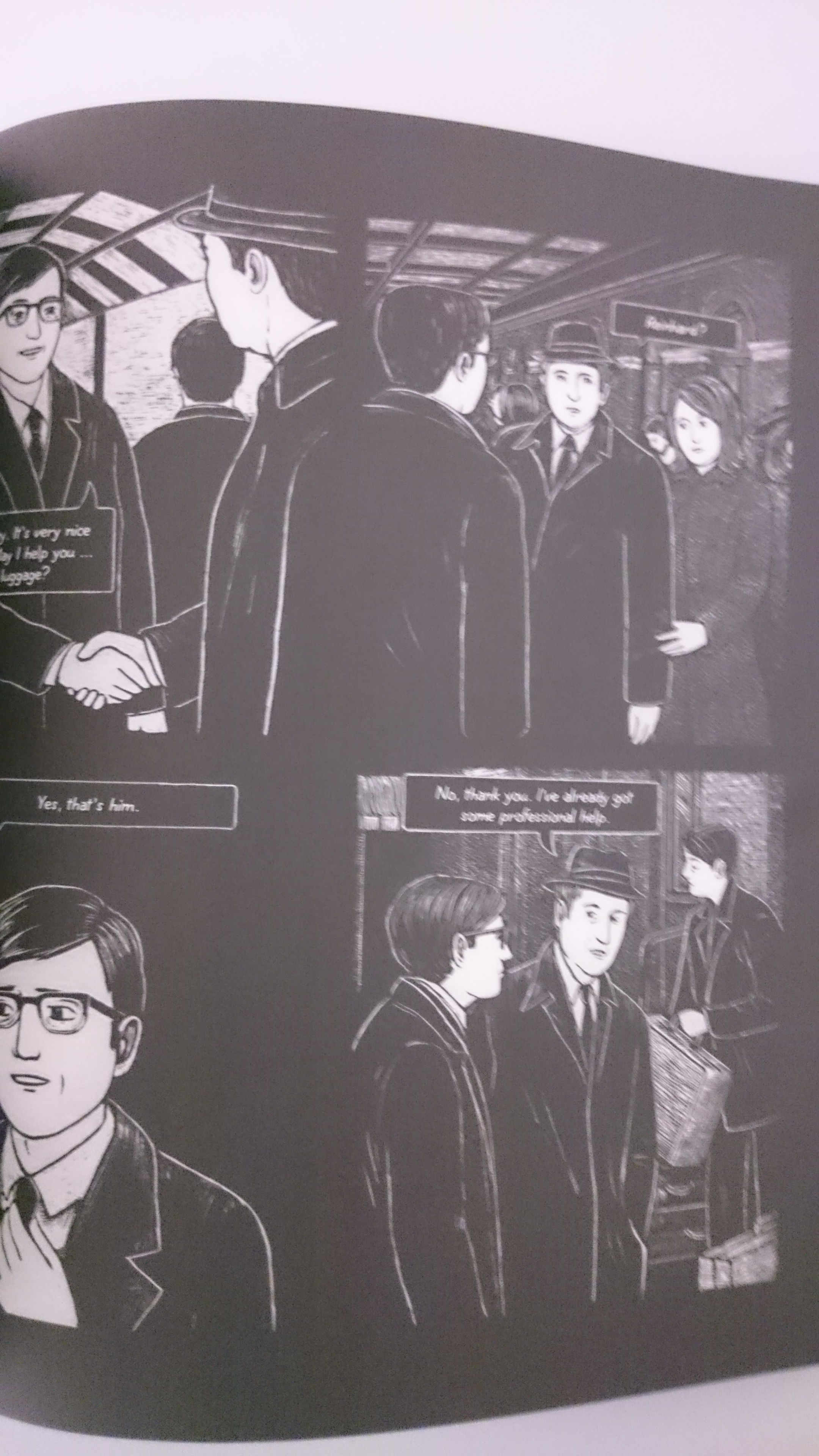
Line Hoven’s art, consisting of stark black-and-white scratchboard or scraperboard art, exquisitely blurs the lines between representations of narrative memory, and between ‘found objects’ like photographs and ticket stubs and other things. The drawing of photographs, thus introducing them into the visual grammar of the artist’s vision, is not part of a Gerhard Richter-like interrogation of representation. On the contrary. I think the book is incredibly disinterested in questions of representation qua representation. Line Hoven’s focus is, almost obsessively, on memory and how getting a family memory ‘right’ can have an impact both on personal as well as collective identities. Hayden White has drawn attention to the way “imagistic” historical representations are “a discourse in its own right” which tells us things “that can only be told by means of visual images.” Love Looks Away is, I think, attempting to do just that, provide a doubly refracted “historiophoty” and the result may be a short book, but reading and rereading it can take a while. It’s been translated into English, but I cannot ascertain the translator’s name. I strongly recommend you acquire and read this book. It is very good. I am personally greatly looking forward to whatever Hoven produces next, given how patient and mature and intelligent -not to mention gorgeous- this first offering is. This artist is going to high places. Get in on the ground floor. Read this book.

The English cover features different script from the German one; the result is so much more anodyne. An inexplicable decision. It makes me worry about the way the book's been translated.

The English cover features different script from the German one; the result is so much more anodyne. An inexplicable decision. It makes me worry about the way the book’s been translated.

So over the past years I’ve consistently reviewed comic books of all stripes. None of those books, however, were German even though Germany has a fairly vibrant comic scene, plus I’m German, so it would stand to reason they would turn up on my shelves at some point or another. The reason for this absence is that until this year I’ve just never read any. A big loss, as it turns out. Love Looks Away is, as you can probably tell from my very laudatory first paragraph, one of my favorite German comic books, a small, but carefully crafted, powerful graphic memoir. It’s been translated into English in 2014 and published by Blank Slate Books, a publisher who also translated other major German comic book creators like Uli Oesterle or Mawil. Love Looks Away is a book about Line Hoven’s family history, and unfolds, in spare imagery and well spaced episodes, a story that’s more than just one family’s tribulations during and after WWII. It actually ends up providing a convincing picture of a whole generation, despite the unique family circumstances. The story is rooted in Hoven’s grandparents who came of age during the 1940s, and I think this connection allows us to see in the work a kind of exploration of what Marianne Hirsch famously (and importantly) called “postmemory” – a memory of a generation that did not experience historical traumata, but creatively and imaginatively invests in a kind of cultural landscape, a memory created from testimony, but more importantly from objects like photographs, documents and the like. Hirsch’s theory, like many in the area of memory studies, was written to deal with the aftermath of the Shoah specifically, but “postmemory” can really apply to any retroactively created memory of events that are hard to explain or comprehend, usually traumatic. There are things that defy easy channels of recollection, and the process of “postmemory” is one that deals with that, I think, fairly well. I think Derrida referred to the material objects that precede us as the “déja là” – the already here. Hoven’s book starts with what’s already there and her art fills the gaps with a subtle, prodding imagination that stops short of filling in all the psychological questions. This is why I said that her book is primarily about memory: it is not about the “why” of history, personal or political. What it attempts to do is give an artfully heightened account of the things that happened, creating a memory in art.

_20160827_010112The gaps are nowhere as obvious as in one of the first sets of family pictures. Throughout the book, the painted copies of photographs are arranged on pages that look like photo albums, with hand written labels, and more. In one of the early “family album” pages, the amorous history of Hoven’s paternal grandparents is represented in four labeled and dated photographs. They met in a Hitler Youth summer camp. That specific photo however is missing, and whether the real photo is genuinely missing, the marked and labeled absence of that photo, shown as a blank space in a photo album, is symbolic of the difficulties of German cultural memory dealing with the more thorny aspects of the nation’s past. Even today, so many year’s later, the events of the time are papered over, guilt is deferred or projected elsewhere. Hoven does not condemn her grandfather, yet neither does she wash him clean of his past. Drawing a blank half page is an indictment of the shame in a suppressed memory. We owe to Martha Langford’s excellentr studies our understanding of how family albums work – as an ersatz oral tradition. Moreover, Hoven’s art in the narrative sections dealing with the past are careful, but sharp. In them, we see a dreaming boy walk proudly and smilingly in his Hitler Youth uniform, and we see a wedding picture where the now young man smiles in a uniform that should not give him reason to be joyful. In a later scene we see that uniformed portrait hanging in a family living room. Hoven’s work consists of scenes with little connecting tissue except for the drawn pages from a family album. It depends on her reader’s sense of history, on our sense of contexts and motivations. According to Martha Langford, reading family albums is an interpretative performance. We all, strangers or actual family, create narratives around the arranged photographs, as Langford found. If we understand this to be part of the underlying oral structure of photographs, then Hoven’s sparse illustrations, low as they are on explanation, have a very similar effect. We get more story than we would from photos, but the isolated effect is very similar.

DSC_2504This style of memory and writing is further emphasized by the book’s use of language. Hoven’s father, Reinhard is German, but her mother Charlotte is American, and the family history offers us both sets of grandparents – who do not, obviously speak German (in fact, Charlotte’s father has an almost pathological hatred of Germans, which is partly rooted in his inability to enlist in WWII due to health issues). Charlotte herself frequently speaks English in the book. Hoven does not translate or annotate any of the English dialog. The book is, in this sense, completely bilingual. Anything that was German when it happened, is rendered in German by Hoven, and everything that was English is rendered as English. This only further emphasizes the near-documentary narrative ethos of Hoven’s work of “postmemory.” The documentary effect does not, however, really extend to backgrounds. I mentioned Nora at the outset, but the book isn’t incredibly concerned with places of memory. I am not entirely sure how strong even the sense of place is? Much of the book is set in Bonn, the former capital of (West) Germany, and since I also live in Bonn, I recognize the vast majority of facades and buildings we see, but I am not sure that for someone who does not intimately know this cooky little West German city, the sense of place is particularly strong here. Hoven does not connect her visualization of memory, or postmemory, to commonly shared buildings. Evading obvious landmarks that are understood across a shared culture is done so thoroughly that it seems almost intentional. One of the “family album” pages shows a foto of family members standing in front of the Cologne Cathedral, which is one of Germany’s most famous buildings, yet the angle only includes part of the front door, as you would in a family picture. There is no wide pan to include the whole building and unless you have been there a few times and will recognize it even from this small snippet, the building will, at best, say “some big cathedral.” The exteriors of Bonn, similarly, are obvious to me (and extremely carefully and precisely rendered), but evade some of the most obvious landmarks.

_20160827_010125I mean, all of this seems hyperfocused. I have not really discussed the smaller stories here because there is so little narrative that I think you should let yourself be surprised by it. I assure you, you’ll like this book, if you like this kind of stuff at all. And I haven’t even mentioned the art at all. Like all the content aspects, the art also contributes to the book’s theme. The art consists of black and white scraperboard etchings (see wiki for details). The effect is really interesting. It creates an interesting dynamic that strongly interacts with the static structure of the book, the photographs and all that, and it also allows us to read the book in a certain German artistic continuum. There is a lot of historically and politically heightened art with similar effects – I mean, it strongly echoes some stark 20th century woodcuts, and in many pictures here I think has a conversation with German expressionist woodcuts (think Ernst Barlach). Another well known/excellent contemporary German cartoonist who employs this scratchboard technique (and hews closer to the German expressionist tradition) is Thomas Ott. Look, I know this review discusses memory studies a lot, and it seems as if I am less interested in the art, but everything I described hinges on Hoven’s art. Fundamentally, the biggest and most entrancing aspect of the book IS the art. Hoven has been working on that art in the years since the publication too, picking up awards, exhibitions and I will read whatever book comes next. It is also the art that sets her apart from many of her German peers. Much of German art is influenced by American underground comix, with some extremely notable and excellent exceptions (the unbelievable Peer Meter comes to mind, who also, incidentally, works on memory and history). Line Hoven is in the process of carving out a space of her own.

*

As always, if you feel like supporting this blog, there is a “Donate” button on the left and this link RIGHT HERE. :) If you liked this, tell me. If you hated it, even better. Send me comments, requests or suggestions either below or via email (cf. my About page) or to my twitter.)

China Miéville: Dial H

Miéville, China; Mateus Santolouco, Riccardo Burchielli et al. (2013), Dial H: Into You, DC Comics
ISBN 9-781401-237752

Wood, Dave; Jim Mooney et al. (2010), Showcase Presents: Dial H for Hero, DC Comics
ISBN 978-1-4012-2648-0

Pfeifer, Will; Kano et al. (2003), H-E-R-O: Powers and Abilities, DC Comics
ISBN 1-4012-0168-7

DSC_0613   So, while I am a fan of comic books and do read quite a few of them, I am still frequently overwhelmed by the incredible amount of characters and complicated back stories. DC Comics is especially infamous for not just having complicated stories, but even multiple realities and universes, which they then attempted to collapse in amazingly readable and fun but convoluted “events”. Then, suddenly, DC decided to do away with all the accrued history and complications by relaunching all of its titles in 2011, calling the new set of books “the new 52”. This reset the stories on all their major titles, giving them new origin stories, and new slants. It also turned the DC universe somewhat more male, due to the fact that female creators were vastly underrepresented among the slate of amazing writers and artists, and also due to the fact that a lot of female characters either completely vanished, like fan favorite Stephanie Brown, or were declared dead, like Renée Montoya. Other female characters were revived as weaker or “sexier” versions of their old selves. And it’s not just female characters. The first waves of comics to come out seemed to have a decidedly conservative slant in how they were positioned vis-a-vis recent character history. One example is Judd Winnick’s Catwoman run, as compared to the more recent history of the character in the hands of Ed Brubaker, Darwyn Cooke and others. However, DC also did something very interesting: they decided to use the bright lights of public attention in the wake of the relaunch in order to relaunch a bunch of much less well known characters, some of whom were pulled from DC’s more alternative imprints Vertigo and Wildstorm.

DSC_0628Frankenstein, for example, last seen in Grant Morrison’s book Seven Soldiers of Victory, was given his own title (written by the great, great Jeff Lemire), as were Animal Man and Swamp Thing, both of whom had iconic runs with Vertigo. The characters thus revived are not all equally well known. While Swamp Thing is probably one of the best known ‘alternative’ properties of DC, they also offered much less well known characters and titles a spot in the limelight. One of these characters/properties is Dial H for Hero, a decidedly odd kind of title, with a very inconsistent publishing history. His revival could have gone either way. DC, however, asked China Miéville to write this title, and the result is incredibly good. I have been reading quite a few comic books during the past year, and some extremely good ones among them (I’ll probably review some of them in the near future), but Miéville’s Dial H is easily one of the best, if not the best among this crop of really excellent comics that have been coming out. If you have been following Miéville’s career (as I have), this will likely not have come as a surprise to you. Miéville has established himself as one of the leading contemporary writers of science fiction, and probably one of the better novelists in the UK regardless of genre. Even considering the regrettable duds like Kraken, his bibliography is full of inventive, smart, extraordinarily well written novels. The news that he would be turning his attention to comic books in order to write a title of his own had me giddy and excited for a year. I spent part of that year reading up on the history of the character or characters that would be featured in Miéville’s book. And as I found out, that is a peculiar history.

DSC_0606(1)Limited as I am to trade publications, I will focus on only two books centered on the “Dial H”-property. There were small instances of the title resurfacing in between, they were not, however, collected as trades. The first time comic book readers came upon the Dial H for Hero stories was in 1965, in the pages of “House of Mystery #165”. The stories featured a boy called Robby Reed who finds a strange apparatus that “looks like a dial…made of a peculiar alloy….with a strange inscription on it”. The “young genius” decipers the inscription running along the side of the apparatus and finds that it asks its user to “dial the letters h-e-r-o”. Intrepid young Robby Reed does just that and, lo and behold, he turns into a superhero. His whole physical appearance is transformed: he has become a giant, complete with a superhero uniform (that even has letters on the front) and somehow he knows that the hero he transformed into is called “Giantboy”. Using the powers of the character, he thwarts some evil villains, and returning home, dials o-r-e-h in order to transform back into his bespectacled mild mannered self. The boy turning into an adult superhero is highly reminiscent of DC’s Captain Marvel, which is a boy called Billy Bateson who turns into the superhero Captain Marvel by saying “Shazam!”. However, as far as I know, Captain Marvel (sometimes also just named “Shazam”) is always more or less the same guy. Robby Reed’s dial, however, turns him into a different superhero every time he gives his dial a spin. There is so much that is bad about this title, from the casual racism (at one point he turns into “an Indian super-hero – Chief Mighty Arrow” and is even issued a companion, “a winged injun pony”. When he is upset, he shouts “Holy Massacre” and wishes he could “scalp” a monster) to sexism (Robby’s love interest find the dial, dials “h-e-r-o-i-n-e” and turns into “Gem Girl” despite Robby’s warnings that the dial is not a toy, and he ends up forcing her to dial herself back into a girl “before she gets any more ideas”), and overall ridiculous writing. However, it’s some of the most incredibly inventive work I have ever seen.

DSC_0607Robby transforms into heroes that make sense, like Giantboy or The Human Bullet etc., but in one issue he transforms into geometric shapes with arms and legs, for example. Coming up with new heroes (although you can dial up old ones too, it’s basically a randomized selection out of a finite, but large pool) forced the writer of the books, Dave Wood, to dig deep. And Jim Mooney’s art perfectly realizes Wood’s wacky vision. It’s just so much ridiculous fun, and the Showcase volume is well worth your while. If you want an idea of the silly fun on offer, click here to see a selection of covers. After a while the Dial H for Hero stories petered out. There were various small scale revivals, including one in the 1980s by the great Marv Wolfman, also called Dial H for Hero, but since none of them have been published as trades, I can’t really comment on them. They introduced more characters spinning the dial and further enlarged the pool of super-heroes. I’ve had a look at the Wiki summary of Wolfman’s run and it seems delightfully insane, and it seems to have more of a coherent plot than the Wood/Mooney version, which is basically a gonzo one-off kind of thing in each issue.

DSC_0611Even more coherent (and initially at least considerably more down to earth) is the 2003 incarnation called H-E-R-O, written by Will Pfeifer and beautifully illustrated by Kano. That run went on for 22 issues, but for some reason, only issues 1-6 have been collected as a trade (called H-E-R-O: Powers and Abilities). Pfeifer’s run features different people finding the dial and examines what happens to their lives when you add the opportunity to transform into a superhero. There is a young adult mired in a mediocre life, “making sundaes at minimum wage”. In order to impress a girl, and more generally as an attempt to “be someone”, he uses the Dial to unimpressive and even disastrous effect. A business man finding the dial becomes obsessed with it. A girl uses it to become popular at her new school, etc. The book was a bit of a letdown, even though the writing and art was just so much better than the Wood/Mooney version. But Pfeifer got rid of the ridiculous fun and inventiveness and infused the whole book with a dour morality, mostly lectures about being content with who you are and knowing your limits and being nice and industrious within those limits. Much more than the original book, the dialing device becomes a metaphor for situations that we all face in our lives etc. etc. I’m boring myself just describing it. For all the good writing and wonderful art that went into this book, it’s hard to recommend, because Pfeifer so consistently underwhelms. The idea of the dial is one of the most liberating literary devices I have ever seen, and to see it used in this pedestrian, moral, middle-class way was disheartening. If that was the direction that the Dial H for Hero story was going, I was worried about Miéville’s run presenting more of the same. Silly me. China Miéville blows Pfeifer’s run clean out of the water.

DSC_0626Miéville renames the series Dial H, and provides a spin on it that is equal parts original and respectful to the Silver Age original. The protagonist of the first trade is called Nelson Jent, and he’s an obese unemployed middle aged man, who, one night, is almost beat up by a group of lowlifes and, attempting to call the police from a phone booth, transforms into Boy Chimney. From that moment the reader knows that this is something else than the other titles in the Dial H for Hero series. And it starts with small details: Mieville, like many writers, offers us the thoughts of the characters that he focuses on. And as Jent transforms into Boy Chimney, his thoughts seem to transform, as well. Strange fragments enter them, and as Boy Chimney proceeds to beat up that gang, he appears to have a dialog with the consciousness of Nelson Jent. Additionally, Boy Chimney is very clearly not a super hero, as all the previous titles imagined them. He is a strange creature that has uncommon strength and unusual powers and abilities, among them the ability to use and command smoke. But it’s only Jent’s consciousness that keeps Boy Chimney from outright killing the brutal assailants in the alley. It feels less like Jent is genuinely transforming into a super hero, and more like a kind of symbiosis. And there is another basic difference: Jent doesn’t have to transform back by dialing the letters in reverse. He automatically returns to his normal self, “into the worst identity of all”, after a certain, variable amount of time has passed. Apart from this, the book’s early parts seem to be fairly straightforward. There’s a villain with a secret plan and he and Jent’s super heroes keep meeting and fighting. And then, the book quickly goes off the rails into the most incredible insanity. The villain, it turns out, is a “nullomancer”, a kind of wizard of nothingness, able to conjure and control nothingness, and her plan involves channeling an ancient beast called the Abyss, a strange thing composed of nothingness, but at the same time, containing universes.

DSC_0625(1)If this sounds absurd, I can assure you that Miéville makes it work on the page, and in his origin story, which closes out the trade, he offers a brilliant explanation for what the dial basically does. It’s hard to give you more details without spoiling the book, so I won’t, but the upshot of it all is that Miéville managed to tell a story that makes use of the incredible artistic liberties that the material has to offer, and yet it’s a book very determined to make sense, in multiple ways. What’s more, the art is not a let down. Would it have been a better book with JH Williams III at the helm? Possibly. But Mateus Santolouco, of whom I have never heard, does an excellent job. I was especially impressed by his work on the super-hero identities invoked by the dial. They are the most crucial visual element of the book, as they have to appear both plausible and iconical – and absurdly odd at the same time. As Boy Chimney leaps from the phone booth he is instantly alive on the page, as a scary, off the wall character. Almost as important are the colors, and Tanya and Richard Horie have done a simply magnificent job throughout the book. In my review of Brian Wood’s DMZ I have lamented the fact that the art seemed but a servant to Wood’s writing in the book, making for a less than great reading experience. That is not the case with Dial H. Even though Miéville is a famous award winning novelist, Santolouco brings a very distinct artistic vision to bear. The sketches in the back show how he worked on and tweaked the look of various superhero identities. Santolouco’s achievement is thrown into even starker relief by issue #0, which presents a kind of origin story, and is included at the back of the trade. Riccardo Burchielli valiantly tries to do justice to Miéville’s amazing script, but it’s an overall disappointing effort, compared to Santolouco’s work that came before.

DSC_0631The book has so many ideas, and one of them is an obsession with identity. With superheroes, we talk a lot about identities, secret and public ones, but that is usually a naming issue: what name do I use? What mask do I wear. Alternative takes on superhero narratives (cf. Millar’s Kick-Ass) suggest that wearing masks is liberating, but they don’t really discuss or problematize the core issue of identity. Miéville, as all his work so far has also shown, is very aware of how identity is tied up in physical forms and in cultural and social ties. The characters that Jent turns into appear to have their own memories, and while it turns out to be an issue more of colonialism and appropriation than of sociology and psychology, Miéville opens wide the doors for these discussions. In doing so, I think, he goes beyond even writers like Morrison, as he uses the iconicity and language of big publisher super-hero comics and examines it carefully. This is not another one of those books critical of ‘superhero myths’, and it doesn’t offer a grimy reality based taken on super heroes. There are enough of those around. No, Miéville embraces a lot of the central qualities of the genre and uses its language in order to interrogate it and tell an absorbing story at the same time. The best news? There is much more to come. For all the density of this book, it merely collects the first issues in an ongoing run. The next trade is due in January 2014. You should be reading this book.

*

As always, if you feel like supporting this blog, there is a “Donate” button on the right. I really need it 🙂 If you liked this, tell me. If you hated it, even better. Send me comments, requests or suggestions either below or via email (cf. my About page) or to my twitter.)

Terry Moore: Echo: Moon Lake

Moore, Terry (2008), Echo: Moon Lake, Abstract Studio
ISBN 978-189259740-3

I’ve been meaning to review this graphic novel for ages, but, as with many of its colleagues, I am frequently puzzled as to what, exactly, to say about it. Well, to cut to the chase: Terry Moore’s Echo: Moon Lake, the first book in an ongoing series, is very interesting, certainly worth reading, but so introductory that, without having read more books in the series, it’s hard to say anything definite about it. It’s self-published in Moore’s own imprint “Abstract Studio”. The book is rather brief and barely manages to introduce all of what I assume to be the major characters. Unlike other brief first volumes such as Jeff Smith’s Rasl: The Drift (my review here), it doesn’t throw you into the hot action immediately. The overall storytelling is very old-fashioned and the present volume is basically an exposition. Make no mistake, it’s certainly not boring and lots of things happen, there’s an enormous amount of actual, well, action, but the tone and the speed of the whole enterprise is, so far, leisurely. There is much that is intriguing about the setup, but, and this is really strange, the series could now go either way. It could turn out to be horribly tedious or marvelously enchanting and/or suspenseful. It’s impossible to tell and this kind of ambiguity is not necessarily a good attribute of any book.

In my recent attempts to read up on classical and contemporary comics and graphic novels, I had come across Terry Moore’s name before but hadn’t actually read any of his books yet. He is most famous for being the creator of the well-known and critically successful series Strangers in Paradise, a series that combines a look at the mundane affairs of a group of women, among them lesbian and bisexual characters, the portrayal of which won Moore a GLAAD award in 2001, with a Mafia-style thriller plot. The accurate portrayal of the interpersonal relationships won Moore a following far beyond the reach of the genre. Plots and dialogue were especially praised for their verisimilitude and lack of clichés. Personally, I can verify none of this but I do see traces of this kind of writing at work in Echo: Moon Lake, as well. Actually, his new series appears to be fundamentally similar in several respects to his earlier books, and Moore’s vision of his art is intact, or maybe even expanded in all the best ways. Moore is both the artist and the writer of both series and both aspects are very well done, at least as far as craftsmanship is concerned. By now, I’ve read too many graphic novels not to be thankful for someone with Moore’s skills at work.

The story, set in and near the California National Park, is about some new hightech battle suit, which looks like latex, but is actually some sort of metal. It’s both a suit of armor as well as a weapon. We’re not explained what it is, exactly, but these are properties that quickly become obvious (personally, I was reminded of Donna Haraway’s cyborg here and if and when I’ll discuss more books from this series I might return to this). As we enter the story we watch a woman in that suit take flight. This is apparently an effort to test that suit and during those tests she’s shot at from planes. Attached to the suit is a kind of jet pack and she uses it to escape a pair of sidewinders launched at her from an airplane. That escape, however, goes awry as the sidewinders finally catch up with her and kill her. The ensuing explosion sends thousands of small suit-particles down, like viscous metal rain. Julie Martin, the book’s protagonist, is driving through the area and a few hundred of those particles slam through the roof of her car and onto her. She tries to flee them but to no avail. Eventually, those particles that landed on her attract some of those that are lying on the ground and on the back of the car and together they form a suit-fragment, all on their own, like a thick second skin around her shoulders and over her large breasts (I will return to that aspect). This is when the story takes off. In the subsequent chapters, the military starts tracking her down, the dead woman’s boyfriend starts asking questions and a homeless man, who was also struck by some particles, is using the suit’s potential for aggression in his own way.

He’s a bit cracked and imagines that God has blessed him with a weapon and proceeds to shower people with lightning. He wears a long, white beard, has wild black eyes and his face appears to be trying out different kinds of snarls. I dwell on him a bit because it is his portrayal that lifts the book onto another level. The whole pace of the storytelling is slow, the military functions the way it always does, especially in visual media, it’s corrupt, greedy and somewhat mean. Julia’s personal history is very much foregrounded. As in Stranger than Paradise, Moore is most successful when he attempts to convey to us how Julia feels about all this. She lives alone with a dog, her husband, a pretty cop, has just sent her her divorce papers, waiting for her to sign them, and now this. A doctor she consults thinks she’s playing a practical joke on him, her husband thinks she’s trying to confuse him and stall the divorce proceedings and this new suit is completely alien. She didn’t ask for it and she can’t get it off either and she can’t even seem to control its powers, since it appears to randomly zap people who touch it. That story is interesting and the suit clearly works as a trope as well as as an interesting object, but the hobo puts a spin on the whole thing, a kind of urgency. His control of the device and Julie’s passivity are in sharp contrast, causing us to read the book in terms of gender. But there is more. His portrayal, especially the visual portrayal, recalls certain superhero tropes.

Generally speaking, the art is, in a way, old-fashioned, a very clean and bright black-and-white look that seems to always achieve what it sets out to do. Violent, expressive scenes are just as convincingly rendered as intimate interiors. Unlike artists such as J.G. Jones, Moore is not very careful with background details when focusing upon people in the foreground of the panel, although, now and then, he draws whole landscapes by panning away from the action, and he’s excellent at that as well, with an interesting mixture of detailed and sketched detail in there. His main strength, that part of his work, where he most appears to come into his own, however, are faces and facial expressions. In keeping with his kind of storytelling that focuses on characters and interpersonal relationships, his art is very intent to be accurate, precise almost, to show us facial expressions. Faces, even in the background, are not left unattended, which incredibly animates the art. Although, as in any work of the genre, facial expressions are conventionalized, Moore’s commitment to his characters shines through. Now, this kind of animated use of facial expressions isn’t new to comics, but the mixture in Moore’s art is rare. The animated, conventional but lively faces are in contrast to the black-and white art, reduced to significant details (although nowhere as near as reduced as, for example David B.’s work), frequently panning out and in again. Moore has a cinematographer’s eye for good frames, and good, even epic shots. He can be artful when he wants to be and he is also capable of seamlessly slipping into the visual language of superhero comics.

Now, on this blog and elsewhere I’ve frequently pointed out that one of the strengths of the superhero genre are iconic visuals. Moore’s main strength, drawing convincing characters, isn’t normally found nor necessary to that genre. However, Moore heavily borrows from it. Several shots and details clearly evoke superhero tropes. There are Julie’s breasts, which are above-averagely large; this is an important fact, Echo: Moon Lake, after all, repeatedly draws our attention to that fact, not least by placing the suit-fragment squarely there. The use of female proportions in the genre has frequently been remarked upon and it has been amply discussed, so there’s little need for me to do so. I do want to remark on the fact, though, that it’s, as so often, interesting that this focus on female breasts is not accompanied by a heightened sexuality in the story. Quite the contrary, in fact. If anything, the book leans towards a morality based on a Christian understanding. One of the book’s topics seems to be the hubris and danger of scientific positivism (the individual issues ( Echo: Moon Lake collects Echo issues 1-5) are all prefaced by a cautionary Albert Einstein quote), which is balanced by a very intriguing set of religious allusions or underpinnings. The basic fact of religious irrationality isn’t so much acknowledged, as exoticised, in the way that irrationality becomes a subset of religious thinking, with ‘normal’ people being both at the same time.

This, however, is very tentative, guesswork, impossible to verify without reading more. Another ‘apparent’ blind spot is patriotism, which plays a very weird role in the book. Again, it’s impossible to judge, from the evidence of this book alone, but. Another superhero trope is found in the visual representation of the hobo. Every panel featuring him and his new powerful glove, basically screams super-villain. He isn’t ‘the’ villain, in fact, he appears to be somewhat delusional and pathetic, but the visual representation tells a slightly different story, reminding me, personally, of Marvel Universe staple Thor (especially of the slighty mad Thor re-invention by Mark Millar in his Ultimates series). In his depiction and Julie’s are numerous stories. About power, strength and gender inequality. About convictions and weakness. And ultimately, the destructive power of the atomic bomb and similar devices, as they are related to crazy people like the hobo, and to male and patriarchal power structures in general. Moore tosses a lot of ideas around, but without reading more, this is all I can say. I enjoyed reading it and will be picking up volume two (Echo: Atomic Dreams, collecting issues 6-10) soon. Volume three  (Echo: Desert Run) was just published this month, it collects issues 11-15. I haven’t read either but on the strength of the first volume, I will read both,because Echo: Moon Lake is a highly original, highly professional and an intriguing read.

*

As always, if you feel like supporting this blog, there is a “Donate” button on the right. 🙂 If you liked this, tell me. If you hated it, even better. Send me comments, requests or suggestions either below or via email (cf. my About page) or to my twitter.)

Jeff Smith: Rasl: The Drift

Smith, Jeff (2009), Rasl: The Drift, Cartoon Books
ISBN 978-1-888963-20-5

I have been seriously reading graphic novels for a short time now, slowly developing a taste and favorites. The first book I fell head over heels in love with was Jeff Smith’s Bone, a huge graphic novel fantasy opus, sprawling, epic and strikingly beautiful. I have not encountered the balance it strikes between humor, drama and pathos anywhere else. It’s also, for a fantasy opus, surprisingly devoid of the politically questionable tendencies of, for example The Lord of the Rings, which is fed from different kinds of right wing ideologies. Bone is a book, the cuteness and tender romanticism of which appeals to children of all ages; at the same time it is a serious, aware feat of storytelling. In the different peoples, Smith reflects upon issues of alterity, the tourist gaze, different tropes raised by the fairy tale tradition and much, much more. Jeff Smith is not just the writer of Bone, he’s also its artist, and much of the pleasure of that book is derived from Smith’s art. In Bone, Smith shows evidence of a unique way of dealing with his material.

In one and the same book he demonstrates vastly different skills, depending on the character he draws, most impressive for me way the way he handled the bodies of the rat creatures, fluffy yet gruesomely cute monsters. On the same page, when he handled the Bones, a group of cartoonish, simple white creatures that look like, well bones, he adapted his style to a simple, yet expressive way of drawing reminiscent of Kelly’s Pogo or even Disney characters (but the depth of awareness that pervades every page of the book puts Bone miles beyond the realm of Disney cartoons). The ten original Bone books, as well as the 1300 page one volume edition (which I own) were first published via Jeff Smith’s own “Cartoon Books” imprint. As Bone grew to be a huge success, it was picked up by Scholastics. Smith’s next project was to reinvent Captain Marvel (the DC Comics character, yes, it confuses me too) in Shazam!: The Monster Society of Evil, written for and published with DC Comics. As many independent comic writers turn into major publishing house staff writers given the chance and success, many people expected Jeff Smith’s career to take that turn, as well.

Instead, it’s now a year later and in my hands I hold Jeff Smith’s latest book “The Drift”, the first installment of a new series called Rasl (an acronym, pronounced razzle), self-published again at Smith’s own Cartoon Books imprint. Rasl: The Drift collects issues #1-3 of the individually published Rasl comic books. It’s oversized, 10×12, and completely wonderful. If Bone appealed to kids and adults both, Rasl is an adult only graphic novel, containing violence, sex and inter-dimensional travel. The main references in Rasl are, instead of fairy tales and fantasy narratives, noir novels and movies. The book’s protagonist, Rasl, is an art thief who used to be a scientist, as we find out. He’s no normal art thief, though, he steals artworks from parallel worlds, from different dimensions. He travels with a big device that he carries around in two large bags and assembles when necessary.

We do not yet know what happened to him, why he embarked upon this course and why he started to steal works of art. Instead, the book plunges us directly in medias res, as Rasl materializes in a dimension where Bob Dylan puts out his music under the name Robert Zimmermann, but this time, his art heist goes wrong, as a lizard faced man wearing a black trenchcoat pursues him, and is even able to jump dimensions as Rasl does. How? Rasl must leave a residue of a kind to enable the lizard faced man to follow him. These and other questions are raised in the book but few of them answered.

Rasl: The Drift is surprisingly long at 112 pages if we look at the actual plot related to us. This is because Jeff Smith is using cinematic techniques, making a walk through a desert as exciting as as the chase after the heist, by lavishing many panels on small details, changes of angle, changes of light. This generous handling of space on the page seems to contrast with the thrifty use of actual details in the individual panels, which can seem sparse, penurious. Where a panel in Bone was able to concentrate an enormous amount of kinetic energy in gestures and bent bodies, Rasl: The Drift is full of rigid drawings which acquire speed and agility by each others company on the huge, black-and-white pages of this great book. The atmosphere is that of Humphrey Bogart’s great movies, caught almost perfectly, down to and including small details from these movies.

The main topic of the series, the dimension hopping, has only been hinted at so far. We only know that it works, that it is tiring, depleting; we also know that the different worlds resemble each other strongly, except for small details, and all these people exist in everyone of these worlds, except for Rasl and a few others (raising questions of identity and what it means to be human). In this short book, Smith hints at many issues, from gender roles to naming and even the idea of the trace, know from Derrida’s work. Smith juxtaposes the quantum mechanics with a spiritual discussion of ancient native American symbols, he also seems to hint at issues of race and culture, but at this point, my impressions are rather vague. After all, he is only spreading hints here. This first volume succeeds in being a perfect, intriguing introduction to the series as well as an action packed, suspenseful read.

Rasl: The Drift is a short book that dazzles. It’s drawing upon a set of pop cultural sources (and quantum theory has been consumed by pop culture a long time ago) and yet it reads completely fresh and original. I cannot recommend this book or indeed anything by Jeff Smith (although, apart from Rasl, I’ve only read Bone) highly enough. I am eagerly awaiting the second collection, titled Rasl: The Fire of St. George. As issue #6 is going to be published in July 2009, I realize it’s going to take a while. As a reader of George R. R. Martin’s work and a huge admirer of Lawrence Norfolk’s, I am used to waiting, especially if the book seems so worth waiting for.

Yoshihiro Tatsumi’s “A Drifting Life”

Tatsumi, Yoshihiro (2009), A Drifting Life, Drawn and Quarterly
ISBN 978-1-897299-74-6
[Translated by Taro Nettleton]

Since I am generally decently well read, strange or unknown translations do not normally bewilder me. This book here, Tatsumi’s mammoth A Drifting Life, is different, since in what concerns comics and graphic novels I’m but a novice at best, a consequence of which is the lack of thorough comments on Tatsumi’s artwork in this review (but you can see a sample page here ). A Drifting Life is a graphic novel that an “ editor’s note” proclaims to be an autobiography from what appears to be one of the most important artists in Japanese comics. It was translated by Taro Nettleton, but the fact that we can read it now is mostly due to Adrian Tomine, who is the editor of a series of English publications of Tatsumi’s books, all with Drawn and Quarterly, a Canadian publisher. My edition is gorgeous, very beautiful, but not very forthcoming with information.

What’s the original title of the book? Tomine/Nettleton keep mum about it. Unless I’m mistaken, it’s Gekiga hyoryū, which means, I’m told, “A Gekiga Survivor”; the change in the title is fascinating, as it stresses a completely different aspect of the book. The original title does more justice to the book, but the English title, taking its cue from a passage in the third-to-last panel of the book, is more poetical, perhaps, and lends a much-needed coherence to the book. However, the book is not about a drifting life, it’s rather about a drifting career, about the development of an artist and the industry he worked in the industry that we watch him help shape.

The name of the protagonist is close enough to that of the author to make the dissemblement obvious: Hiroshi Katsumi. Hiroshi, when the book opens, is a teenager, who is obsessed with comics, especially the Japanese variety called Manga. Both he and his sickly brother are avid readers of Manga books and turn out to be talented artists in the genre themselves. When they grow up, developing a love for the genre, an important medium, besides books, which never went out of style, were Manga magazines, which solicited short strips from its young readers and rewarded publication with a medal. From the start, we are told of the way that constrictions of the medium afflict the creative process, as Hiroshi ponders the difference between work on short four-panel pieces and work on longer graphic novels. Incidentally, at this point, I felt left out in the rain by the editor once more. The term “graphic novel” appeared in English in the 1970s and has ever since been the subject of much controversy. As far as I know, the Japanese tradition of using the novel format for comics is older than the English, but Nettleton’s and Tomine’s decision to nonchalantly include this term in the thought processes of a young boy in the early postwar period is problematic, and the reader is completely on his own at this point. No footnotes, no explanations, nothing.

The first chapters are significant in still more ways. For one thing, the first six panels of the book are not primarily concerned with Hiroshi and his story: they relate the situation in Japan directly after the war, linking Hiroshi directly to a historical context:

Hiroshi was ten years old, the war ended during his fourth summer vacation

As we meet Hiroshi, he’s already a Manga fan, but the novel makes no attempt to tell us anything about the war or anything else that happened during that period. The first chapter’s title, “The Birth of Manga”, links the rise of the art form directly to the rise of the nation after the war; thus, when Hiroshi becomes a Manga artist, a circle of sorts is closed. These three elements are shown to be interlinked, interdependent, over and over.

One of the most important factors in the early chapters is their demonstration of how young the early practitioners of the art form were. As we see Hiroshi and his friends establish an alternative tradition to the Manga mainstream, we can’t forget these early chapters. There, even as we watch Hiroshi adulate his heroes, chief among which would be Osamu Tezuka, who debuted in 1946, we are frequently reminded of the fact that they, too, are barely of age. The first hint of this is offered when we are told, as Hiroshi, on his way to school, crosses through the yard of a medical school, that it is this very school, where, at the time, Tezuka was enrolled as a student. When, later, Hiroshi and his friends start publishing work that pushes the envelope in a young but already firmly set genre, they, too, are just of age. The youthful energy, the anger, the hunger for something new, are portrayed as the most important factors in creating art.

Refreshingly, in all the discussions of the artistic achievement of Manga artists and the development of the genre, Tatsumi never discusses talent or other innate factors. Instead, he focuses on two things, both of which have already been mentioned. One is the energy and the questing mind of the artist. This is shown to be important on a personal level: Hiroshi, growing up and becoming successful, has ups and downs in his creative confidence and the quality and quantity of his output. To a large extent, this is explained through the presence of that energy or the lack of it. The other important factor is the medium in which Mangas were distributed. The difference between large format books, short books, short stories, longer novels is not merely a marketing distinction. It directly affects artistic output. To write a short, humorous four panel piece calls for different techniques than, perhaps, a 130 page novel. As Hiroshi grows into his own as an artist he commences what his brother calls wasting panels: he incorporates cinematic effects and techniques into comics, taking several panels to describe a short action, so as to depict it in the most vivid way imaginable. This is difficult to achieve in a story that runs slightly less than 20 pages, because you need more room to develop a story, if the action is to have so much breathing space. So, technically, it’s restraining, but at the same time it opens up new possibilities because you can invoke a slew of new moods, and thus enlarge the kinds of stories you can tell. Hiroshi is a generous narrator, freely attributing innovations to his fellow artists, recounting his jealousy as well as his admiration and, most importantly, his urge to improve, to broaden his palette.

Discussions about the mechanics of Hiroshi’s art are at the heart of this book, which, as I mentioned above, is called “A Gekiga Survivor” in the original. Gekiga, according to a friend of Hiroshi’s, is NOT Manga, but when I keep using the term Manga as a catch-all term, I follow Hiroshi’s distinction, who understands Gekiga as a kind of Manga. This may seem like a superfluous observation, but the mere fact that the book would take the time and room to entertain a long discussion about the question whether Gekiga is Manga or not points to the importance of the question of genre; not, I might add, because Tatsumi wants to stress the permanence and importance of genre limits. On the contrary, his careful use of distinctions and genre allows him to show how Hiroshi’s and his friends’ work was at the eye of a cultural storm, taking hints and aspirations from ‘traditional’, Tezuka-style Manga, from movies, hard-boiled novels (especially Spillane’s) and individual inspiration. Genre is shown to be an economical factor, but also a fact of culture, something that fuels literary dynamics.

Tatsumi’s art in the book serves as a perfect way to transmit this. Tatsumi frequently quotes from these sources. Quotes how you may ask? He recreates, in black and white, images from movies, he re-draws panels from artists that he references. They are not cut out and pasted in, they are drawn by the artist, in short: quoted (although here, too, the documentation by the editor is severely lacking). A Drifting Life makes the utmost of the fact that it is a graphic novel and not prose. When, at one point, Hiroshi reflects upon the way that the amount of detail in a panel makes a reader read slower or quicker, that an artist can thus manipulate the speed with which his readers progress through the book, we, the readers, immediately read the book with a different awareness. When a certain brand of satirical humor, contained in certain graphic quirks, is discussed, many a reader will catch himself looking through sections he’s already read, just to re-evaluate them in a new light.

I could go on for ages, because this book is rich, extremely well told, and infinitely fascinating. The narrative is not suspenseful, but it’s full of intricate symbols and foreshadowing, of developments and reversals. I suspect that this book will open up new vistas with each rereading. It is about the possibilities and the necessities of art when the publisher and the artist have to live off it. It refrains from opening a simple and simplistic opposition between greedy publishers and the poor writers, on the contrary, we are apprised of the fact that the progression of not just an artist but his whole art form is inextricably bound to the fact that money is made off it; several times we see the history of Gekiga make a sudden jump forward because the artists are trying to surmount an obstacle. What happened to Gekiga after the 1960s? The book doesn’t tell us, nor does the editor or translator. In the context of the book, I found it significant, that this book, too, was published in several installments, in a Manga magazine., which I found out trawling the net for the information that Tomine denied me. If this book has a weakness, this lack of information is it.

In a way, this is reflected in the choice of a title that I complained about earlier. As I pointed out, Tatsumi’s book does not show us his drifting life, his main character merges into the culture he was influenced by and that he, in turn, influenced. The drifting is Hiroshi’s life as an artist, it’s the drifting of the group of writers who were to identify as members of the Gekiga workshop, drifting as a cultural dynamic. I suspect that the fact that Tomine read the book as narrowly autobiographical led to his lack of explanations. It is generally called an autobiography because Tomine’s short, largely uninformative “Editor’s Note” informs us that it is one and that

the author has chosen to alter some characters’ names, most notably his own.

What’s the use of that, if the author’s name is on the cover? Oh, I know. Because it’s not an autobiography. It may follow Tatsumi’s biography rather closely, but the artist’s decision to withdraw his own name from the book suggests that it’s not, in fact, an autobiography.

I know that many memoirs and autobiographies are in equal parts portraits of a time as they are portraits of a person. But what we’re up against here is a direct decision of the author. He put his name on the cover, but struck it from the book. When he depicts Hiroshi’s older self, the face he draws looks a lot like the author’s photo in the back of the book, but he hachures over it, so as to hide it from the reader. These are clear decisions of the book and it means selling the artist’s work short when we reduce it to the limits of that genre, and act as if there wasn’t any difference to other proponents of it.

Hiroshi’s life is shown to be in service to his art and his fellow artists, something that is reflected on a different level when, many years into his career, he takes on an unpaid job as an editor. The novel is so well constructed, with all its levels reflecting each other that the more profitable reading would look for inward references instead of streamlining a reading as autobiographical. Reading a text as autobiography (which is how genre, generally works) means involving it in a web of references, claims to truth etc.; there is a good reason to accept the narrow definition that Lejeune famously put forward in the autobiographical pact, which (if I remember it correctly) hinges on a correspondence of names. So, I think it’s not an autobiography, not in the common sense, anyway, but it’s still a biographical novel (in the sense of a novel that follows a person’s life, fictitious or not) that shows us the development of an art form through the development of a small group of friends, who grow up in post-WWII Japan and dream of becoming Manga artists, or rather: Gekiga artists:

I’ve drifted along, demanding an endless dream from Gekiga

the protagonist tells us at the end, continuing:

And I…probably…always will.

This endless dream creates a book that is like a long, meandering stream, like a slow burning fire that explodes sometimes in moments of illumination. In the last chapter, the protagonist, his face carefully shaded, another evasion from the autobiographical glare, attends the funeral of Tezuka, bringing the whole book full circle. The book did not, however, work towards that ending; you don’t read it, breathlessly, to finish it. No, here, as in many other good books, the journey is the reward, the glimpse into the birth both of a culture and of an artist in it. This is an incredible book. I have read few like it. Not Tatsumi’s drifting life, but his life of drafting, of drafting panel after panel, story after story, is an inspiration.